A Simple, Subtle Kit from Brondby
While the EFL has seemingly only just kicked off, the Danish Superliga is in full swing. Eight games have been played and the league is beginning to take shape. Furthermore, Brondby, a team that took second place last season, is currently sitting in third place. Alexander Zurniger will want to see his team push further up the table and hopefully take hope the title in a few months time.
Today we brought you Watford FC’s away kit. The English team’s jersey was bright and eye-catching. Now we want to show you Brondby’s away kit. It isn’t quite so eye-catching but does have some subtle characteristics that make it special. We at UK Soccer Shop quite like it. What do you think?
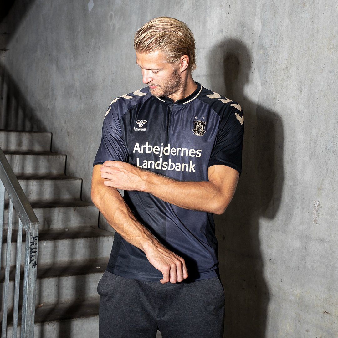
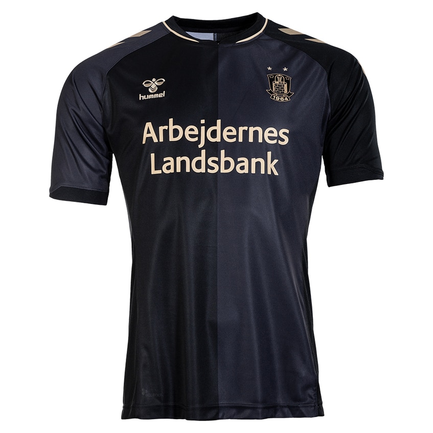
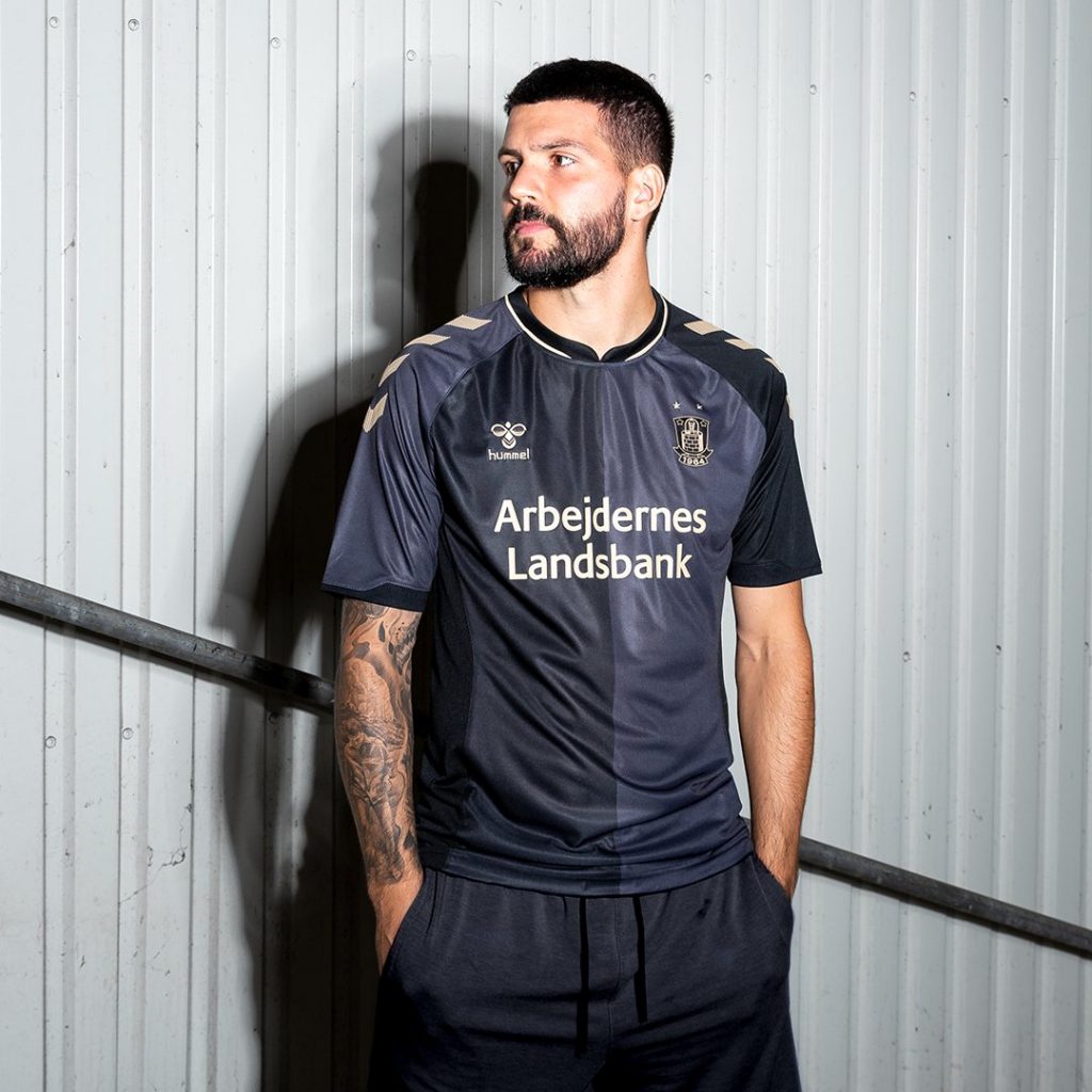
Normally in this section of a blog post we talk about the kit’s colouring. Whether that’s the chocolate bar-looking kit of Brentford’s away kit, or Bristol City’s purple and lime-green jersey. In this instance, we don’t have much colour to work with. Half of the jersey has the appearance of charcoal. The other half is either a lighter shade of black or a metallic grey. You be the judge.
There is a reason for this kit colour construction. It is to represent the combination of Brøndbyøster and Brøndbyvester Idrætsforening at the club’s formation in 1964.
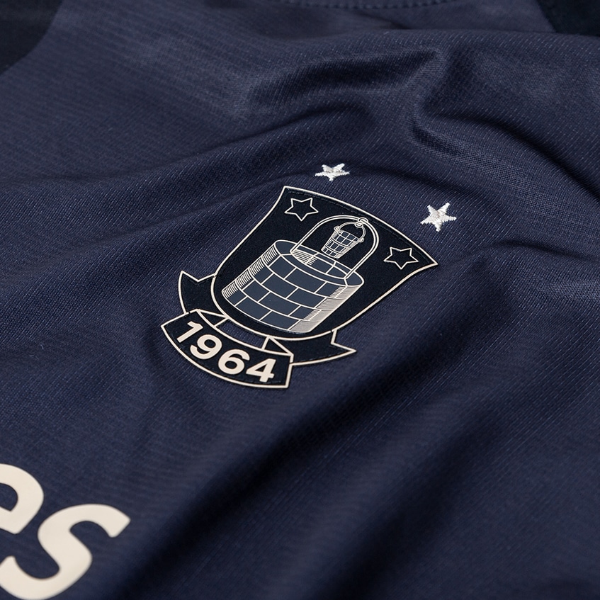
This “colouring,” does act as the perfect blank canvas for the club’s crest, main sponsor, and Hummel’s logo to appear on top of. The neckline is simple, with a break at the front and two thin white lines running down either side.
Across the shoulders and down to the tops of the sleeves are a number of large white arrows. These arrows are made up of thin lines.
We look forward to seeing this kit compete in the Danish Superleague, after the international break.

