Last month we showed you Aberdeen’s Home kit. We thought it best to show you their away one.
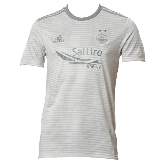
There’s just something about Scottish football. I don’t know what it is but Aberdeen fc encapsulate whatever that is. While this might be quite a vague opening sentence, it is relevant. Kind of. Perhaps it’s the fact that money hasn’t completely spoilt the SPL yet, or simply watching Scott Brown each week and thinking, “I wonder if he really is that tough.” Maybe it’s the overall energy at places like Easter Road or Pittrodrie Stadium. This energy is about to be unleashed against Burnley in the Europa League. Aberdeen have just released their latest away kit and it is excellent. If a little grey.
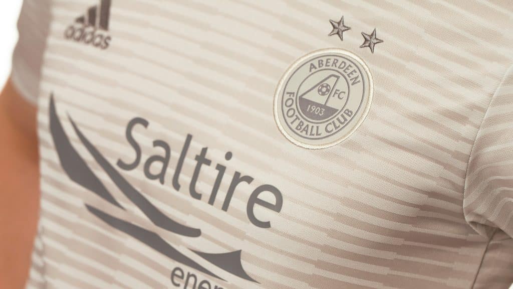
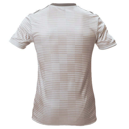
Although we’ve literally just called it grey, the kit is actually silver. Silver and white, a decent combination. Running horizontally across the chest are a number of stripes. These stripes suddenly get thicker and then are paper thin. This sudden, jarring contrast gives the kit a really nice depth and contributes to the jersey’s overall character.
These lines, when seen from a distance create a checker board effect and can be seen running round the whole kit.
The bright red colouring of the club’s crest has also been ditched. Instead, going completely silver (or grey, depending on your opinion).
You’d think that by doing away with the colour, fans would be unhappy but actually, the kit has received mainly positive feedback. Perhaps Adidas would rather focus on the shape and lines, rather than finding a colour which will be unpopular. Like Brentford’s. Which is brown.
Aberdeen FC finished their 2017/18 season in second place. They pipped Rangers and Hibernian to the post and left Hearts in the dust. Finishing only nine points behind the titans of Celtic, many fans are asking whether The Celts’ run of luck and dominance is over. Only time will tell but we can’t wait to see this away kit next season.


