What is Scotland famous for? William Wallace, tartan, whiskey, and recently kits that make us say “ooh”. Yesterday we brought you Ross County’s latest away kit and today it’s the turn of Inverness CT. The team who play at the Caledonium Stadium have just released their 2018/19 away kit and it blends the two perfect concepts: simplicity and an abundance of style. While colour doesn’t feature prominently, it is still a bold, well-designed jersey.
Currently competing in the second tier of Scottish football – the SCL, are Inverness Caledonian Thistle. While 2017 certainly wasn’t their year after being relegated from the SPL, the team are looking ahead to next season where they hope to bounce back in true Braveheart fashion.
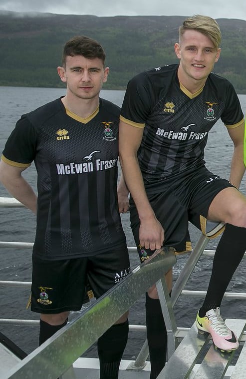
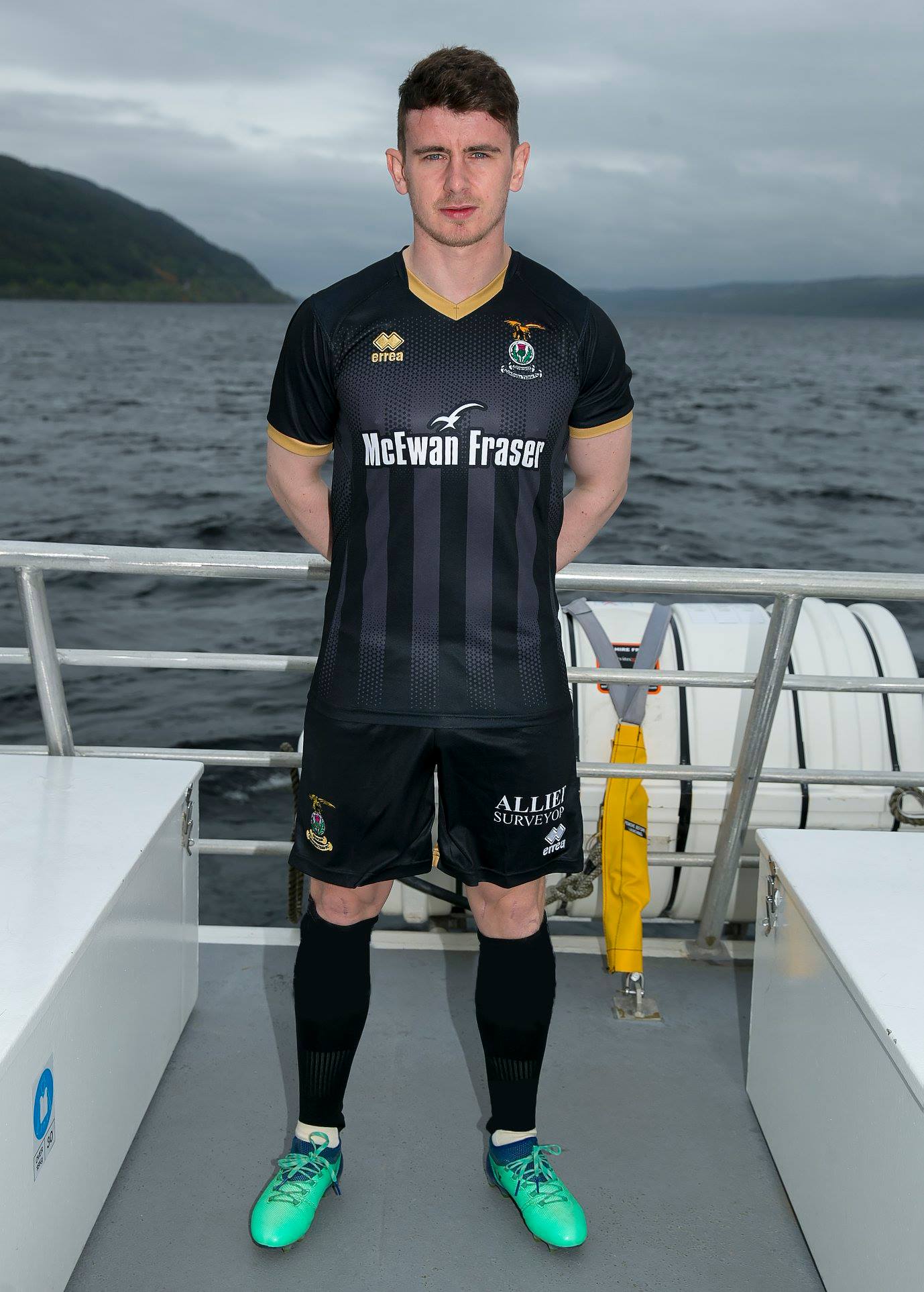
The kit itself is is charcoal in colour. The pattern however, is what really makes the jersey unique. From the bottom of the kit a number of vertical stripes seem to fade into existence. This fade in and out ensures that the stripes have positive shape and don’t crowd out the main sponsor, the club’s crest, or Errea’s design logo.
Around the neckline and tapering the sleeves is a bright gold, matching the bird of prey on the crest and giving the kit top some real character. The club have opted not to go for the classic collar and have instead kept the jersey modern and sleek.
The shorts are completely black on the front, however the backs have a golden band which goes half way around and the socks are black, completing the look.
Whether this kit can truly deliver The Pride of The Highlands into the Sottish Premier League is yet to be seen. John Robertson will hope that his team can shine like the gold and be competing against names like Celtic and Hibernian in the 2019/20 season.
Will this kit prove to be as popular as the club’s thistle or a thorn in their side?


