Yesterday we showed you PSV Eindhoven’s new away kit from Umbro which commemorates the club’s incredibly successful 1988 season. On the sleeves the designers had opted for interlinking Umbro logos to create quite an effective, classic tapering. This theme has run onto Everton‘s new home kit which we really like.
The Toffees have had a season which sees them finishing outside of the top six and just behind Burnley. Can the new kit which has been warmly received by fans push the Liverpool team up into title contention? We’ll have to wait and see.
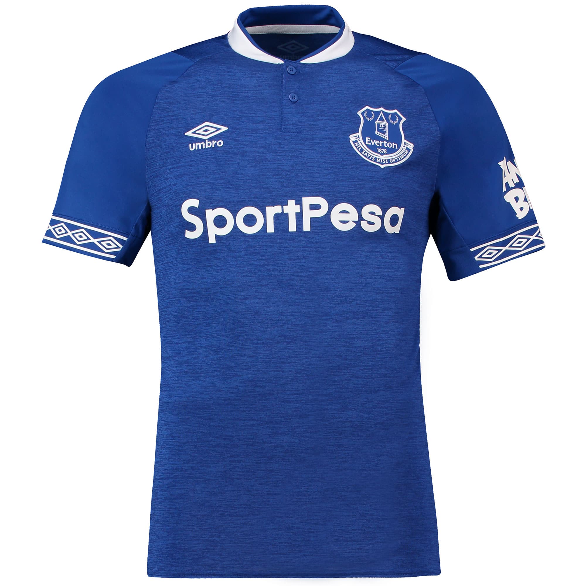
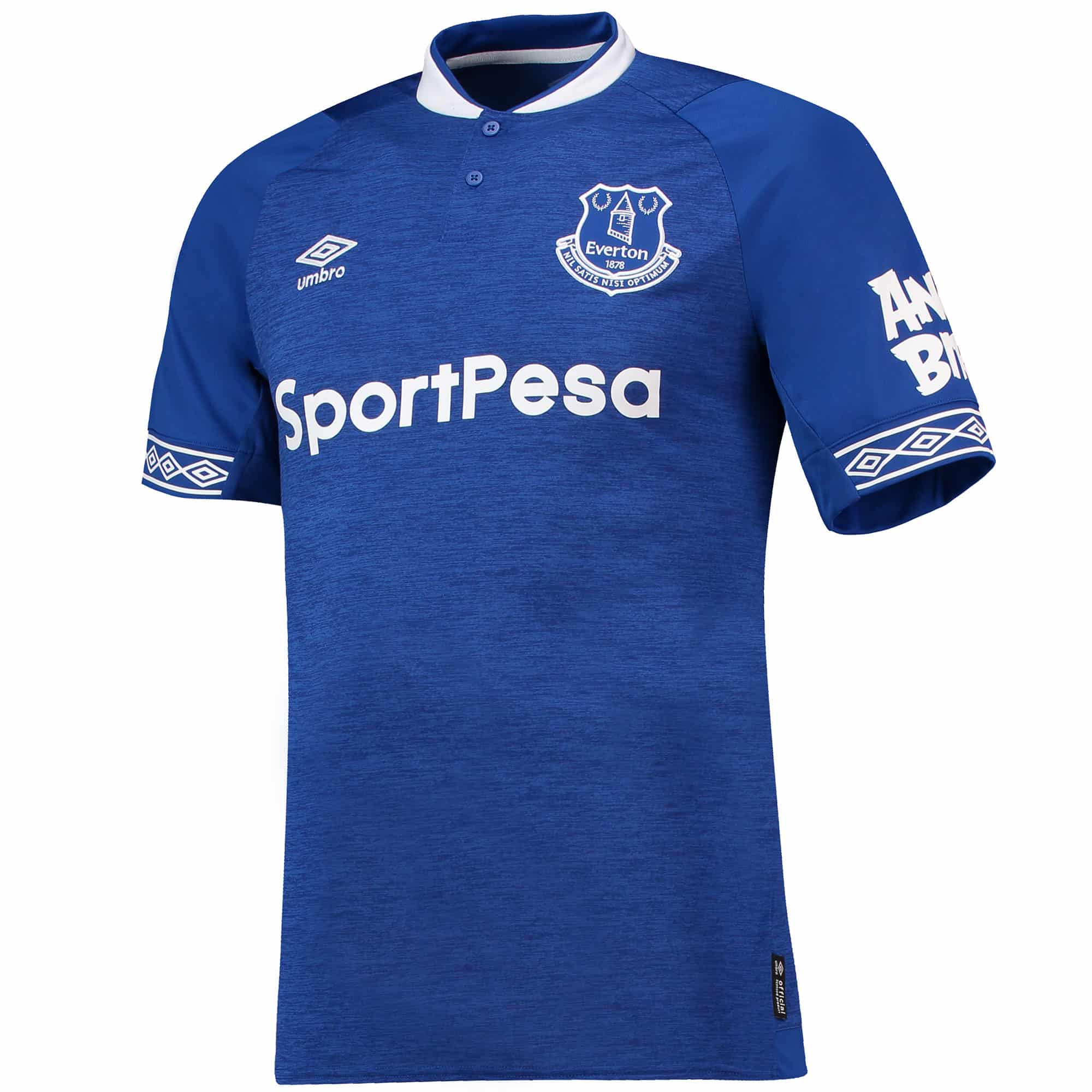
Using marl fabric on the body the jersey is given more character than the material used for the 2017/18 kit.
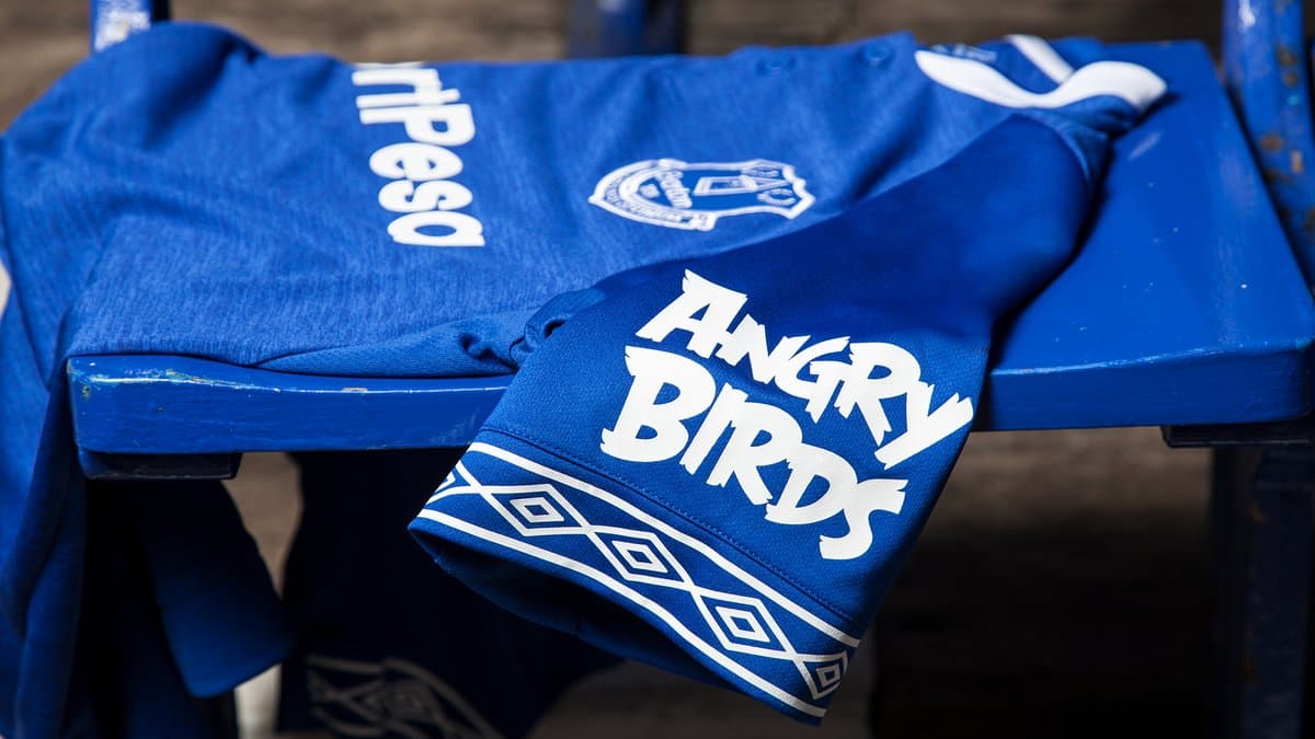
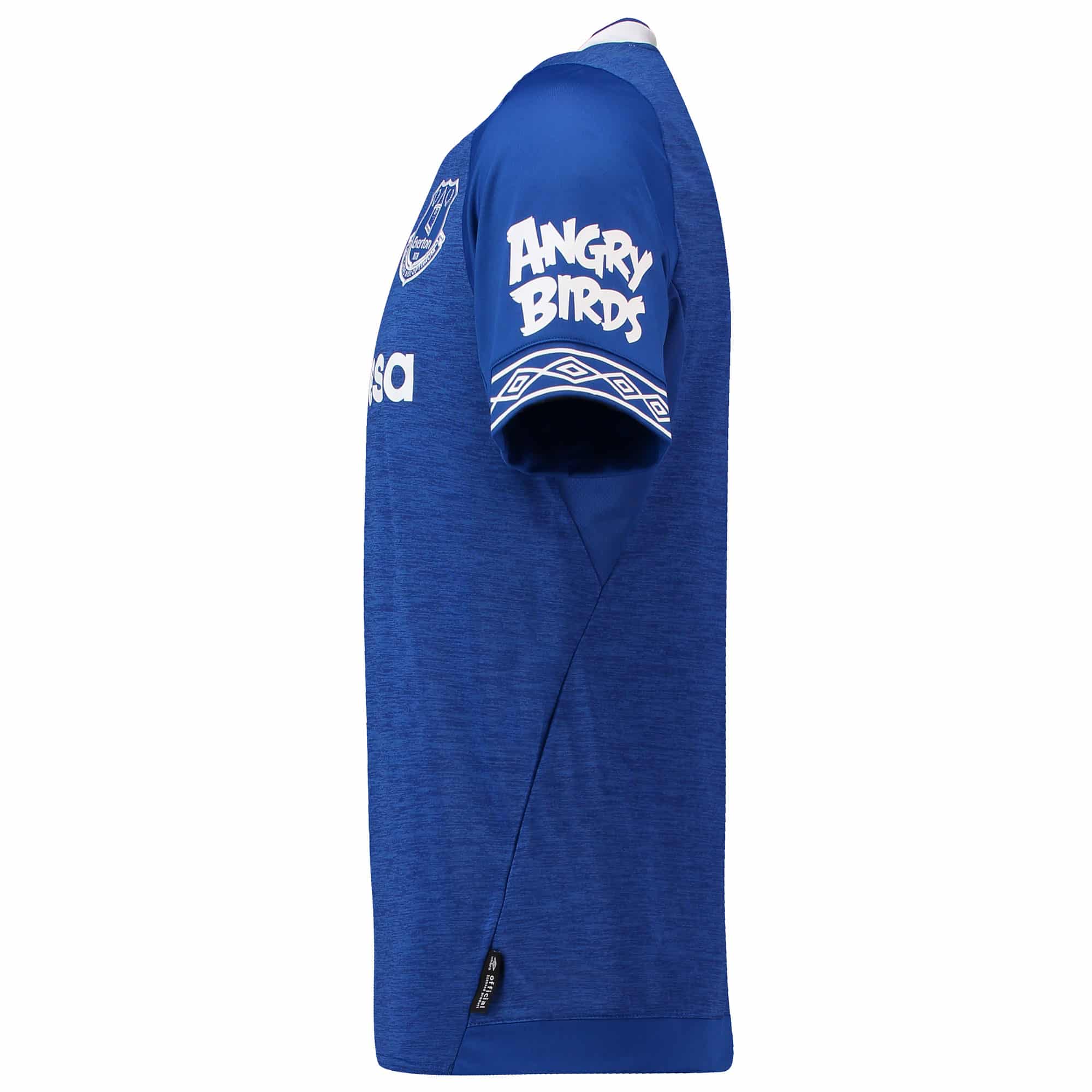
On the sleeves, as well as the Umbro tapering which appears on the outside, the Angry Birds logo is a bold, opinion-splitting sponsor. The material used for the sleeves is more what we’ve come to expect from football tops in recent years – flat colouring set in breathable fabric.
The collar is where the jersey becomes most interesting, in our opinion. The white collar with blue on top, together with the pre-mentioned body material gives the illusion of a polo top, certainly in style. At the top, the jersey features two buttons, not seen since the 2013/14 season’s kit.
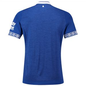
Running not quite vertically down the side of the kit top is a physical line where the two sections have been joined. The line is more diagonal so gives ,ore of a shapely effect.
Whether this kit will allow Everton to climb to the top of the table it’s uncertain, but this kit will have its first appearance in the club’s game against Southampton this Saturday.

