Earlier today we wrote about how exciting this weekend of football was. We wrote it while focusing on Brighton & Hove Albion’s win over Manchester United and the club’s away kit. Still running with the theme of plenty of action (although not too much of an upset), we want to bring you a kit from the Scottish Premier League. Edinburgh is a city of footballing rivalry. The Hearts hate the Hibs and Edinburgh City just slot in when they can. On Sunday, Hibernian played Ross County in the Scottish League Cup. The match ended in a 3-2 victory for the Hibbees, the winner coming in the 91st minute and ensuring that the next game is against SPL titans Aberdeen.
When the club released their home kit we were admittedly a little pre-occupied with the build up to the World Cup. It really was a great tournament, so we hope you don’t blame us too much.
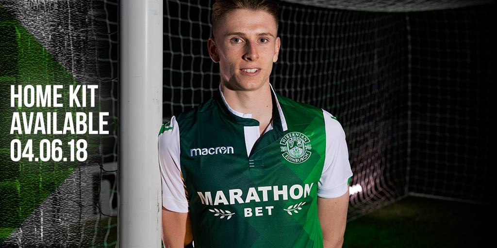
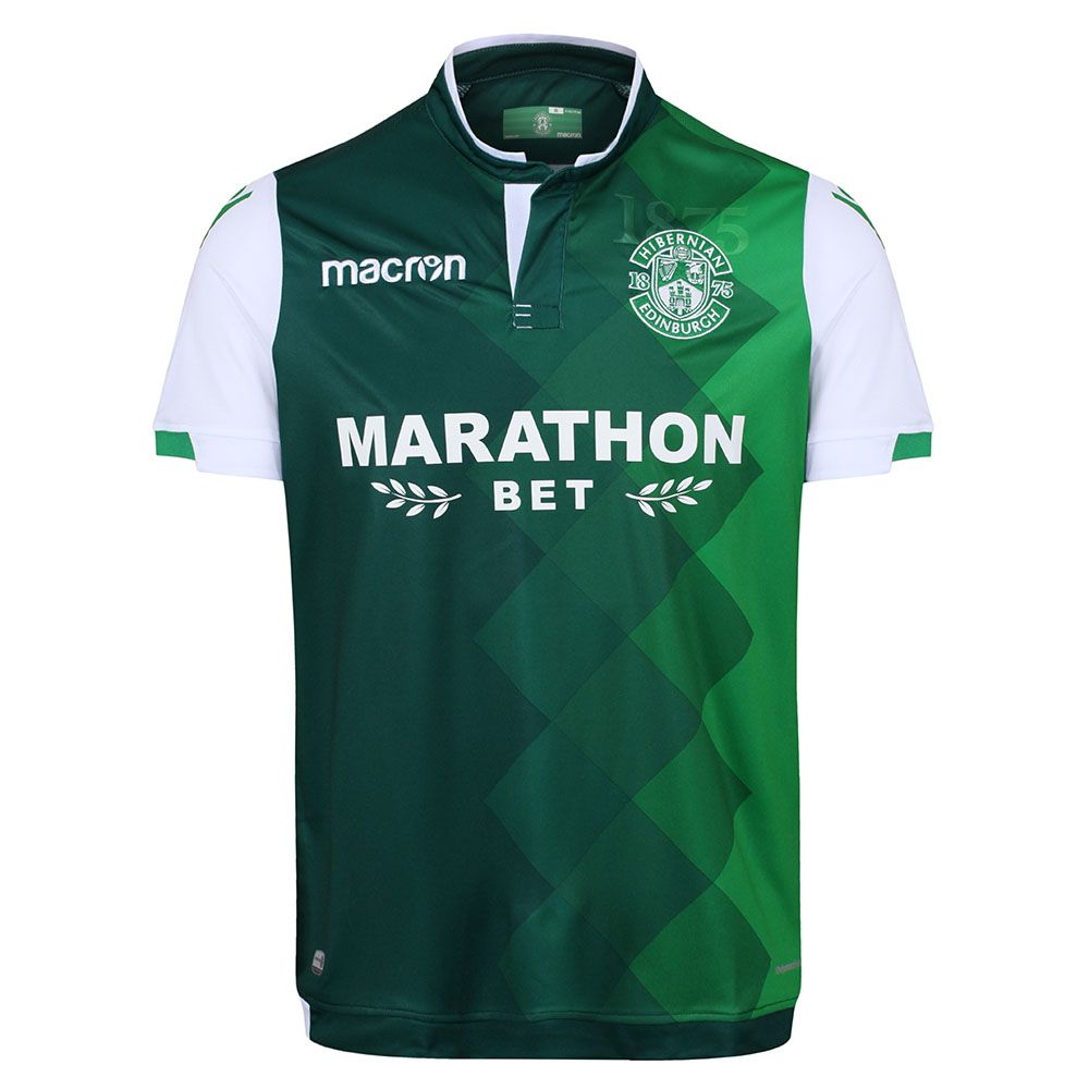
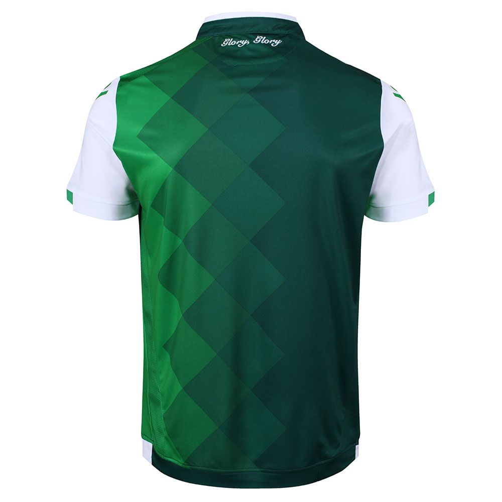
Better late than never, here’s Hibernian’s home kit.
The colouring of the jersey is green. That isn’t very surprising, but the pattern across the front ensures positive dynamics. The green fades in from the side – light green to a rich, darker colouring. On the brightest side, above the club’s crest is the year 1875. This reflects the club’s heritage and suggests that perhaps the colours represent a timeline of change for the club.
When researching this piece, we were sceptical as to how well the design would be received by fans. Looking on social media and club forums, it’s clear that the kit has pushed the envelope enough to be surprisingly popular.
The kit’s design is finished with white sleeves and the neckline is semi-classic. It’s built up at the sides and the front has an opening.
Hibernian will want to ensure they finish this season higher than Hearts, and certainly competing with Celtic, Rangers, and Aberdeen.


