They’ve just finished their 2017/18 season. The one that celebrated their return to the championship. Bolton Wanderers are a team that seem to float around promotion and relegation constantly. Their turbulent time in English football since 2013 has meant that 2017 needed a steady season. Their season was not the plain sailing ride that was necessary. Instead, the Whites narrowly missed relegation back to the third tier. While their fans take a much needed breath of fresh air and wait for the World Cup hopes of England to be dashed, the club have released their 2018/19 home kit that is simple in design and stylish with its finish. We really like this new kit. What do you think?
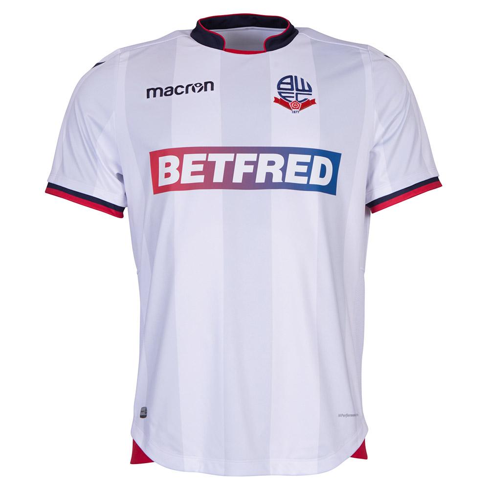
The base colour of the jersey is white. Afterall, it would be a strange direction to take if it wasn’t. The kit top is trimmed on the sleeves, neckline, and bottom with red and dark blue. These colours match the club’s crest and make sure that the look is complete, rather than unfinished.
Across the chest is a Betfred logo. The club’s sponsors happen to have similar colours to the scheme of the top and it does work nicely as a large sponsor. This is in contrast to Ipswich Town’s latest kits, where the sponsor’s colours do not fit in and actually dominate an otherwise good-looking kit.
Underneath the white of the jersey are several medium, vertical stripes. These stripes seem to be a shadow of a different design and perhaps a compromise on Macron’s behalf.
The kit top is simple, its tapering completes an effective design, and the collar is bold but new. White Bolton Wanderers have suffered in recent years, it is hoped that their 2018/19 season will be the one that steadies the boat. Perhaps this kit will spark the energy to get the club back to the 2004 days, coming sixth in the Premier League.


