Real Betis’ Illustrative Third Kit Has Arrived
Yesterday we brought you their away kit. It was an excellent pattern consisting of a dark background and numerous lighter triangles. The design was bold, eye-catching, and unlike anything we’ve seen so far this 2018/19 season. So, when their third kit was pushed across our desk this morning, we couldn’t believe our eyes. Another excellently crafted kit from Real Betis. The Spanish side has three excellent kits to choose from when they run out onto the field. All have an element of green, however it is the third kit that is perhaps the most extraordinary. Let’s take a look.
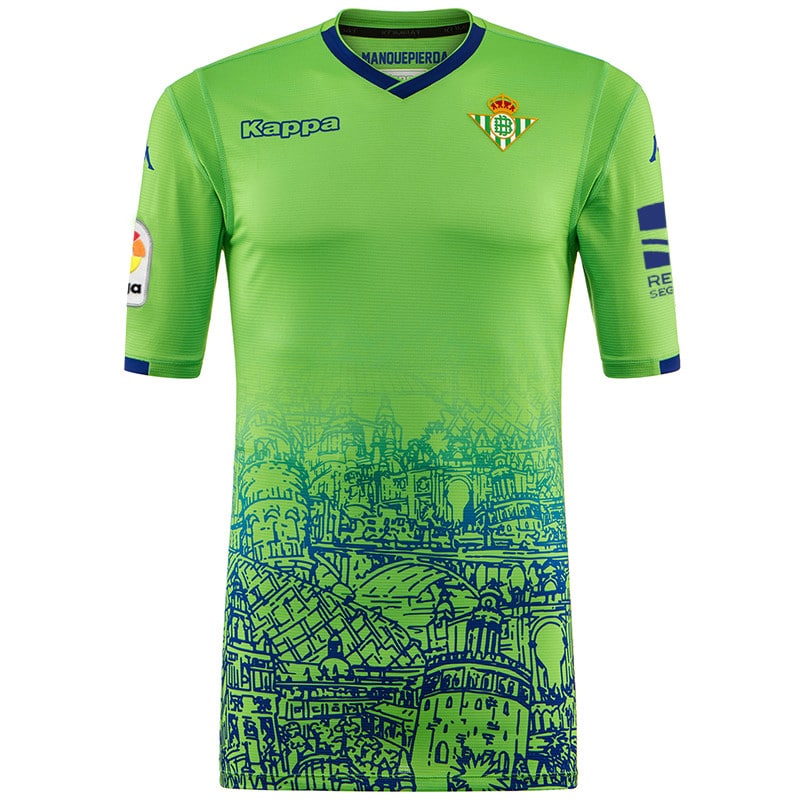
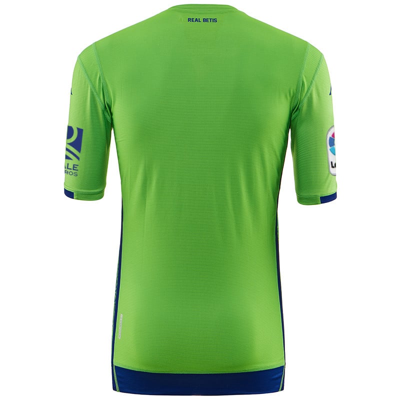
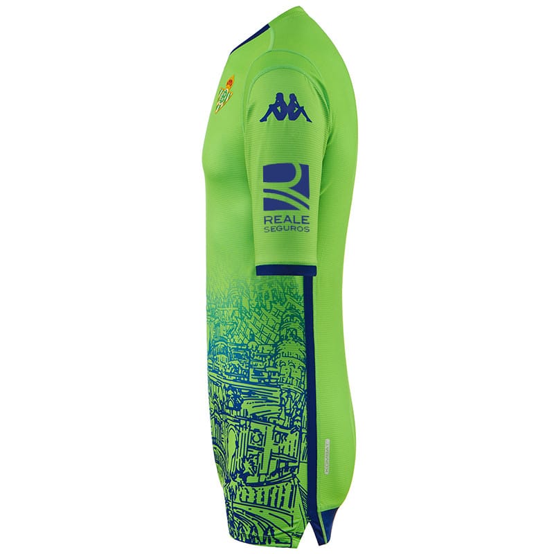
Real Betis’ third jersey is apple green. It acts as an excellent blank canvas for the club’s crest and Kappa’s logo. Around the simple neckline are two bands of dark blue. The two colours contrast nicely and this contrast can also be seen around the bottom of each sleeve. Furthermore, to ensure that the body remains uncluttered, Real Betis’ main sponsors feature on the sleeves, rather than on the centre of the chest. This might change but it seems like the correct decision when you take into account the jersey’s main pattern.
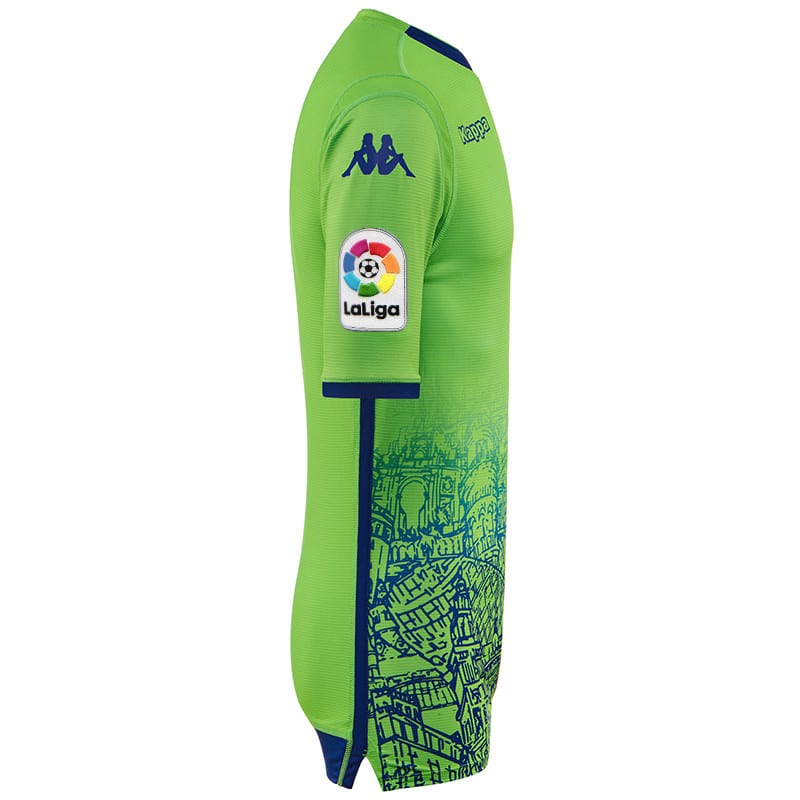
In the club’s press release, the pattern is explained. Rising up from the bottom of the jersey are a number of Seville’s most prominent landmarks. They include: Puente de Triana, Torre del Oro, and Giralda, las Setas. Each building seems to be blended with the others and are bordered with a thick, dark blue line that runs from under the arm down to the bottom of the kit top.
The pattern fades out to the top, allowing for an uncluttered feel. It truly is an exceptional kit and one that we think belongs in the hall of fame. What do you think? Stunning or over the top?


