Almost a month ago we were showcasing Leeds United’s latest home kit. It was simple, bold and effective. Well as effective as a white kit with a few emblems can be. The promotional photos seemed to be a little more exciting than the kit itself but nonetheless, we really did like it. So far, in their 2018/19 campaign, the club is off to a flying start. They’ve played three games and taken all nine points. As it stands, it seems like they and Middlesbrough are the two teams to beat. However you can never be sure after only three games. Eitherway, Marcelo Biesla will hope his team can continue this momentum for the whole season. It seems unlikely, but who knows?
After showing you their home kit and now they’re flying high at the top, we want to bring you their away kit. It pushes the envelope and fans have reacted to it like a popular yeast-extracted sandwich spread. Some love it. Others hate it.
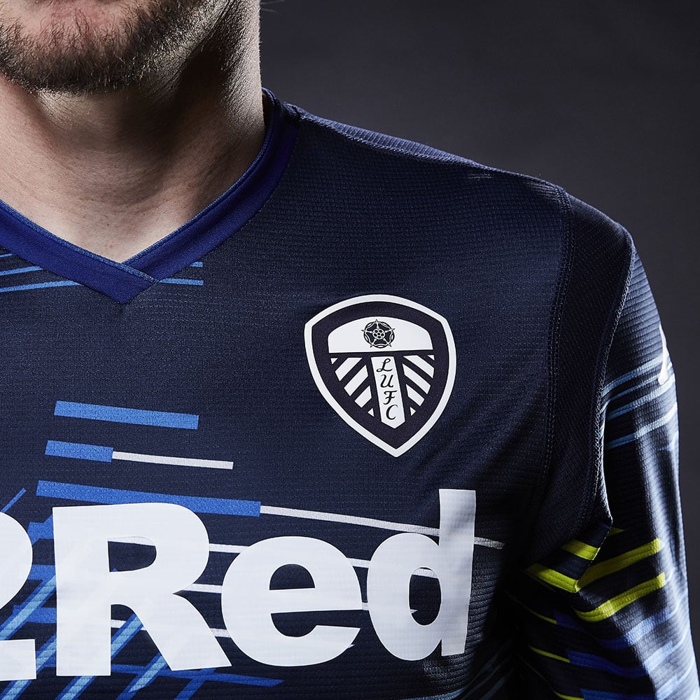
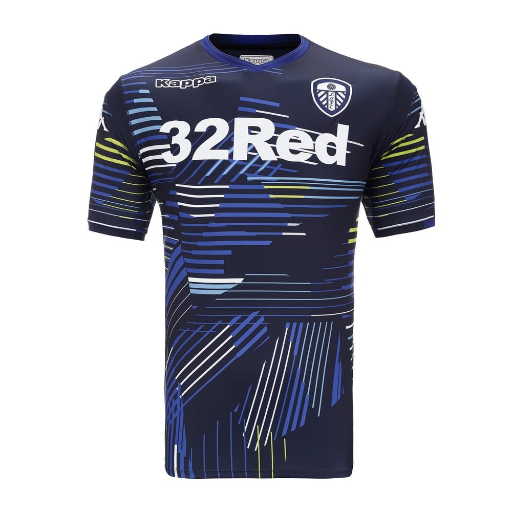
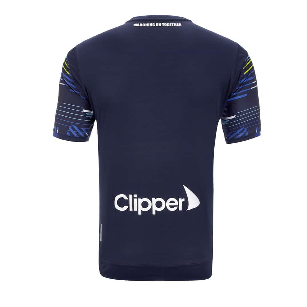
The kit itself is blue. So far, so good. However the kit is cut from all angles with thin lines. The lines are luminous blue, green, and white. On the one hand, these colours give the kit character and depth. We’re glad that it isn’t another completely basic away kit. However this kit seems to bear no resemblance to the home one. Apart from the club’s crest, main sponsor, and Kappa’s logo.
The kit gets a little more confusing when you see that the motto for this release is, “marching on together.” This motto can be seen on the nape of the away kit but doesn’t seem to fit thematically with the rest of the jersey.
It might be the case that this author simply doesn’t understand a good design. That could be completely true, however the kit just seems a little too cluttered for his taste.
Right now, it seems like Leeds United are the team to beat. It will be interesting to see the table in nine months time.


