While we’ve been talking about the many exciting score lines over the weekend, there have been some that were simply okay. One of which was the match between Ipswich Town and Aston Villa. Ipswich Town were playing for Paul Hurst’s first competitive win in charge of the club. Aston Villa were hoping to show that they’re on top form after struggling against Yeovil Town in the week. The game finished 1-1 and featured a red card for Town’s new signing, Tayo Edun. Ipswich will see the point as important – the scoreline could have gone either way. It still means that Ipswich are one point ahead of the rivals of Norwich.
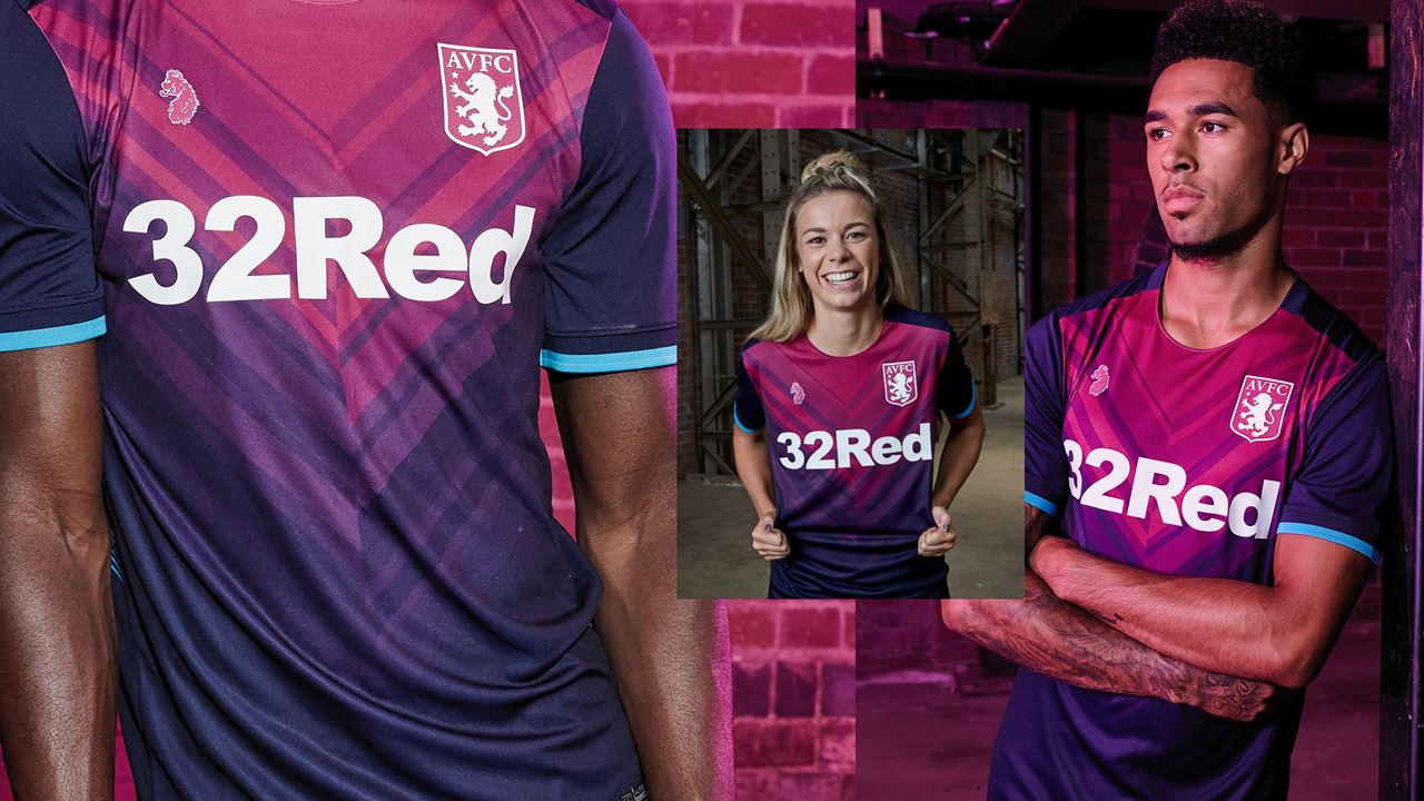
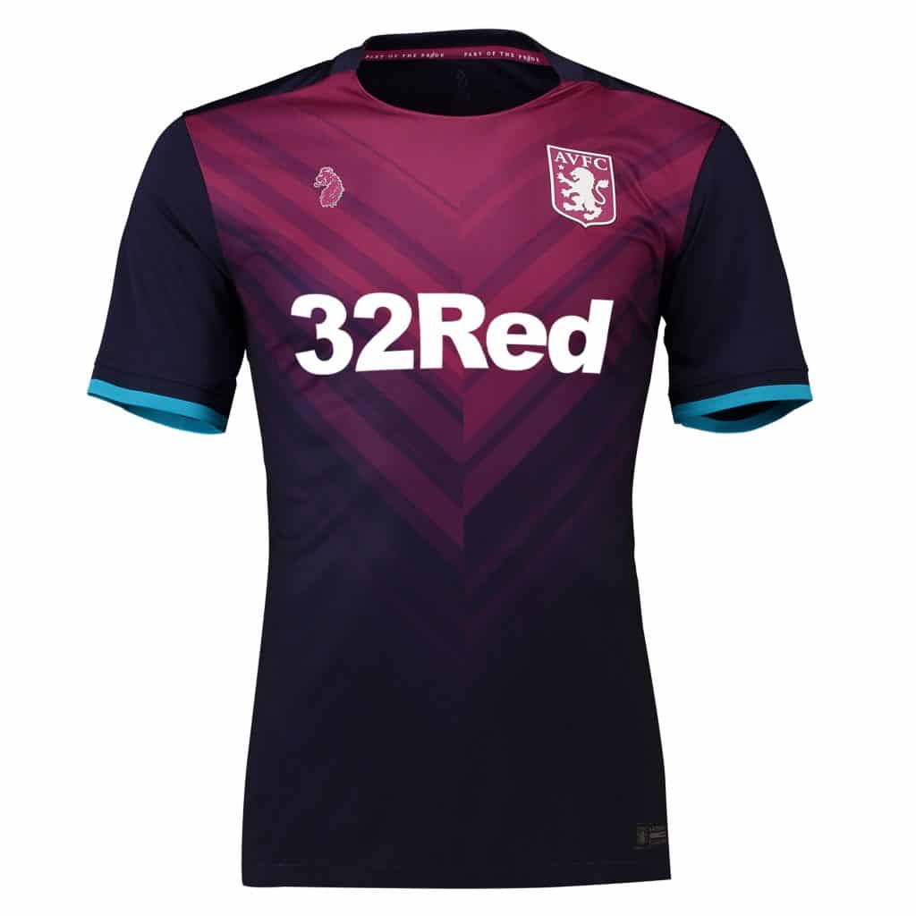
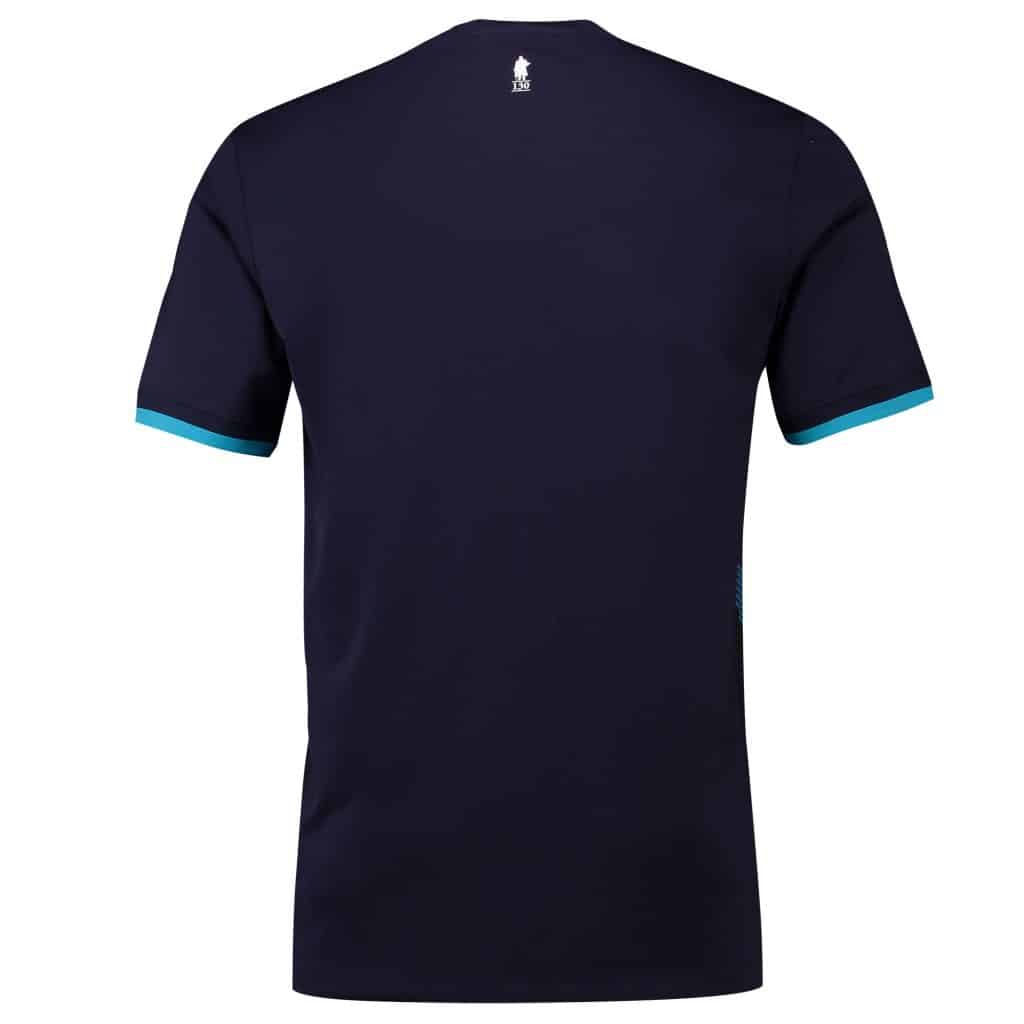
While we’ve brought you their home and away kits, we wanted to show you Aston Villa’s third kit. It’s eye-catching, bold, and in our opinion, dynamically designed. What do you think?
The kit’s main colouring is navy. It features from the bottom and transitions into a muted pink towards the top. The pink comes in the form of an upside-down triangular pattern and acts as the surprisingly suitable canvas for the club’s crest, designer’s logo (a design company called Luke), and 32 Red’s name.
The bottom of each of the sleeves is tapered with light blue, this is a complimenting colour and finishes the kit off nicely.
The nape of the kit features the number 130. Why is that significant? Because it is exactly 30 years since the club was formed (1888). Fans often respond positively when club’s reflect their heritage in the design. This eye-catching kit has received mainly positive feedback and despite being the third kit, will certainly be well received whenever it’s used.
Aston Villa will want promotion. They’ll want Premier League football once again. Could this be the season to do it? Furthermore, could this be the kit to do it in?


