When we look at AS Roma, we think of their previous season. They finished with 77 points, only two places behind Juventus. That’s an excellent finish but for a top Italian club, it isn’t too unexpected. The interesting point to us here at UK Soccer Shop is that they finished five points above Inter Milan. We just put up a piece about Inter’s latest away kit. It’s one that oozes style through simplicity and features Nike’s trademark sleeve pattern for this sleeve. A sort of digital, modern style that gives excellent character to the kit. The interesting point comes when you compare AS Roma’s latest away kit to that of Inter’s.
They are very similar. In terms of colouring and, more importantly, in terms of the Nike trademark pattern.
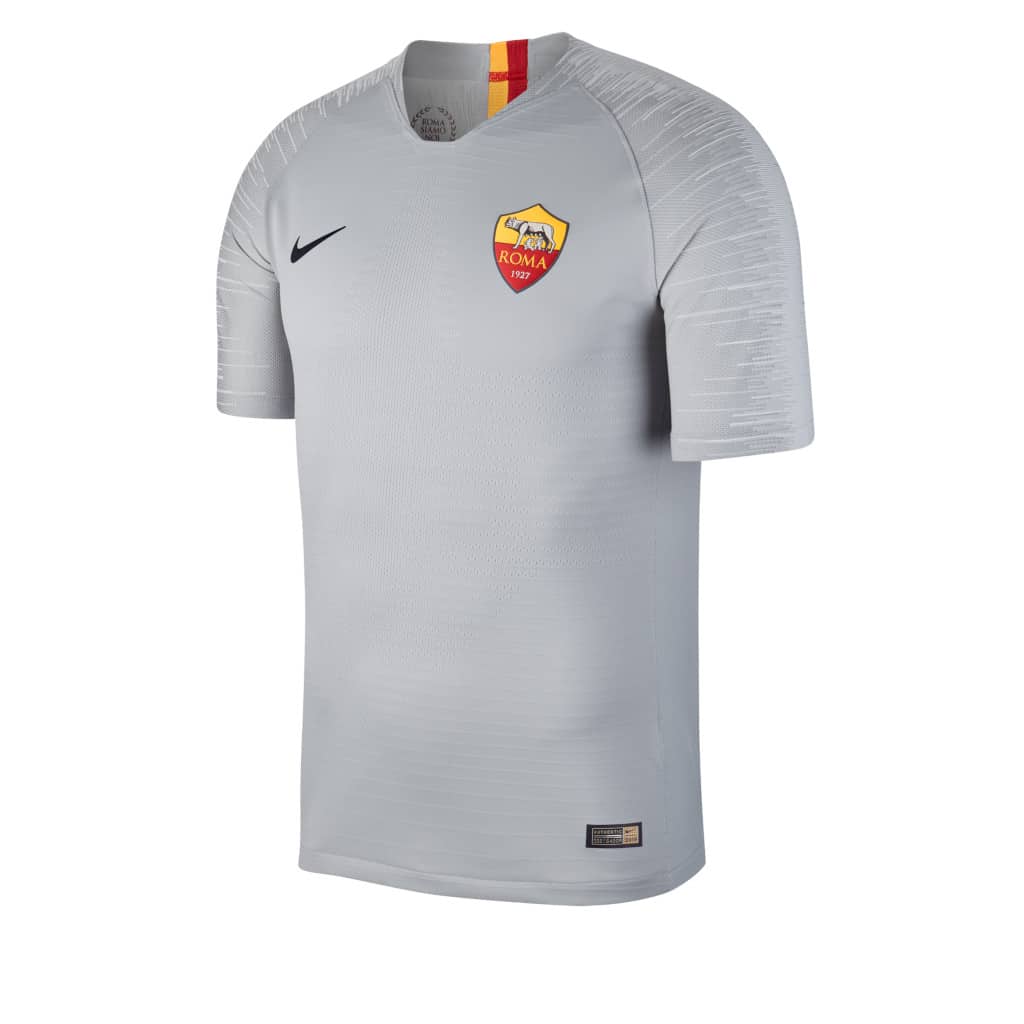
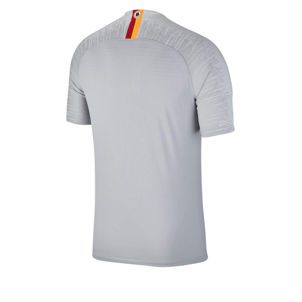
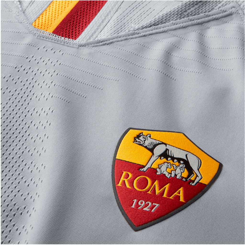
As Roma’s colouring on the crest is yellow and claret. Similar to that of FC Galatasaray, but not quite. This colouring appears on the nape of the kit, in two lines running towards the neckline. Roma’s chosen representing animal is a wolf. This comes from the Romulus and Remus story about two infants raised by a wolf. This animal also features on the nape of the kit top.
That’s the end of the colour.
The rest of the kit is a light grey, quite an effective choice that allows the crest and nape to stand out.
The kit design features a physical pattern. Across the sleeves and shoulders we see Nike’s 2018/19 bold pattern. It’s a number of lines, tall, and short creating a dynamic effect. We quite like this style, it’s just strange seeing it on two teams that compete so closely.
Next season these two kits will be competing at the same time. Individually we think they’re both great kits. Obviously they won’t ever be seen together but the similarity is uncanny.
It will be interesting to see who comes out on top next season. Check back in a year’s time.


