Friday, two days before England’s incredible result against Panama, we showed you Bristol City’s beautiful home kit. Now, let’s turn our attention to their away design.
The club finished their 2017/18 campaign in 11th place. Not a bad position when you look at the previous two seasons. Bristol City finished 18th in the 2015/16 season and 17th when their 2016/17 campaign came to a close. The club have a famous follower in Tony Robinson, the former Time Team presenter and eccentric historic explorer. some might argue Baldrick is not in the same league as Ipswich Town-supporter Ed Sheeran. However, Tony Robinson has been knighted.
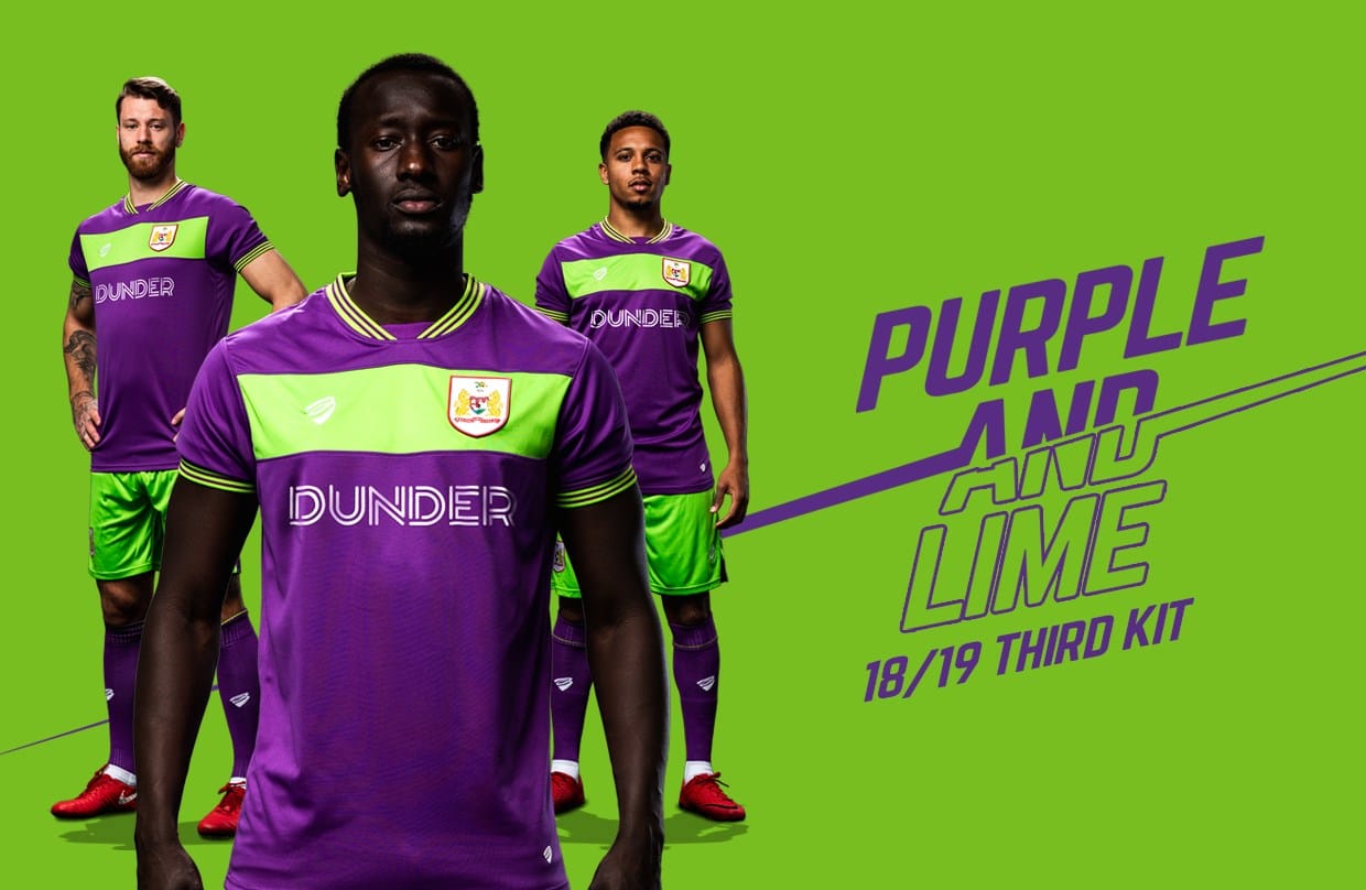
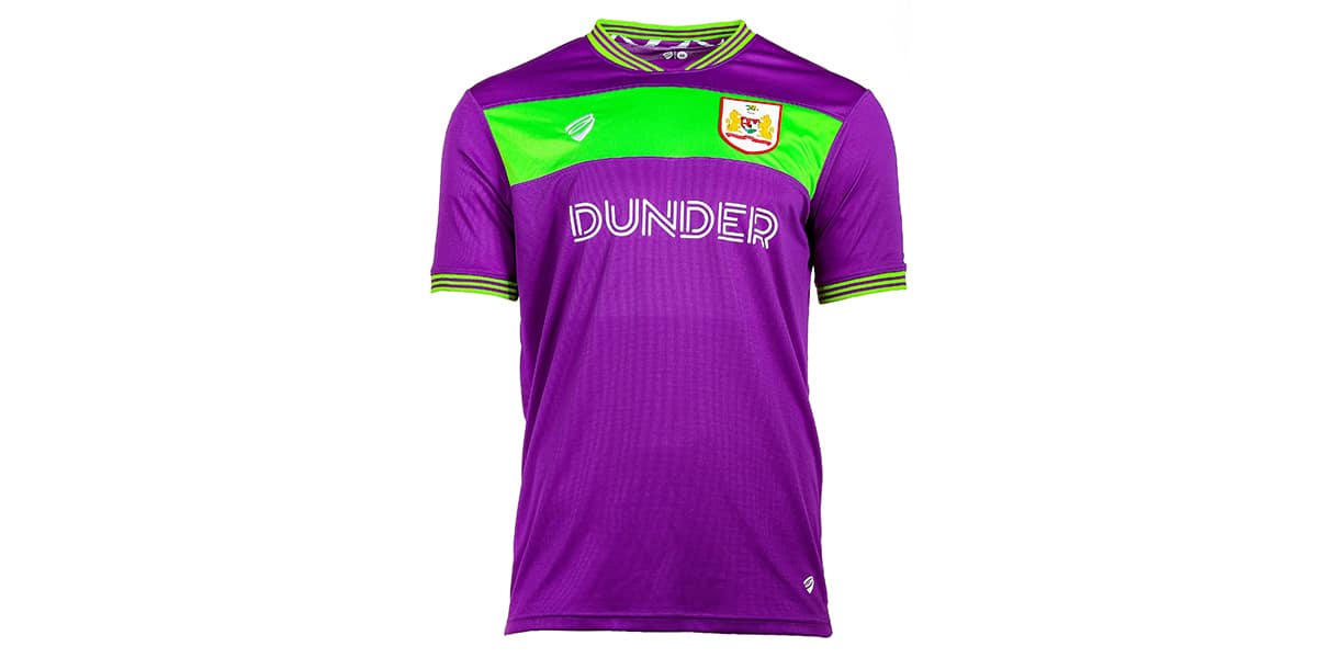
Now, looking at the colour choice, Bristol City have opted for bold and bright. Not quite as boldly alternative as Brentford’s chocolate kit, however it is purple and lime green. Certainly fans sitting in the Dolman stand at the Ashton Gate Stadium will be able to spot these players on the pitch nice and easily.
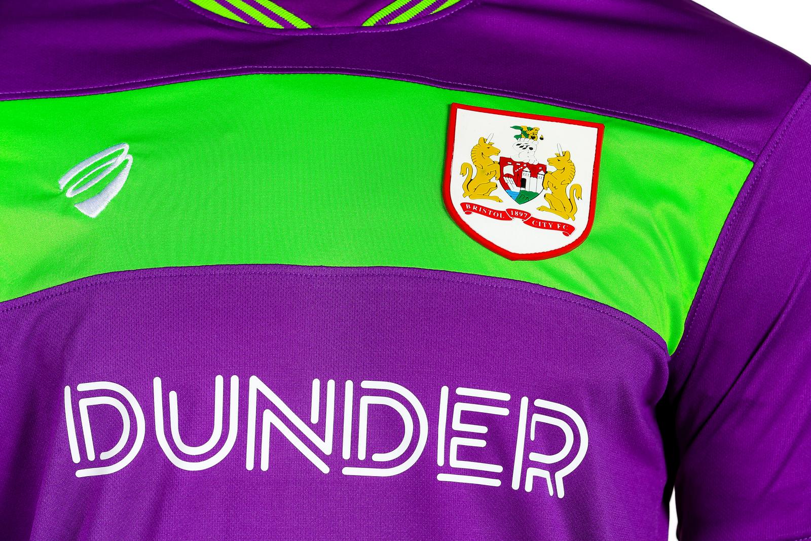
What really makes this kit fabulous is the club crest standing out on the lime green stripe on the chest. It isn’t lost against the bright colour. Instead, the logo stands out and is only aided by the garish nature of the kit.
The kit itself is a continuation of previous season’s away kit. Bristol City clearly love the purple and lime combination.The only addition made by the designers is the green stripe across the chest.
Both the sleeves and the neckline feature bright green tapering. The tapering gives the kit a completed look and ensures its excellence.
Fans seem divided on the away kit. Some love it, others hate it. While it may not look like Marmite, the away jersey does have the Marmite effect. Some are big fans, others not at all.
This time next year, Bristol City supporters will want their club promoted. Promotion is what all Championship teams want. This Premier League status brings in more revenue, more airtime, and an increase of fanbase. This kit could very well be the one that gets them there. We will have to wait and see.


