Mo Salah. He’s the player who exploded onto the Premier League scene for Liverpool. His constant positivity, excellent pace, and keen eye for the back of the net meant that he swept up awards such as the PFA player of the year. Since his cruel injury inflicted by Sergio Ramos (we’re still not over that), he simply hasn’t been playing his best. Having now crashed out of the World Cup, Egypt just couldn’t do the business. Even with a world-class striker.
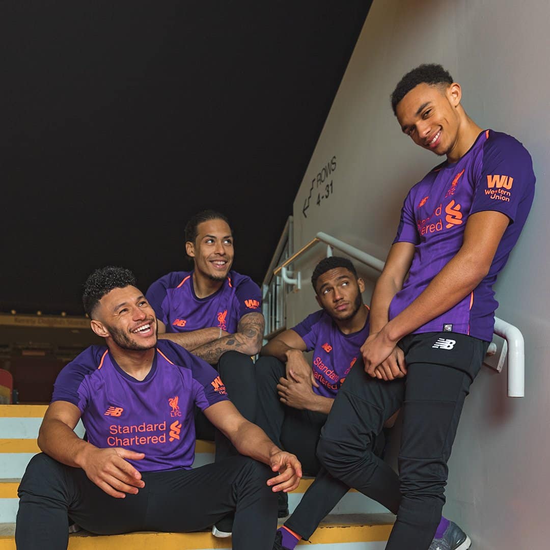
While Mo Salah will surely be upset about his international team’s performance, his attention will slowly be switching back to club football. Fully fit, he is one of the best players in the EPL. Liverpool have always been able to compete for top six. With the release of their away kit they’ll be hoping to boost fans’ morale and have another go at the title.
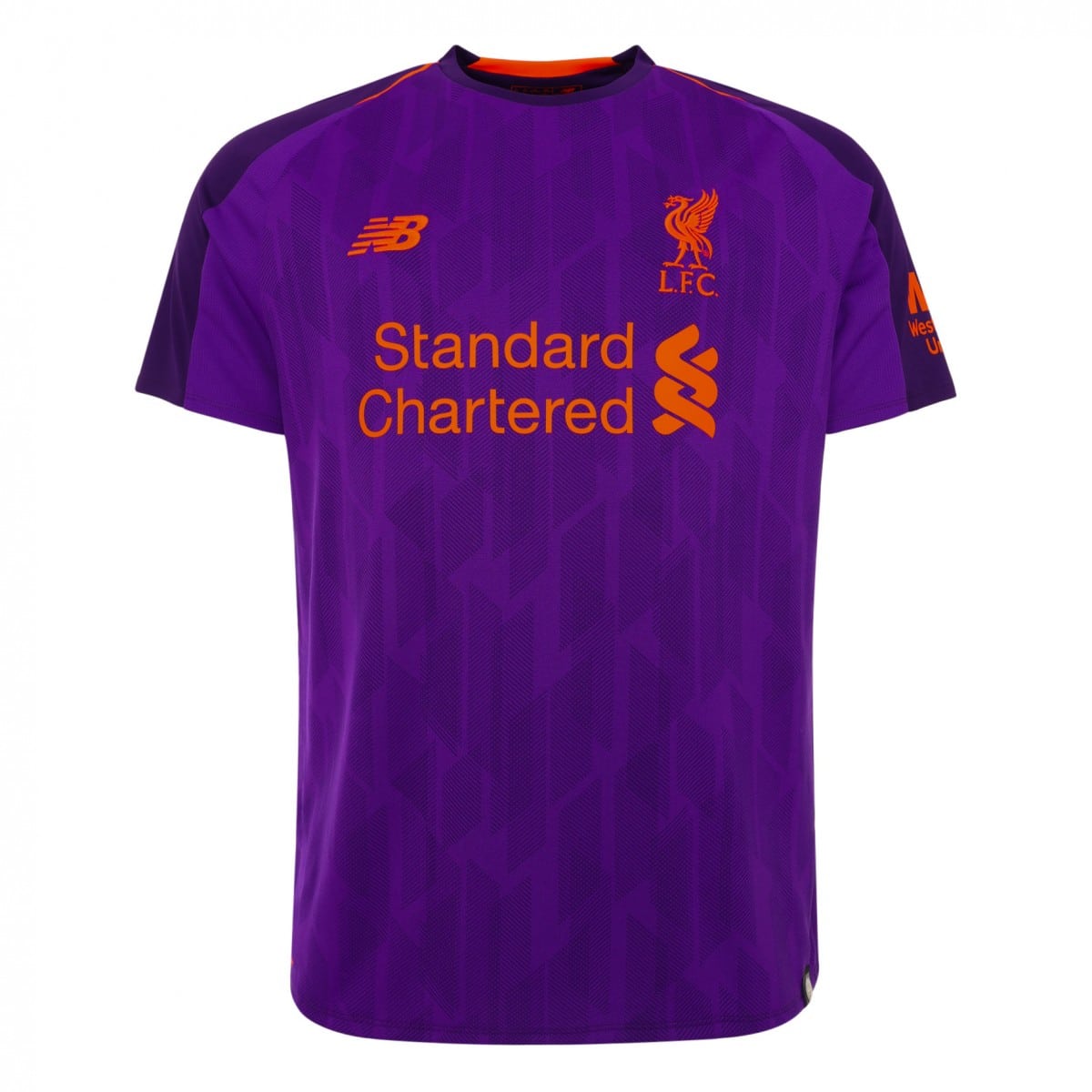
It’s a bold kit. Both in colouring and pattern. We at UK Soccer Shop really like it, but is it a little too garish for you?
The colouring is purple. Very similar to Stoke City’s newly released away kit. However, the garish nature seems to be emphasised by the orange writing covering the jersey.
The pattern underneath the purple is an angular one. Whereby darker and lighter diagonal lines are layered to create a 3D effect. Its inspiration comes from the shape of Anfield’s main stand and is a nice pattern, but on this kit colour, is it a little too much?
One could argue that the colouring suits Jurgen Klopp’s energetic personality. New Balance model the kit from the previous season’s very successful third kit. One that was very popular with the fans.
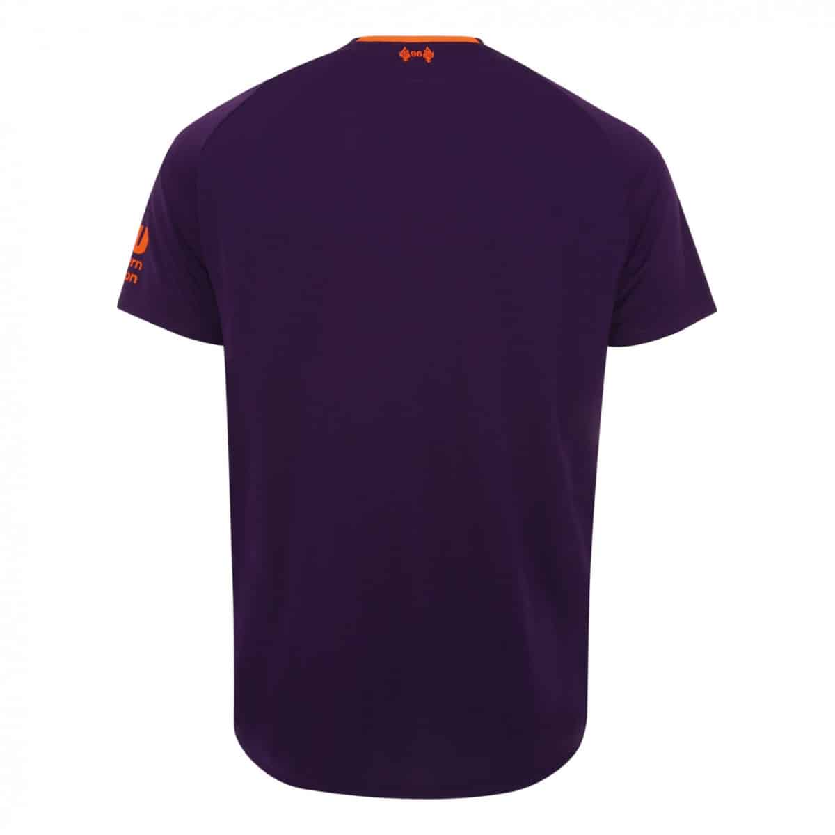
On the nape of the kit sits the number ’96’, between two eternal flames. Recognising those that lost their lives in the Hillsborough disaster.
This kit is probably going to be like Marmite. Some love it, some hate it. Personally, this author loves Marmite, he just isn’t too sure on the kit.


