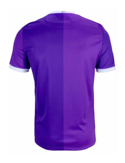
This is not clickbait. We genuinely think Stoke City’s away kit is something to see. Whether the reason is good or bad.
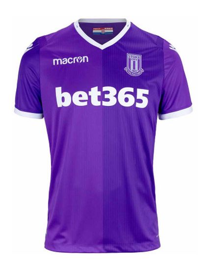
Next season will see the club in the Championship. Whether they bounce straight back up like Newcastle United, or linger there for many years like Ipswich Town, the club will be competing in the second tier of English football. Many fans see the relegation as an opportunity to rebuild, to start again in the Championship. These same fans might recoil in horror as their eyes drift across the images of the bright purple away kit. Yes, bright purple.
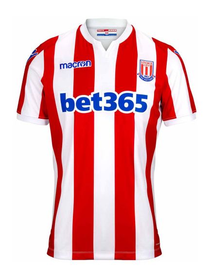
Before we get to the kit that makes us queasy, we’ve first got to introduce you to the home kit. This jersey aims to be bold, simple and fit in with previous seasons. Whenever we introduce you to a home kit like Stoke City’s, there isn’t too much to say because it stays largely the same. Think of it as the starter before the purple bonanza of a main course.
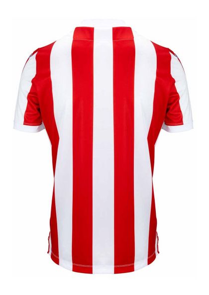
The red and white stripes run vertically around the entire kit. They are vibrant, bold and wonderfully bright. The kit designers at Macron also added a semi-classic collar which completes the look.
Onto the away kit.
There is a particular scene in Charlie and The Chocolate Factory. You know the one. Violet Beauregarde. She is awfully behaved and tries a chewing gum still in test phase. As she tastes the blueberry pie, she blows up like a big balloon, a very similar shade to this kit.
The kit is half-and half. One half is a brighter lavender colouring and the other is a deeper purple. The two shades do work well, but it is quite a brave choice.
For the away kit, Macron have decided to ditch the classical collar. A shame but perhaps more time needed to go towards finding that perfect colour.
We hope to see Stoke City in the EPL sooner rather than later. Even if our only reason is to see Peter Crouch before he retires the robot.


