


The mighty, mighty Port Vale. The club who finished their 2017/18 season just outside the relegation positions. The relegation positions of League Two. Playing at Vale Park and managed by Neil Aspin, the club look with a concerned gaze at the 2018/19 season. Will it be the season to steady the ship? Will they push on into League One, or will they flounder and be playing non-league football sooner than you can say “Sunderland were good once”. (Please note that this author actually quite likes Sunderland).
Whether or not next season will be more successful, we’ll have to wait and see. The club have just released their away kit. The jerseys are purple. That’s right, similar to Stoke City’s away kit. Just slightly sharper and a little nicer (in this author’s humble opinion).
The club’s crest is black and white, keeping a colour scheme of purple, black, and white. This makes sure that the kit top always appears complete and nicely finished.
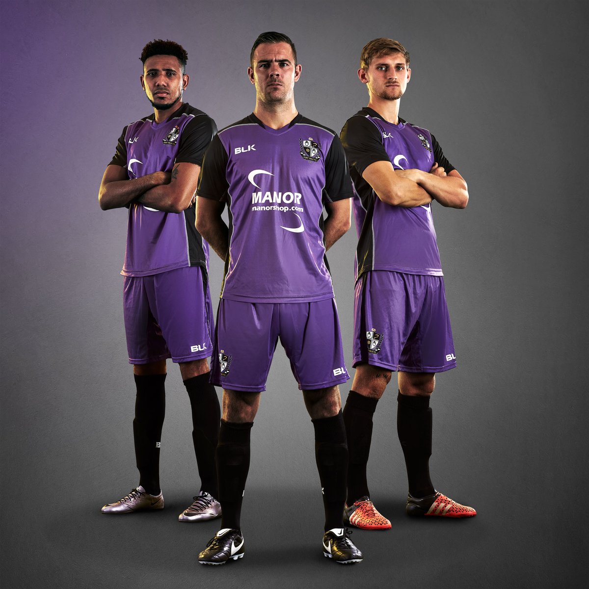
Manor, described as “the nation’s local IT & electrical provider” has their logo on the front of the kit top. The arrows on the diagonal corners of the logo mean that the player might appear taller and broader. The author’s only source for this is the stripes theory (vertical make you appear taller, horizontal – broader). This might not be true but we like to think it is.
Black makes a bold appearance across the shoulders, down onto the sleeves and in a large black section running vertically under each of the arms. This shaping gives the kit top an extended dynamic look. The appearance of black was certainly well-planned by BLK, the Australian sports brand.
We at UK Soccer Shop look forward to seeing how Port Vale perform next season. Can they steadily build back up to meet their rivals Stoke City?