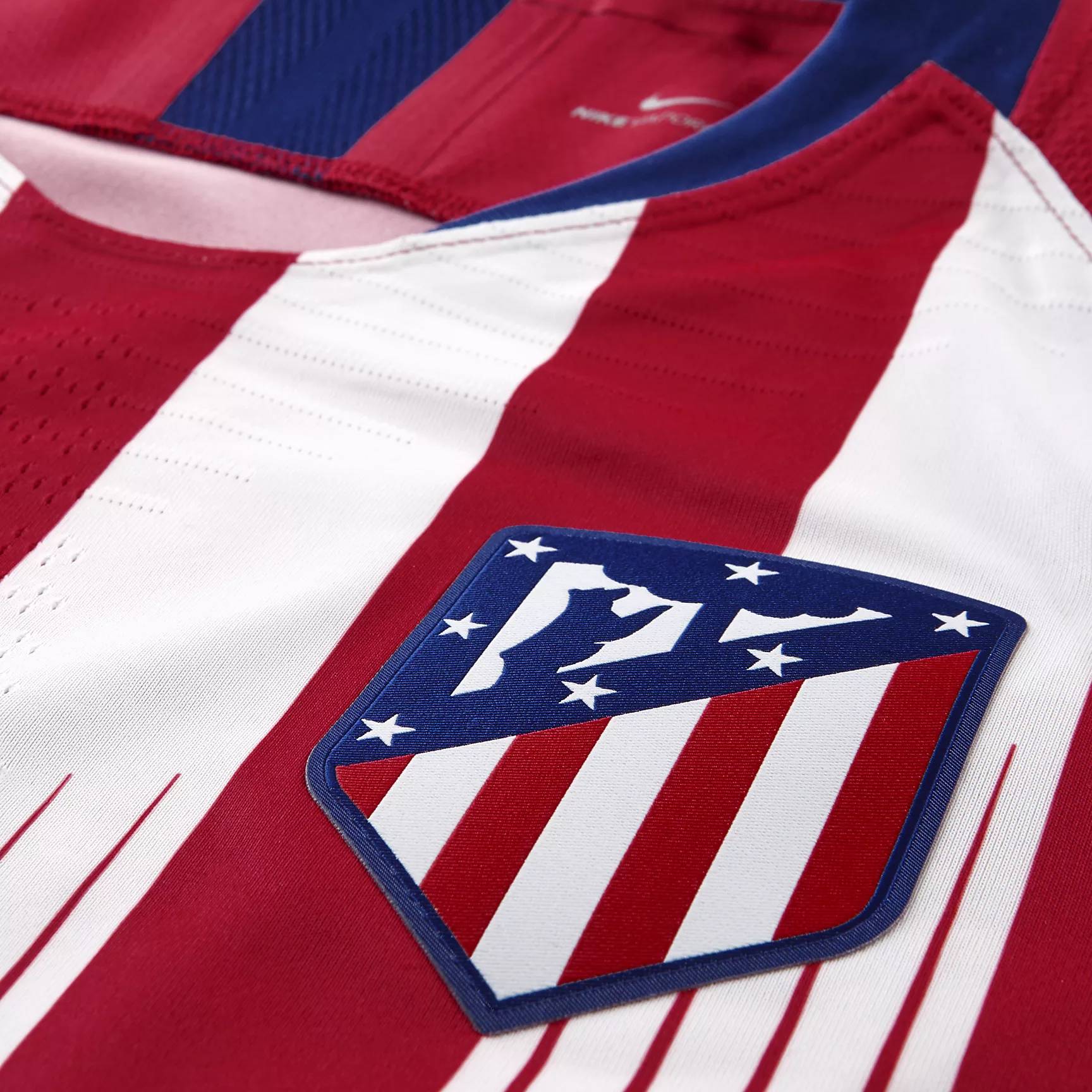
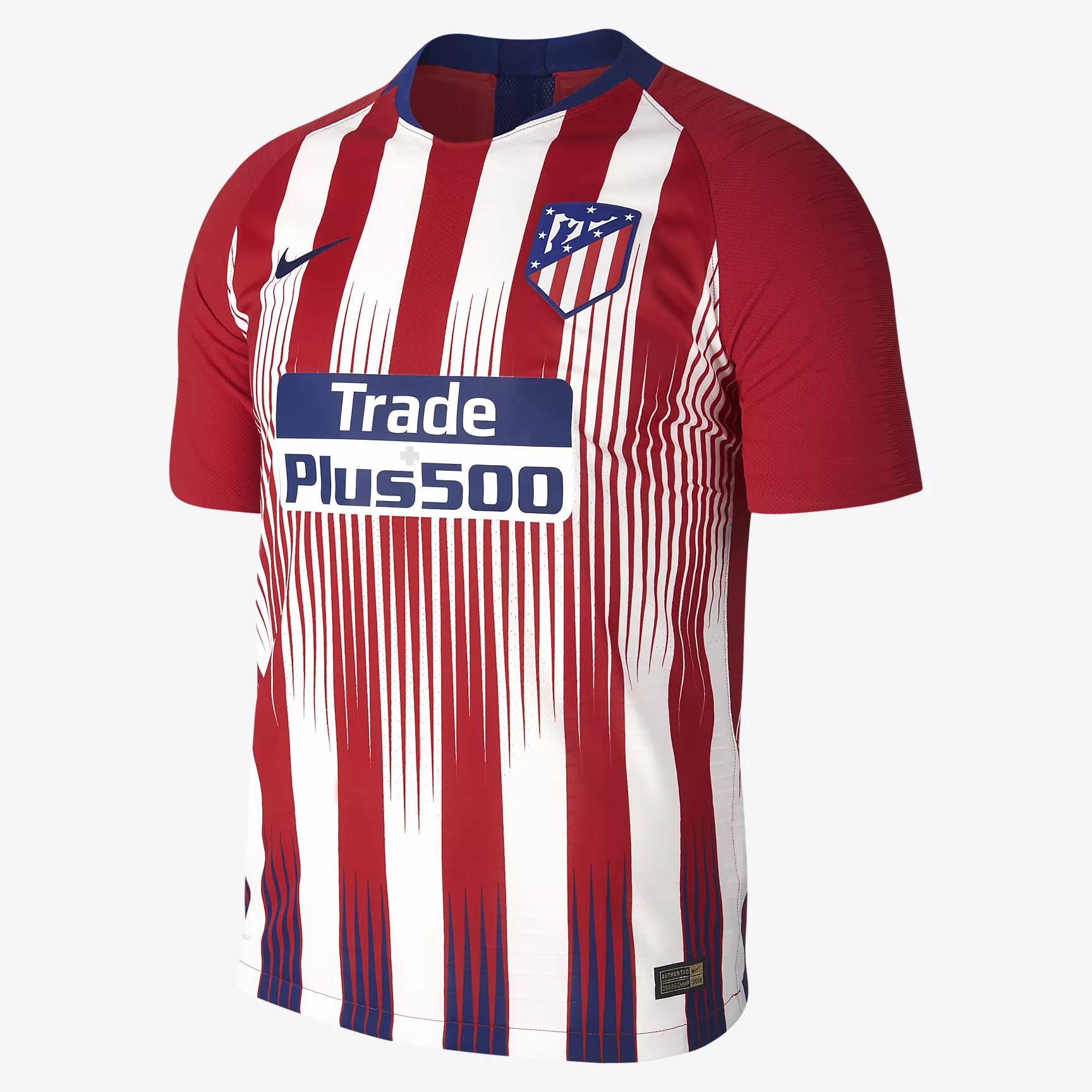
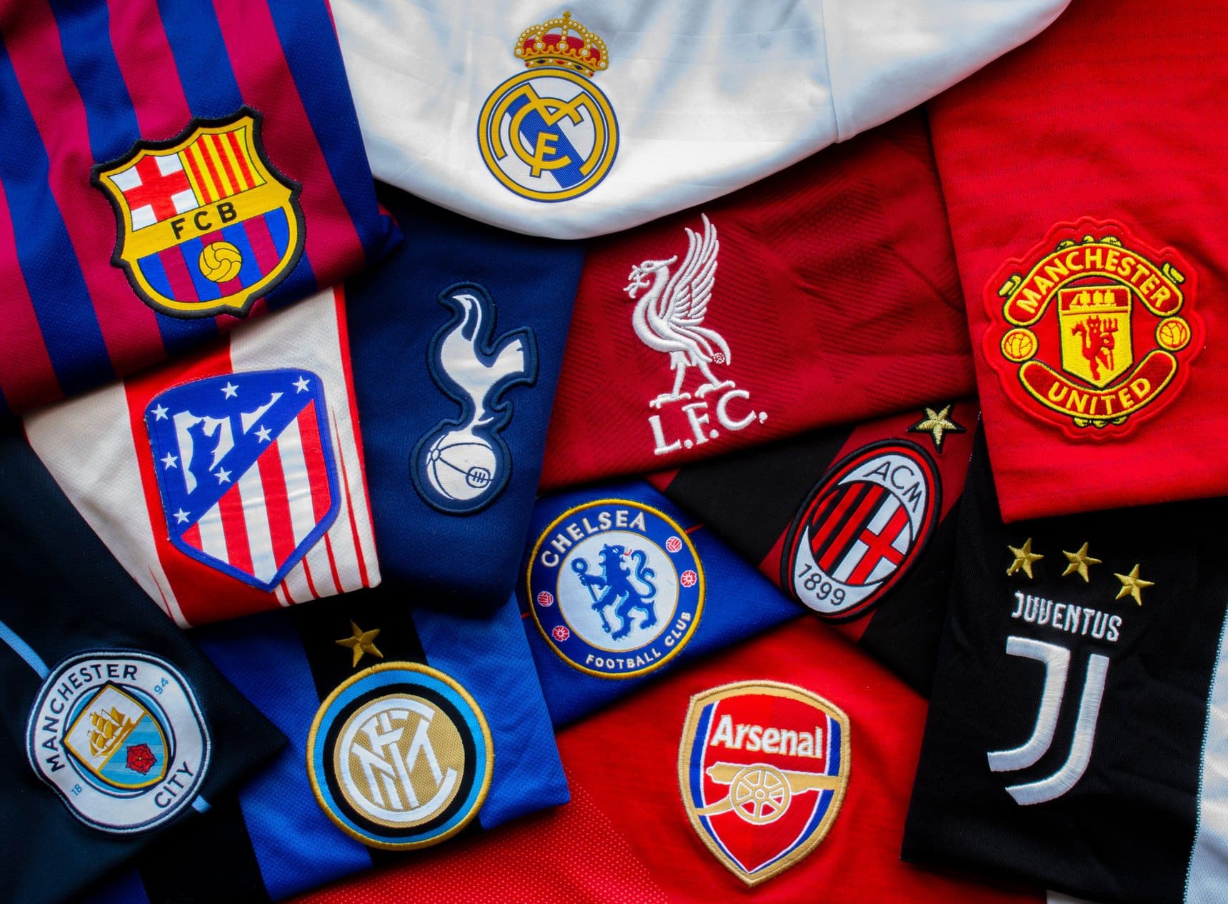
Atletico Madrid. Famous for being the Madrid team without Christiano Ronaldo, Atletico actually finished their La Liga season in second place, three points ahead of their rivals. Their home colours are red and white in vertical stripes and their 2018/19 kit, designed by Nike, follows this theme while also attempting something new and unique. Having finished the season with such positivity, the Mattress Makers (strange nickname), will be hoping that their newest kit will catapult them into the top spot.
Firstly, its sleeves. They feature a pattern that we’ve seen many times in recent weeks. It’s the difficult to describe sound bars which are physical rather than coloured. (That time it didn’t sound so convoluted). Most memorably we saw them on China’s newly released kit, however it was Nike’s proposed away kit that really stole our show (the kit was actually rejected for being too out there).
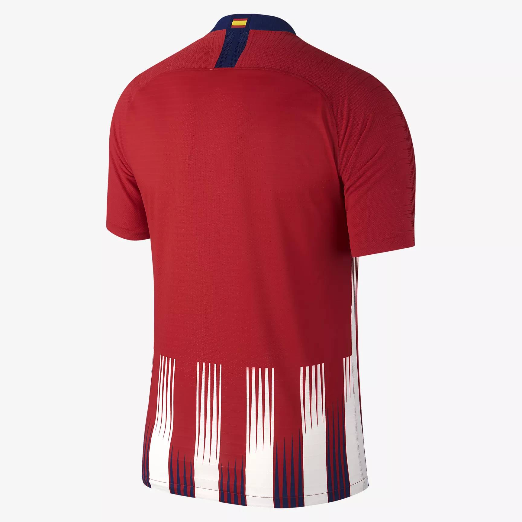
The body’s stripes are seemingly standard until where the main sponsor sits. Here, the sound bar pattern seems to be most prevalent and emphasised. This over-laid pattern seems to give a scratch effect. Not quite like Ross County’s kit but still very scratchy, all the same. From the bottom of the kit, similar thin lines can be seen in blue, this gives the kit all of the three colours in their crest and complimenting a very complete look.
The nape of the kit top features the Spanish flag, giving each player pride in their country and perhaps spurring them on to victory. Perhaps the club are confident in Spain’s performance at the upcoming World Cup. Or perhaps they just like the flag.
Atletico Madrid are going to continue to be a real rival for first place in the coming years. This stylishly designed kit top will allow maximum productivity and a heavy sense of style to be brought out.


