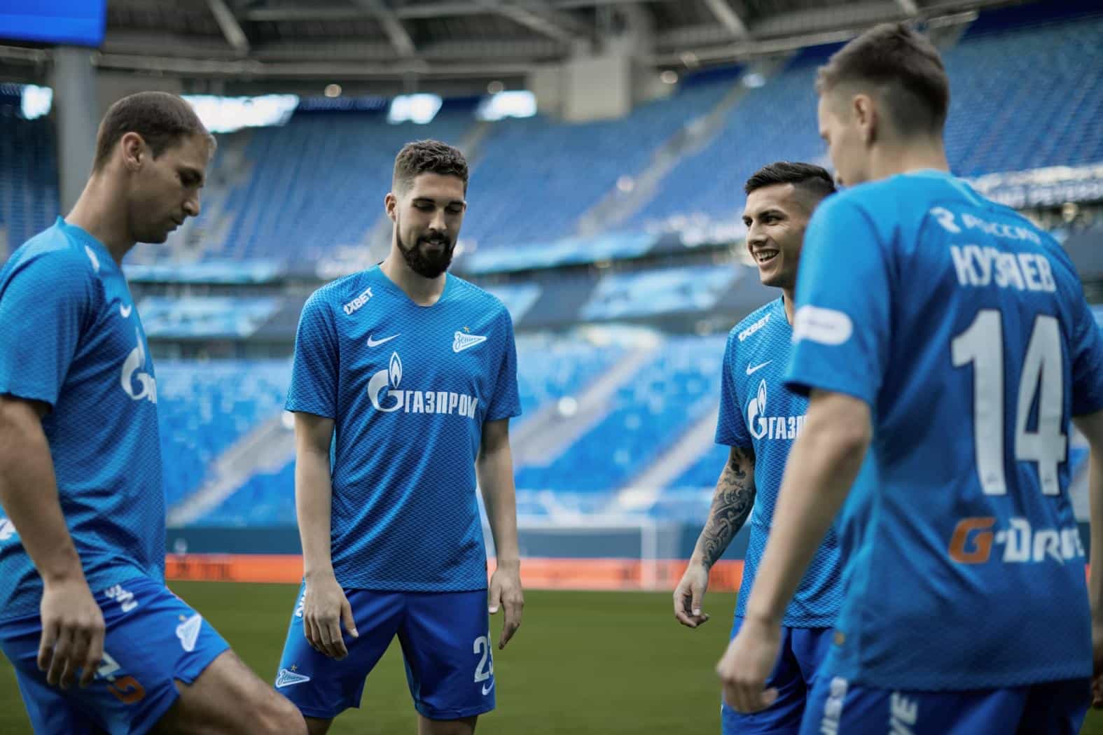
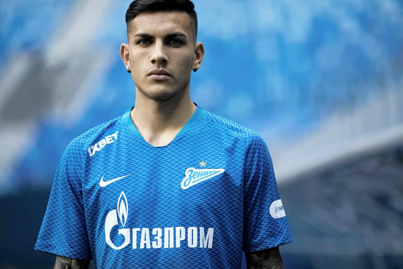
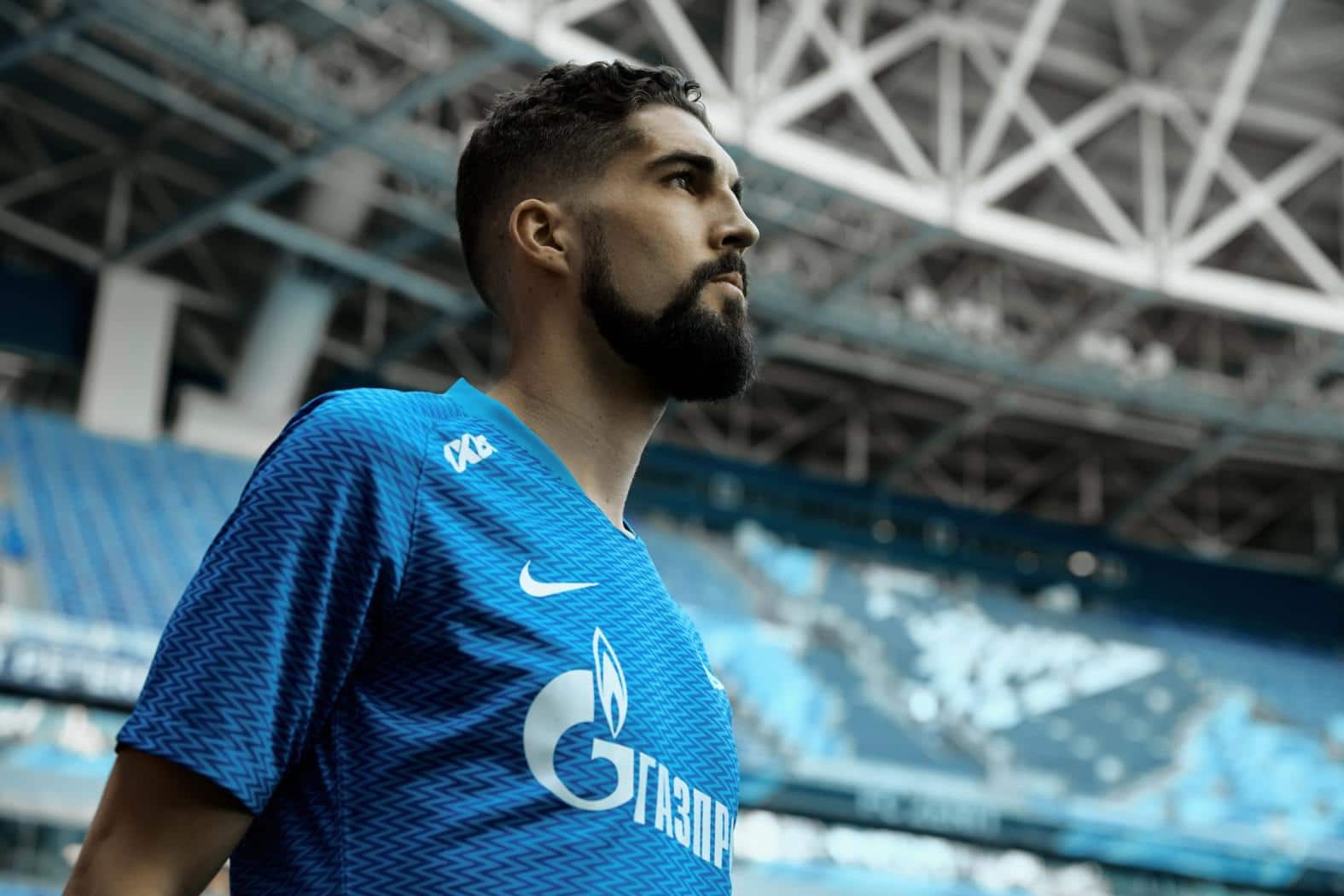
Here it is! A zig-zag kit. Once in a while, a sentence comes along which pricks your ears up and intrigues you to no end. Zenit Saint Petersburg, the team who have now finished fifth in the Russian Premier League have made a big announcement in the form of their latest home kit. It has been designed by Nike and is a seriously brave choice. The zig-zags don’t just subtly appear, they positively shout out at the viewer.
The kit top is blue, just like last year’s kit and matching the club’s traditional colours, however, as previously mentioned, this one has a very bold pattern. The zig-zigged lines are vertical, running all across the front, over the sleeves, and across the back. From afar, the kit simply looks defined: a subtle pattern, however up close, the pattern is not only striking, some might say it’s a little childish. But certainly not us.
The sponsors, logos, and club crest are highlighted by the slightly darker pattern which covers the jersey. This stylistic decision does pay off – the badges are incredibly noticeable, however when looking at the zig-zags for too long, one’s eyes do become a little bit confused.
It could be said that these darker, edgy stripes could be a reflection of a more classical kit. We showed you PSV’s retro look, made by Umbro, perhaps Nike have listened to the fans and equally given a more classic look.
We really hope that Zenit Saint Petersberg can improve on their season’s results and we’re rather positive that they will do. The only question is whether the club can put as much energy into their football as is displayed in the kit top that they wear.
Perhaps the club should stick to simple stripes, but what do you think? We always love reading the comments.


