They booked their World Cup 2018 place ahead of Scotland and are looking forward to a tournament with plenty of goals and perhaps even a chance of success. Slovakia are currently ranked 29th in the world so doing well at the prestigious tournament isn’t outside the realm of possibility. While we’ll have to wait and see whether they succeed in this summer’s campaign, their latest home kit is stunningly simple and, like the Danish kit that we showed you, it commemorates their country’s heritage and rich culture.
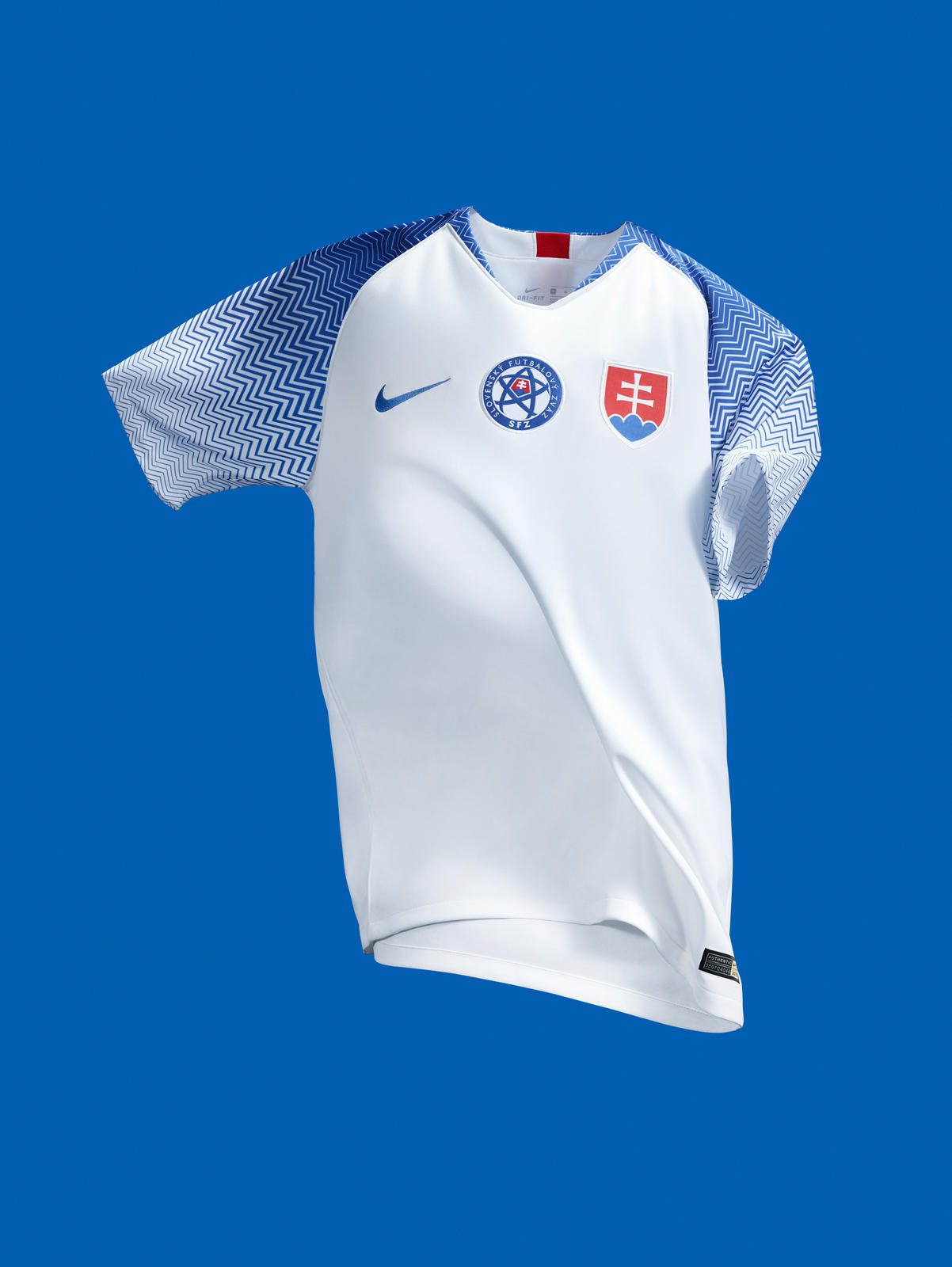
The kit top’s body is plain white. The white allows the country’s crest, their football logo and Nike’s iconic Swoosh to stand out uninhibited in a simple sea of blankness.
The back is also white apart from the nape which pays homage to the country’s crest. On the sleeves, up and across the neck is where the jersey really comes alive. It features a repeated zig-zag pattern which gets closer and further apart. At first glance, this is just a stylish design pattern, but after reading the press release, the stacked triangles mean more than you would first think. Arguably Slovakia’s most famous building is the Slovak Radio Building. Its unique, upside down pyramid shape makes it one of the most recognised buildings in Europe. The early 80s architecture is a little harsh, however the home kit simply reflects the country’s past.
The zig-zagged pattern finds its way around the neck, however, while the shapes might reflect earlier times, there is no classical collar which pushes minds further back than the 1980s. By keeping the neckline trimmed and simple, the kit top remains uncluttered.
It’s exciting to write about a country which will be going to this summer’s international tournament, it’s even more thrilling to write about a kit which epitomises everything good about football jerseys – simplicity, reflecting heritage, and smooth shapes.


