It’s fair to say that none of Nike’s England kits are going to be well-remembered. Admiral and Umbro managed to pull some classics out of the hat but the current batch of Nike kits are distinctly ordinary. While the usual criticisms about cost surfaced in the media, the most vehement complaints were that the kit looked “too Scottish”!
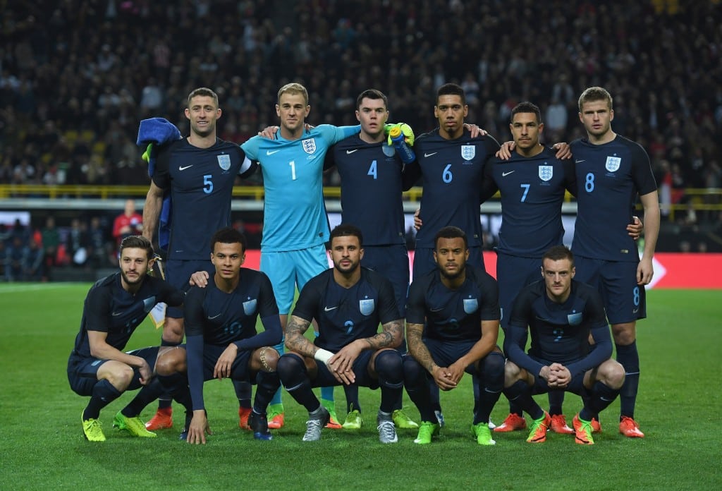
The all-navy kit made its’ debut in the 0 – 1 defeat to Germany in Dortmund. England played well but were sunk by a typical Lukas Podolski strike in the German’s last full international. The famous yellow and black wall was replaced by a pictorial tribute to the former Arsenal striker.
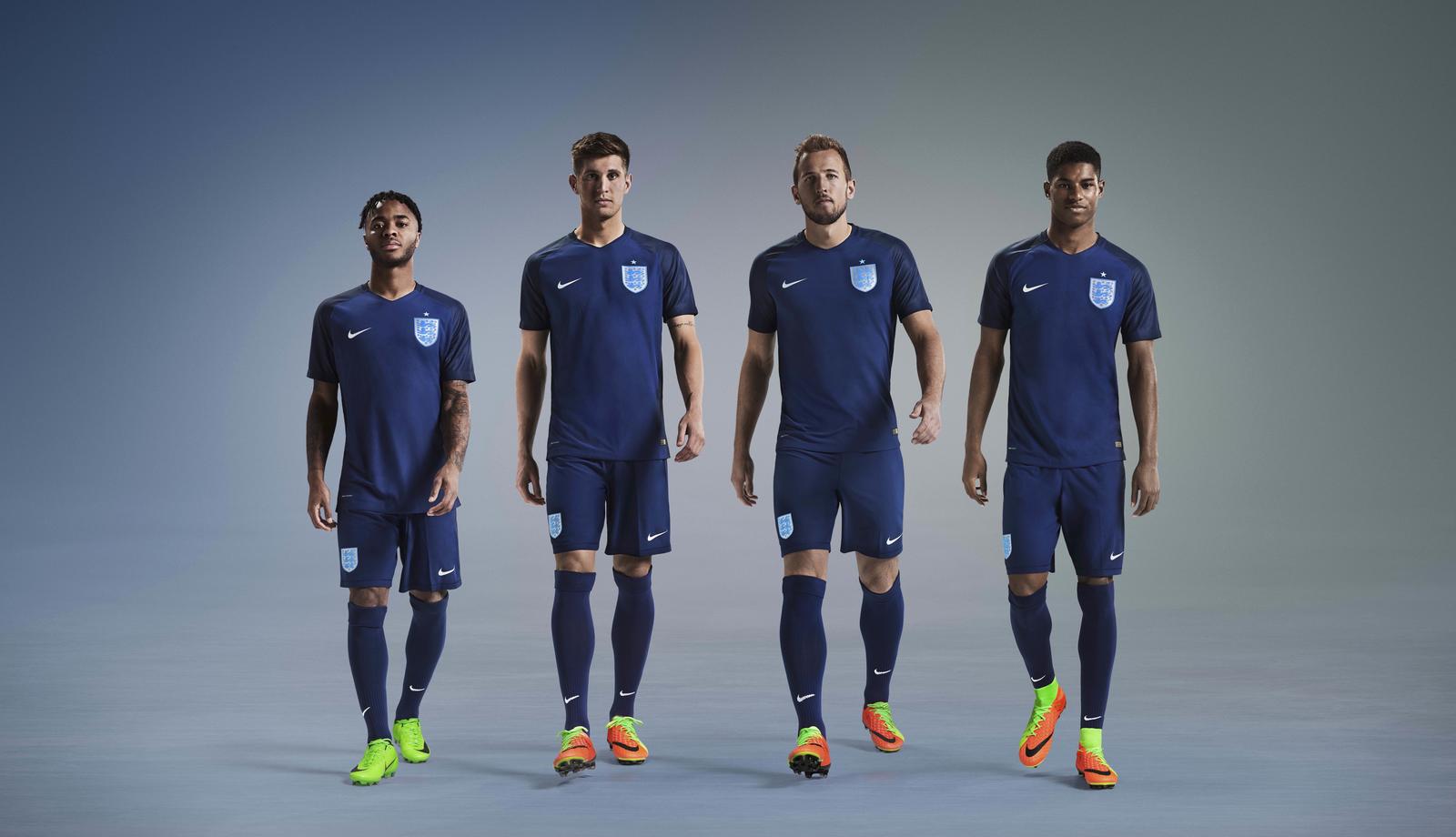
England 2017 Nike Third Kit
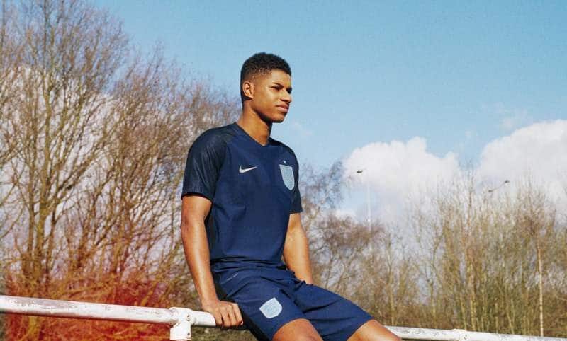
This is the England third kit, as designed by Nike
It’s Nike’s standard template, in navy blue. The contrasting shoulders are in a darker navy but the key to the design is simplicity.
Nike’s Swoosh and the Three Lions badge are in silver on shirt, shorts and in the case of the brand, on the socks. Looks like a kit Scotland would wear? The silver star above the Football Association crest recognises a World Cup win. There’s no way Scotland will get to wear that!
Let’s be honest, it’s better than the white and red kits Nike developed. Their template works well with dark colours but the lighter colourways are abject! As opposed to England, where that’s a description which fits the football perfectly!


