OK, so Nike got back on track with the PSG third kit. They even gave Corinthians a great looking third kit but things have gone awry once again. They’ve fallen off the wagon and landed in a colour meltdown as far as Manchester City are concerned.
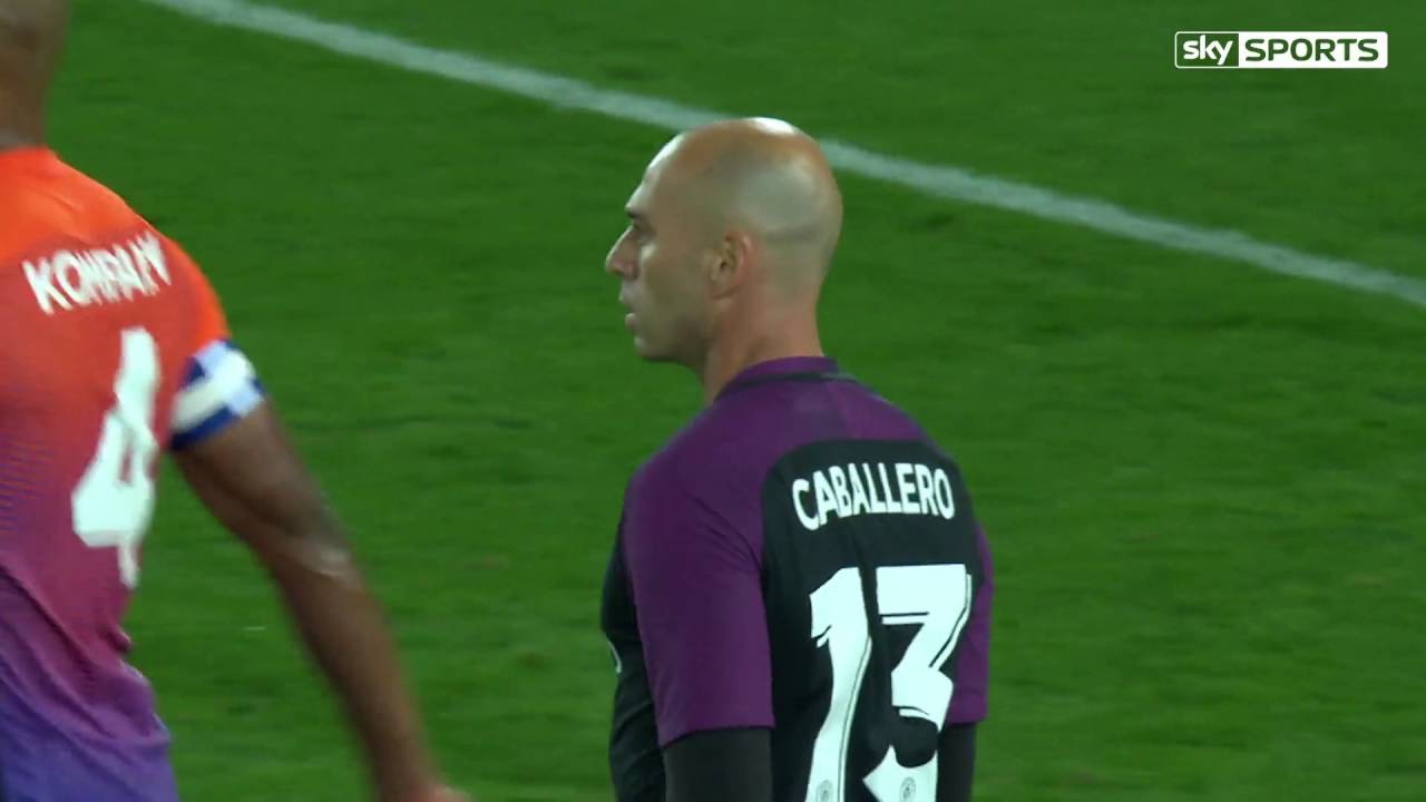
City gave a debut to this horror show at Swansea during the midweek EFL Cup tie. Were they not playing so well, it might tempting to say that the Welsh club’s players had fallen to the floor begging for mercy at the gory colourway.
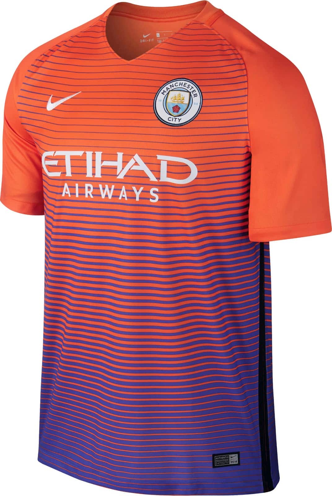
From a distance it looks even worse with the patterning at the bottom of the shirt similar to the patterns used in 1960s spy movies when the ‘baddies’ were trying to hypnotise the unsuspecting victims or hapless heroes.
Manchester City Third Kit
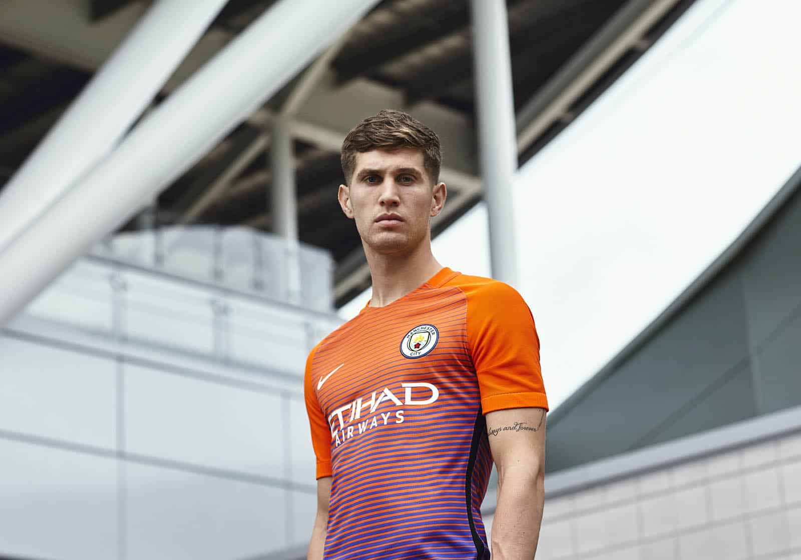
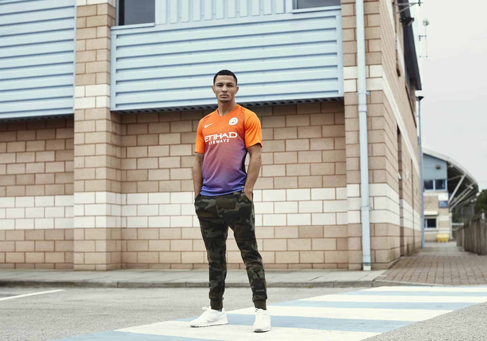
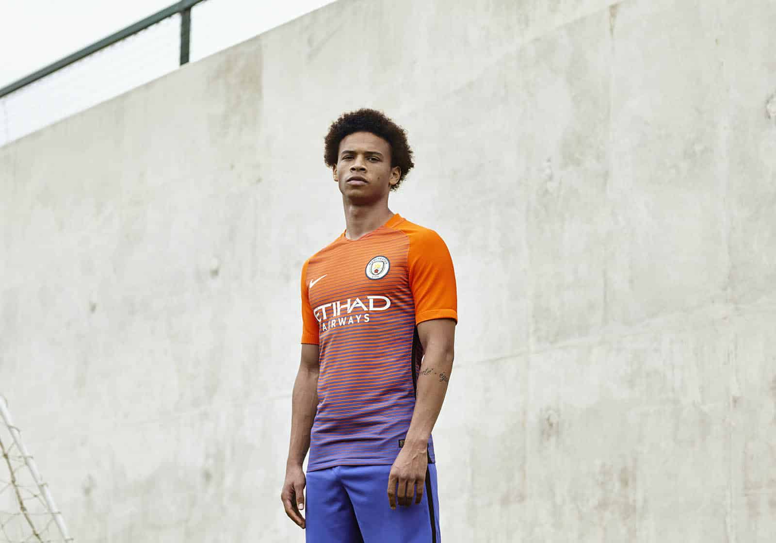
Yes, this is the Manchester City third kit for 2016/17:
The only question is why?
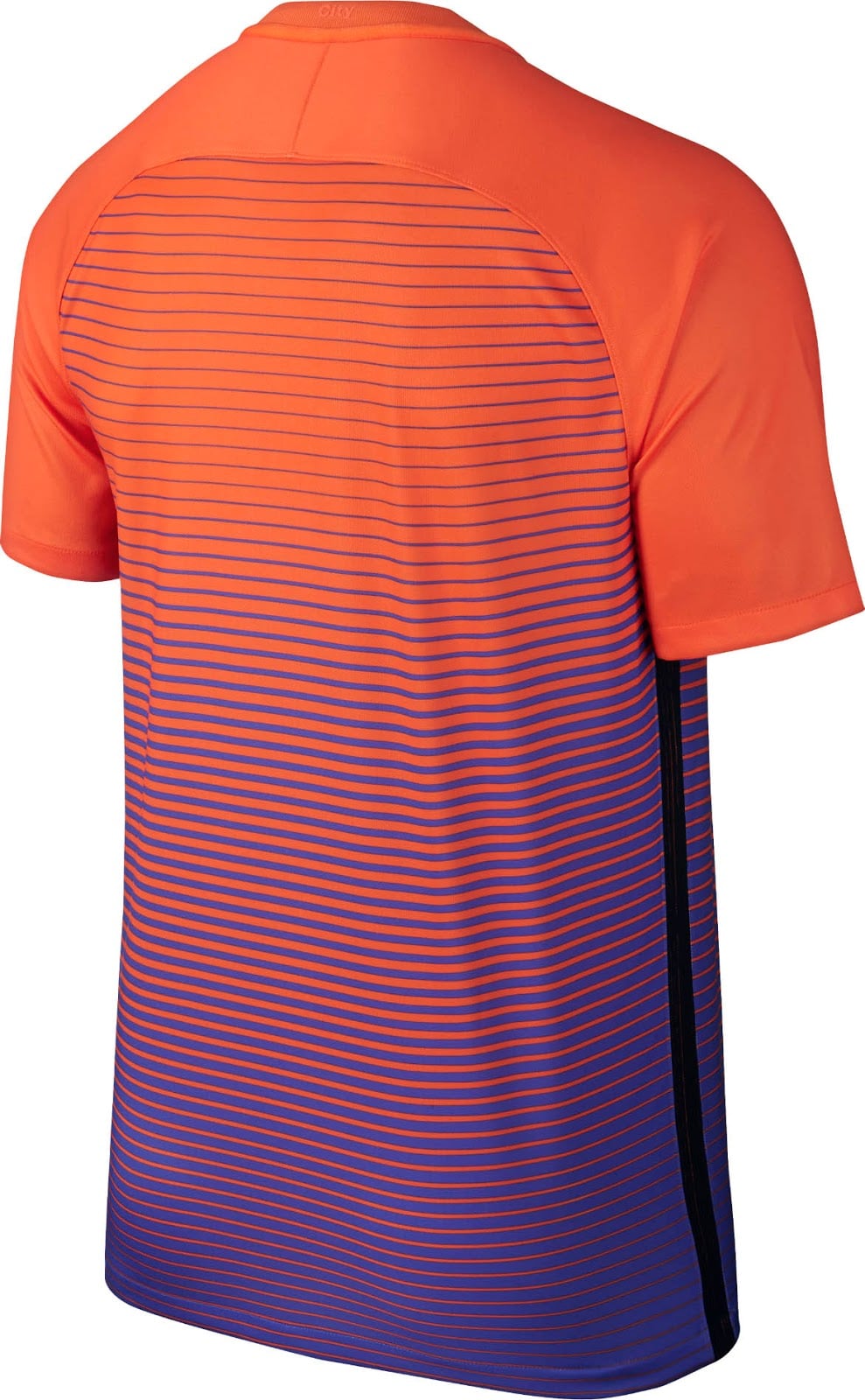
Orange at the top, fading to purple at the bottom. Across the body of the shirt,, horizontal purple stripes start at the chest level. Moving down, they become thicker until purple is the dominant colour.
The sleeves and shoulders are plain orange in a style familiar from the main Nike template.
Bizarrely, the shorts are blue, as are the socks. It’s an utterly monstrous kit with little or no redeeming features.
Willy Caballero by contrast gets a nice looking black kit with purple contrasting colour which works well. It isn’t very often that you can the goalkeepers kit look a lot better than the one foisted onto the outfield players but this is definitely one such occasion.
Thank god they are changing this next summer.

