Their name is legendary, fitting with the two Manchesters, Real Madrid, PSG and Liverpool. While they’ve crafted something recognised as some of the best football in the world, the Italian top side are looking at slightly reinventing their identity, with the kit’s title: “black and white and more”. While the kit is black and white, we do fail to see the “more”, but here at UK Soccer Shop we are willing to see something that has been extensively designed and tries to do something new.
The season has now come to an end for Italy’s Serie A. Juventus dominated from start to finish and have finished first, well above Inter Milan and only four points above Napoli.
Is the kit suitable for champions? Is the overall design good enough and do the smaller details stand out to complete the look?
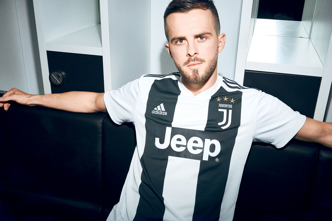
The overall design is black and white, if it was anything else, this would be a much more important article. The two large black stripes which run vertically on the front of the jersey are a change from the previous season’s multiple thinner stripes which, it could be argued, worked better.
On top of the breathable fabric, the black stripes appear a little broken up, these do give the kit top a nice feel, however it is impossible to avoid the elephant in the room…
The two large black stripes, together with the club’s main sponsor: Jeep, create a very large ‘H’. Once you see the letter on the kit, we’ve found that it’s incredibly hard to un-see it.
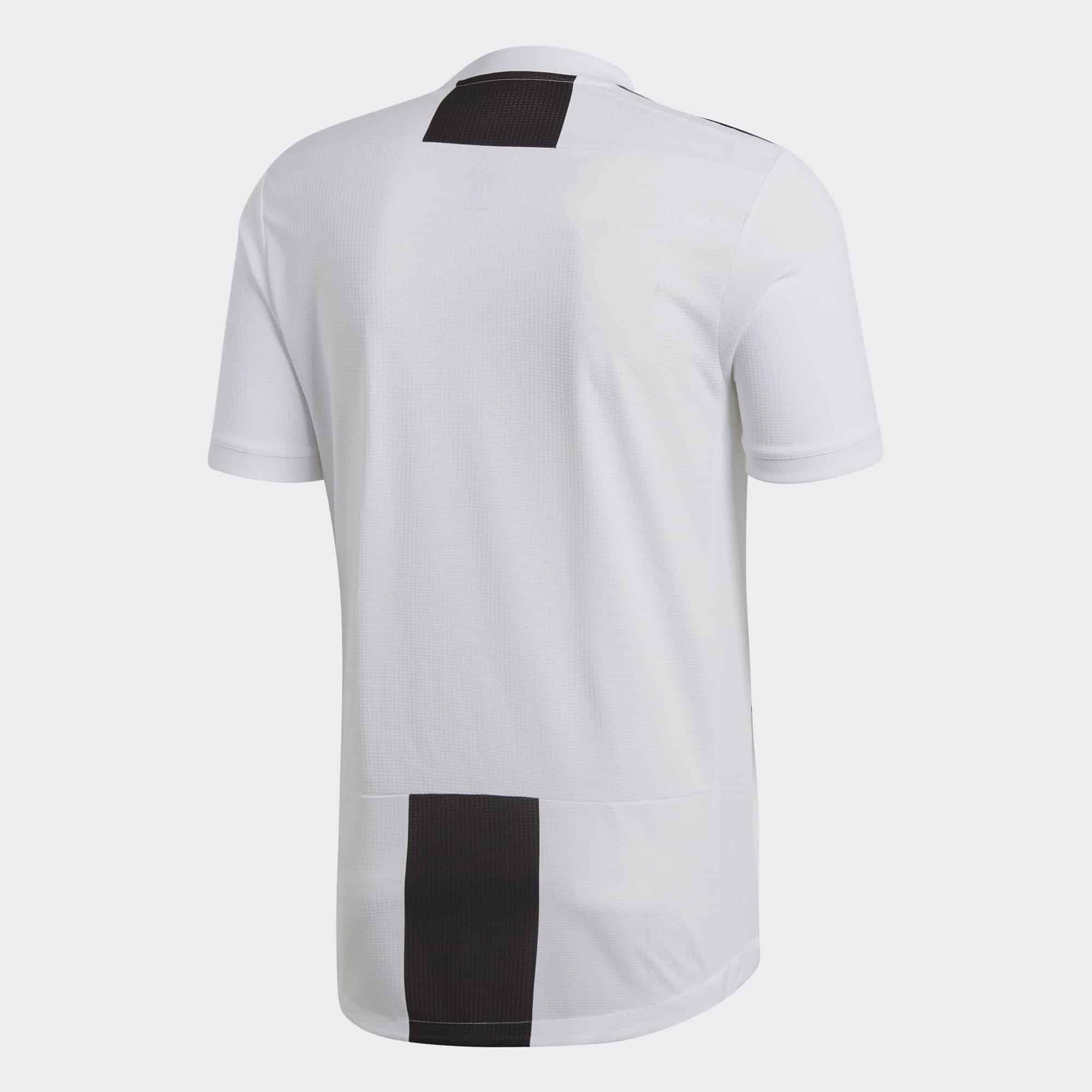
Ignoring the jolly-phonics kit, over on the back is a black square on the nape, with a gap for the player’s name and number, then another extended black rectangle at the bottom of the back. This does give a nice, solid look, however is it enough to ignore the giant ‘H’?
Whether Juve can do the same next season is undecided (although it is quite likely), and we’re also quite undecided about the style of this kit. Whether it’s a winning champion of a loosing design is yet to be judged. We just aren’t quite certain.

