Atletico Madrid‘s PR department might be caught on microphone humming a bar or two of “Anything You Can Do, I Can Do Better” today. With city rivals, Real Madrid launching their 2016/17 kits today, Atletico took the opportunity to do the same for their home kit.
But like their neighbours, there was no earth-shattering changes to the design but subtle tinkering around the edges.
Atletico Madrid 2016/17 Home Kit
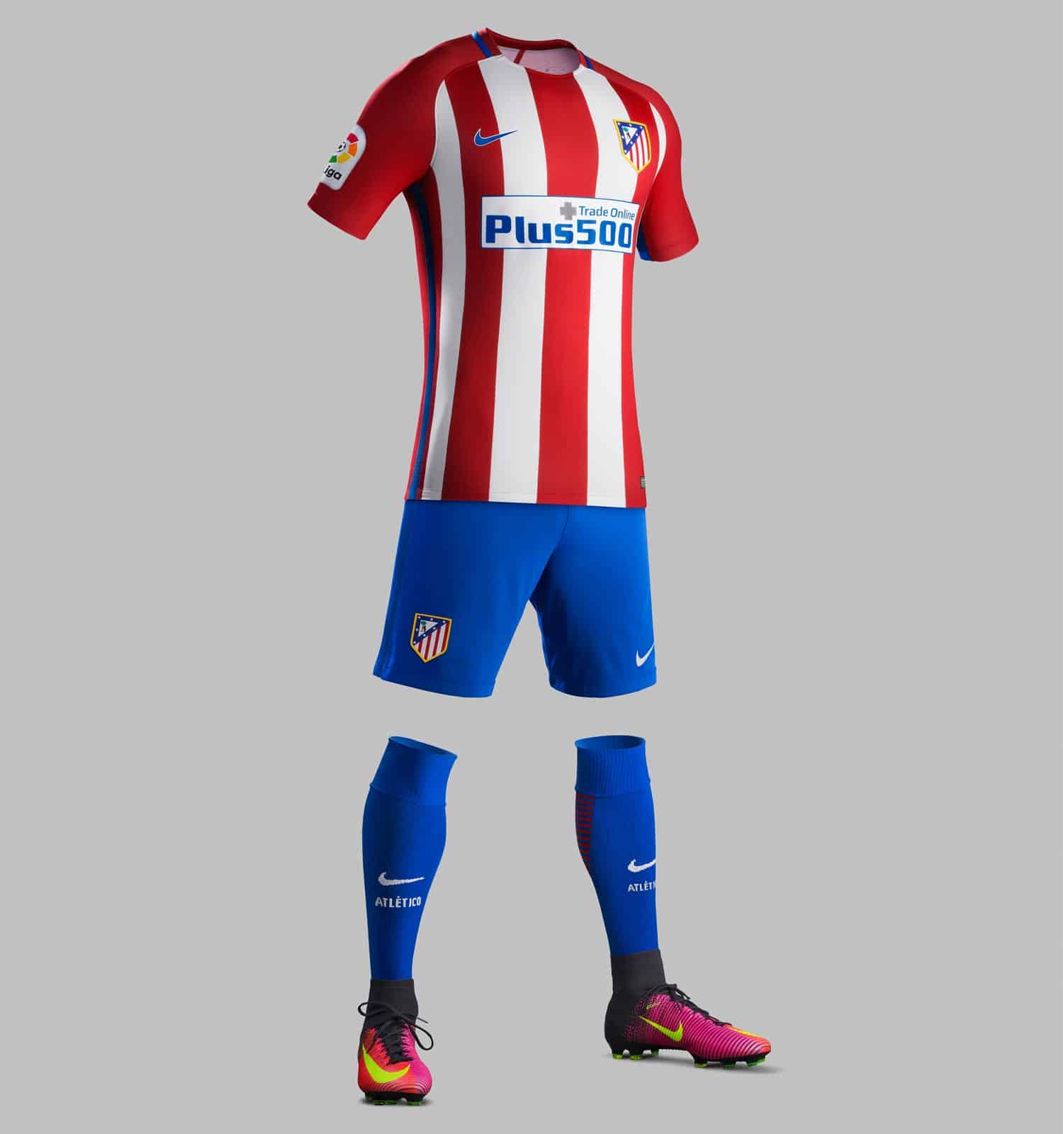
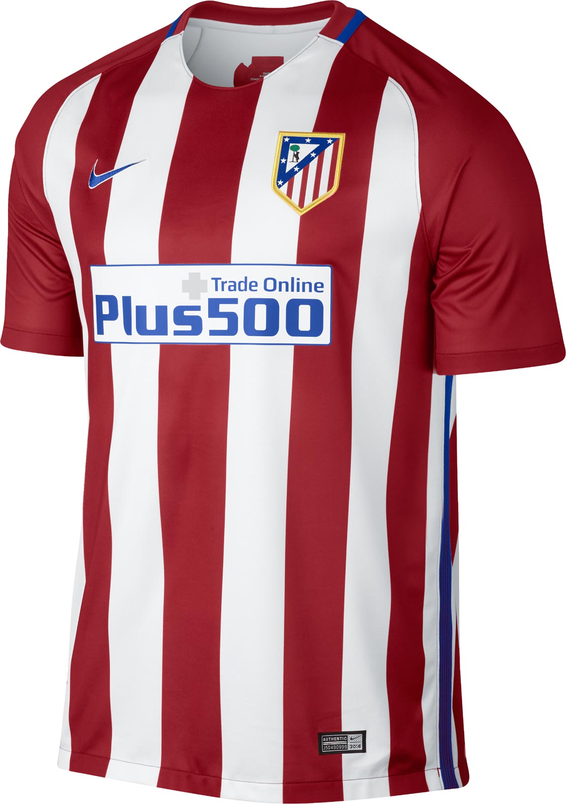
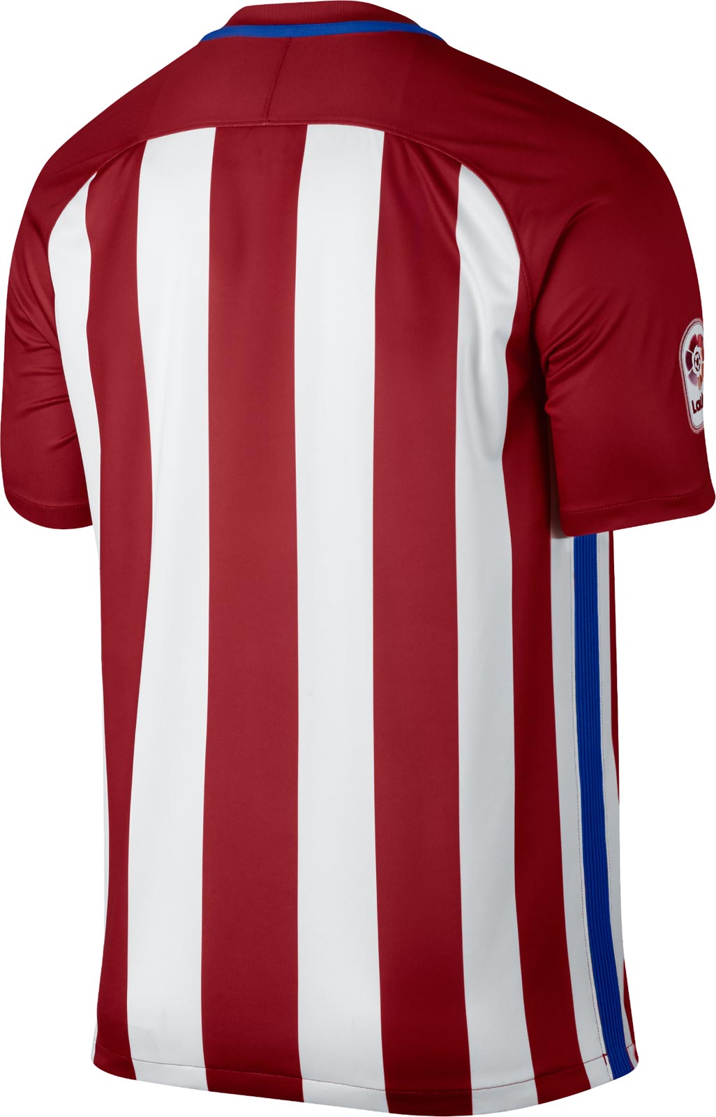
Atleti’s home kit for next season is the familiar red and white stripes.
The most striking change is the new Atletico Madrid sponsor logo, Plus 500 is in blue font, contained within a white panel with blue edges. Nike’s logo, opposite the club crest, is also in blue.
Running down the side of the shirt on either side of the body is a blue stripe.
As ever though, the shirt is red and white stripes, evenly spaced and symmetically around the body. The shoulders of the shirt and sleeves are solid red.
The collar is a curved v-shape with the stripes of the front rising to the neckline, and a solid blue band from the collarbone around the back, finishing parallel on the other side of the neck.
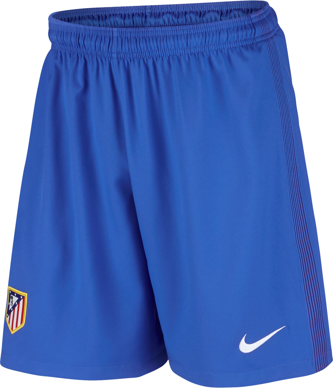
The shorts and socks are blue with marginal trim.
It’s a stylish kit, comforting in its consistency with the past designs and club traditions.


