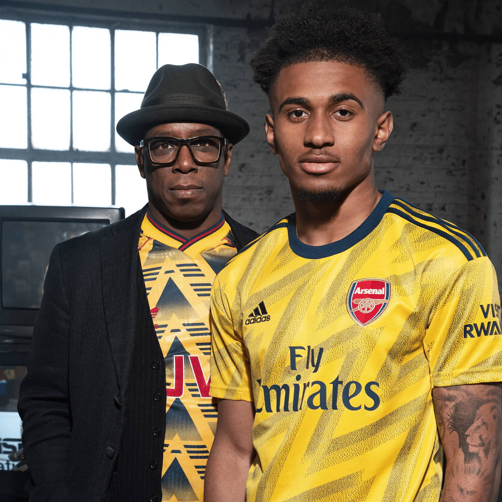
Coming on five years ago now, Arsenal looked back into their back catalogue of iconic shirts and reworked one particular design to great effect.
Making the most of a freshly reinvigorated Adidas partnership, the bruised banana strip bore new life into classic chevrons – alternatively slanting them with diagonal precision and zig-zagging brilliance.
Instead of the red JVC sponsor of the time, it was – of course – to be the Fly Emirates wording that would lay coolly on top of the superb colourway. This colourway itself was subtly toned down from the extremely-90s chevron-based black and bright yellow, to a duel-yellow movement – almost reminiscent of the zig-zagging excitement of fresh blood Reece Nelson or Bukayo Saka.
Adidas designed the distinctive pattern as a “modern twist” on the kit worn by Arsenal between 1991 and 1993, for the 2019-20 season as an away shirt. Inigo Turner, design director at Adidas, said of the revamped shirt:
“I think it was screaming out to be brought back and refreshed. It is a much loved and talked about football shirt, it is one of the most iconic shirts of all time and a symbol of Arsenal.”
The shirt is complete with a crew neck collar, along with Adidas’ three stripes on the shoulders and a logo all in navy blue. The very zig-zags of the shirt are said to have further meaning; making this all the more poignant design. Turner continued:
“After a lot of research and exploration, we arrived at a graphic that resonates with the spirit of 91/92 as well as other elements such as the lightning bolt taken from the crest displayed on the facade of the Royal Arsenal Gatehouse.”
The design forms part of an approach that Adidas calls “authenticity to progression”, as in this piece – we end with Turner once more.
“That is where we bring in progression, we don’t want to simply do the same thing that has already been done, that wouldn’t be moving the look forward and creating new future classics.”

