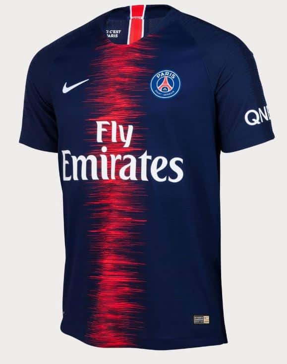
They’re at the top of French football by a mile, they play in the Parc des Princes, and they’ve just released their 2018/19 home kit. Paris Saint- Germain compete regularly in Europe with the best of the best but what do you think of their latest kit? Personally, here at UK Soccer Shop, we rather like it, but is the pattern down the front a little too modern, or perhaps just too simplistic for your tastes. We love a simple kit and PSG has always had a basic, effective kit, but is it too far in this direction?
Much like Celtic in the SPL, the French Ligue 1 is dominated by these titans of football, and much like the league, Nike dominate the kit design world, creating bold, stylish designs which are seen at the highest heights of all sports. The club’s previous kit was dark blue with a simple orange stripe running vertically down the centre. This has been the style opted by PSG for many years, however, for next season they’ve chosen to go with a little more flair. Still retaining the darker blue, the orange down the middle is not simply one singular stripe, instead it is many thin vertical stripes which rise to various levels. The design reminds us of a graph showing volume and it is truly eye-catching.
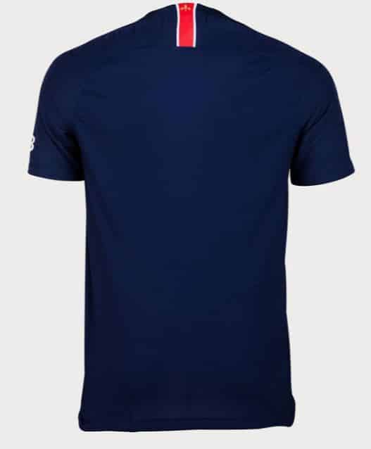
The only part that we see this kit as having broken down is the nape. This part of the kit has the orange, however it appears in a much more recently traditional way – white bordering a thick orange stripe. Perhaps the clash of the modern sound bars with the more accepted single stripe is enough to throw fans off a little and dislike the design.
Whether a football fan or not, it’s easy to see that PSG are a huge club with world-class players, but is this recent design by Nike just as world class as their team, or does it fall short of the mark? We’d love to hear your comments.


