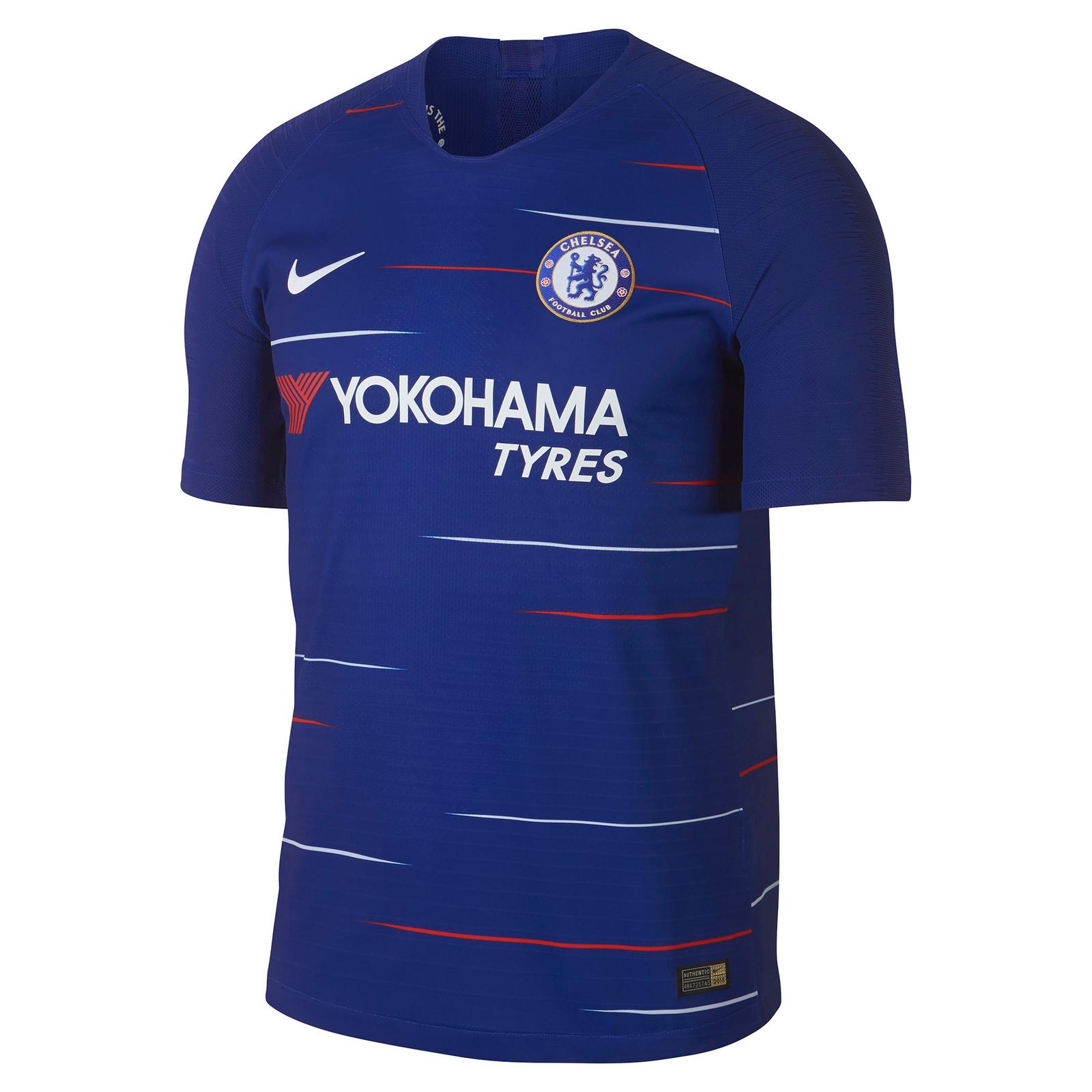
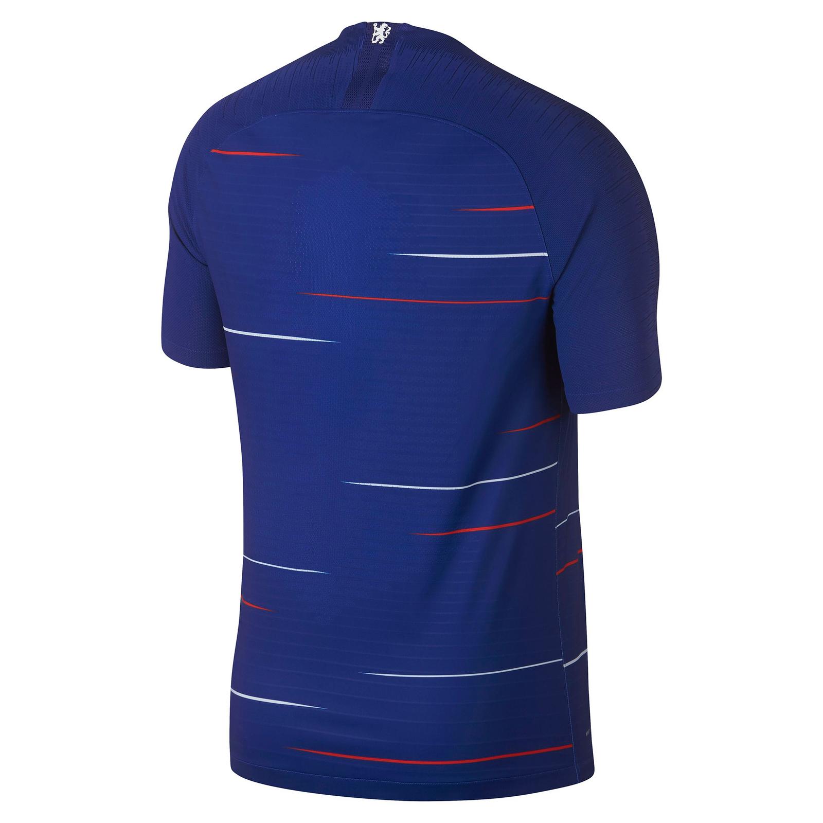
Chelsea football club. A team with an incredibly passionate manager and a confused animal on their badge, they’re one of the six titans that play in the Premier league. Readers of UK Soccer Shop’s daily blog will know that we love a simple kit, we also love a retro kit, and finally, this author really loves stripes on a jersey. With the release of Chelsea’s 2018/19 home kit, fans are treated to all three of these elements and a simple hidden touch which echos the fan base’s pride in everything blue.
So let us introduce you to the Nike-designed kit.
The body is blue (duh!), it is their signature, rich colouring, however the body is also inflicted with these horizontal, thin lines which seem to come out of nowhere and give the kit a red, white, and blue colour scheme vaguely representative of the horizontal lines which were popular during the seasons through the 80s and 90s. There’s a particular red line which passes from the left arm right through the club’s crest. This line must have been purposeful but it’s an interesting choice to put a line through the emblem, all the same.
As well as the white and red lines which are dotted across the chest, there are also many physical, non-coloured lines which give the kit top a dynamic shape and allow the pattern to be carries on almost sub-consciously.
We mentioned that there was a hidden element that would epitomise the fan base’s commitment and passion. That design element is found inside the top, hidden away from the fans, on the back of the right shoulder. It is the opening four words from Chelsea’s anthem, sung from the terraces of Stamford Bridge each week: “Blue is the colour”.
Chelsea are unlikely to miss out on the top six next season but with Leicester City winning the league in recent years, anything is possible.
This simple away kit brings flair and style, we look forward to seeing it on the pitch!


