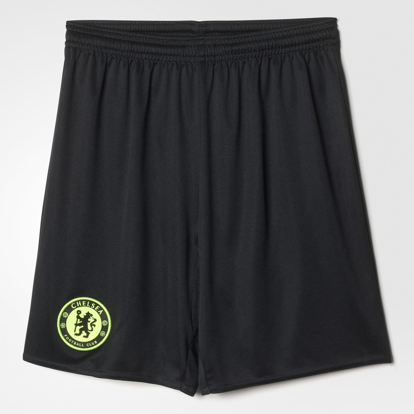
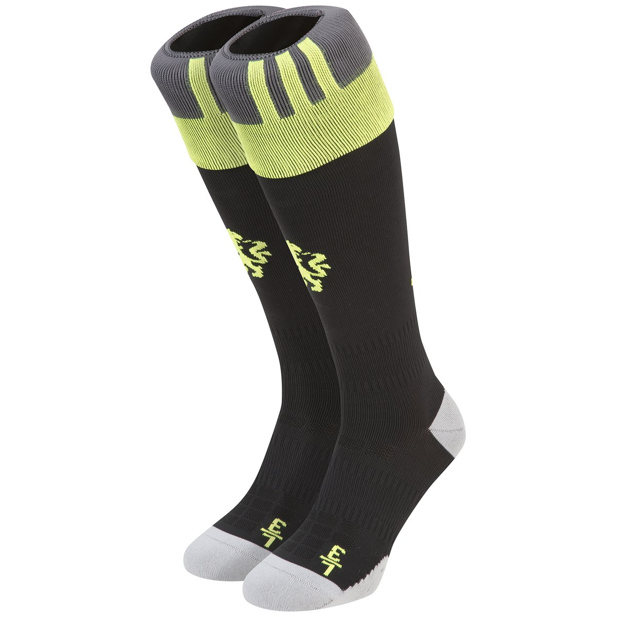
Chelsea have launched their 2016/17 away kit, the last to be manufactured by Adidas with Nike set to take over from next season.
Reaction to the new design has been mixed although the club have been quick to point out that black is a very popular colour with supporters for the away kit. Mixed reaction is better than the bad reaction to the home kit which was derided on Chelsea blogs as looking like a set of pyjamas.
Chelsea 2016/17 Away Kit
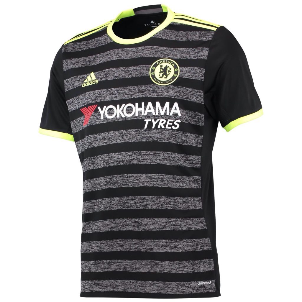
Widely leaked on the internet before today’s official launch, this is the 2016/17 Chelsea away kit.
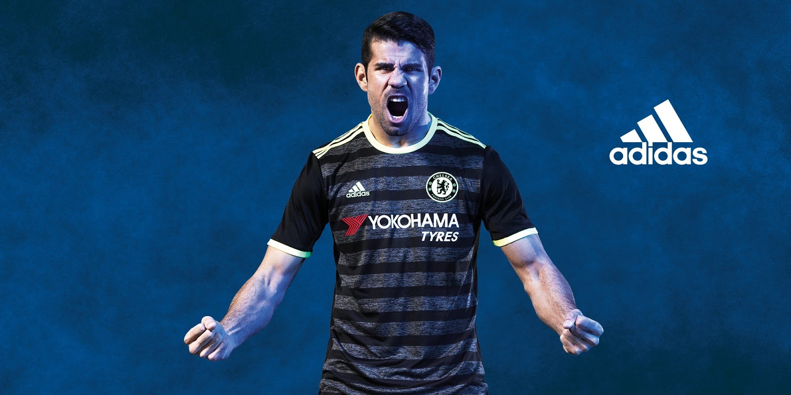
Adidas have come up with an unusual shirt design. The body of the shirt is charcoal with black horizontal stripes. The sleeves are solid black without pattern until the neon yellow trim.
Across the shoulders are Adidas’ trademark Three Stripes leading to a round neck collar, all in neon yellow. The remaining logos and insignia, including the club crest is in the trim colour. The only exception is the logo of shirt sponsor, Yokohama Tyres which is in white and red.
There is a ‘worn’ look to the charcoal bands, an original look for a football shirt and not used elsewhere at the moment.
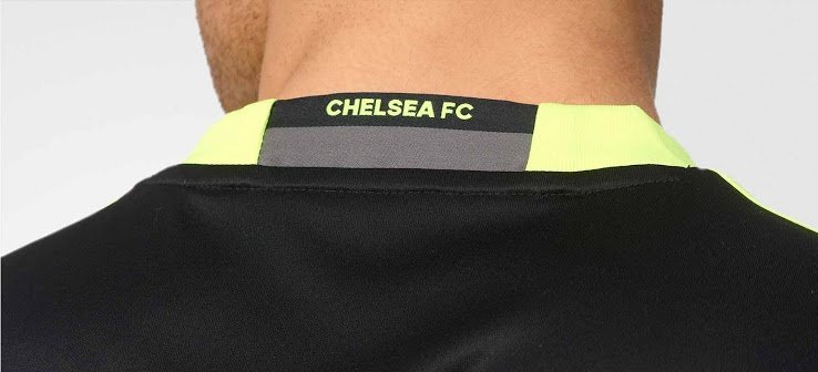
The back of the shirt is solid black. On the rear of the collar is a black and charcoal panel with the club’s name printed in neon.
The shorts and socks are black with neon yellow trim. The socks feature a dual-coloured charcoal and neon turnover, featuring the Adidas Three Stripes in yellow. A similar pattern is used on the shorts.
Chelsea 2016/17 Third Kit
The Chelsea third shirt will be all-white and for the most part, used an away kit in the Champions League.
Similar to last season’s away kit, the body of the shirt is plain white with a blue rounded v-neck collar. There is a thin white band above the blue. The cuffs are similar with the Three Stripes in blue down the side of the shirt’s body.
The shorts and socks will be white with blue trim.
Have Adidas got either kit right or were Chelsea an after-thought? Let us know if you like the kits in the comments section.


