Leicester City FC’s Concept Kit Design is Doing the Rounds on Social Media. Let’s Take a Look.
Now that the 2018/19 season is underway for most teams, we at UK Soccer Shop want to look towards 2019/20. Yes, we are getting a little ahead of ourselves, but it’s good to be prepared. Concept kits are created by designers who have a strong knowledge of football kits, their design choices and software necessary to generate designs. On the whole, they’re mostly wishful thinking. A way of betting on what the future kits might look like. So far, we’ve seen Arsenal’s, Brentford’s and Wolverhampton Wanderers. Leicester City’s concept kits have been pushed across our digital desk, and we want to take a look.
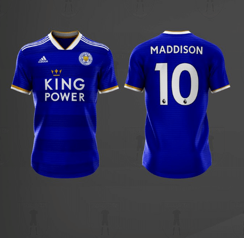
The home kit is a rich blue. Almost identical to the current 2018/19 home jersey. Running horizontally across the front are a number of thick, darker lines. These lines are subtle, however they add a huge amount of character to this excellent kit concept. The bottom of each sleeve is bordered with white and gold. Furthermore, Leicester City’s simple neckline is also bordered with white and gold.
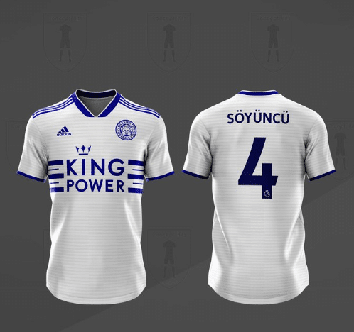
Leicester City’s current away kit is metallic silver, with orange stripes running across the shoulders. In the club’s away concept kit, the designer has chosen a white jersey. Thin, subtle grey lines run horizontally across the chest, and the club’s main sponsor is sandwiched between several dark blue lines. This secondary colour also runs across the shoulders and around the simple neckline.
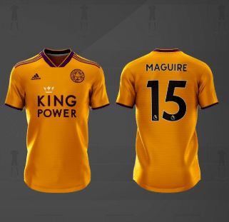
Finally, when a kit designer creates a third kit, it is their chance to push the envelope. Here, the concept kit designer for Leicester City has chosen an orange jersey. Its secondary colour is a darker blue and the crown above King Power’s logo is white.
The concept kit designer for Leicester City has provided three excellent designs. Which is your favourite?


