What do You Think of Galatasaray’s Latest Third Kit?
The Turkish Super League is well under way. Five games have been played and the table seems expectedly tight at the top. Three teams currently share the first three places with 12 points, and the team with the highest goal difference is Galatasaray. They’re from Istanbul and are looking for their second consecutive title win. The team has often dominated the league and the derby fixture between themselves and Fenerbahce is famous. Helping them on their 2018/19 footballing campaign is Nike, who have designed an excellent home and away kit. Furthermore, they’ve designed a rarely seen third kit that is bright and eye-catching.
Let’s take a look
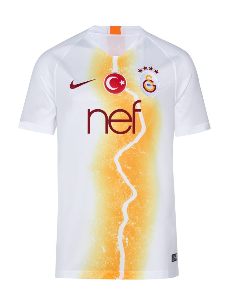
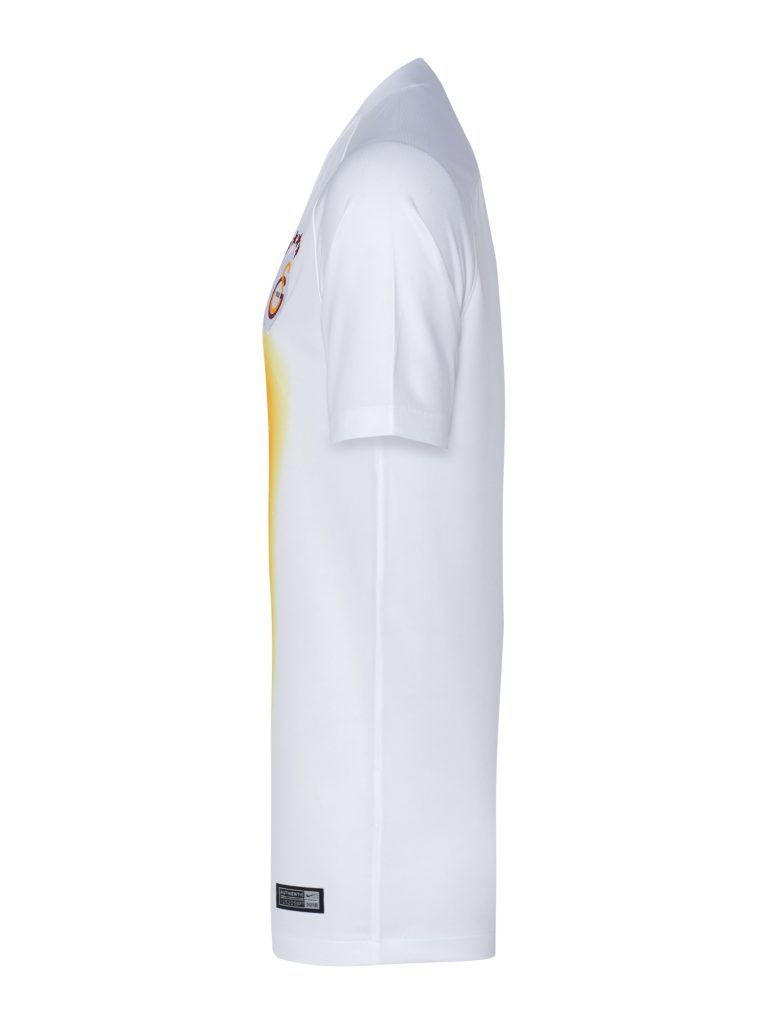
Galatasaray’s third kit is white. While sometimes that might cause alarm bells to ring (especially when we think of the New York Cosmos), this kit has been expertly crafted and while simple, it’s a truly stunning design.
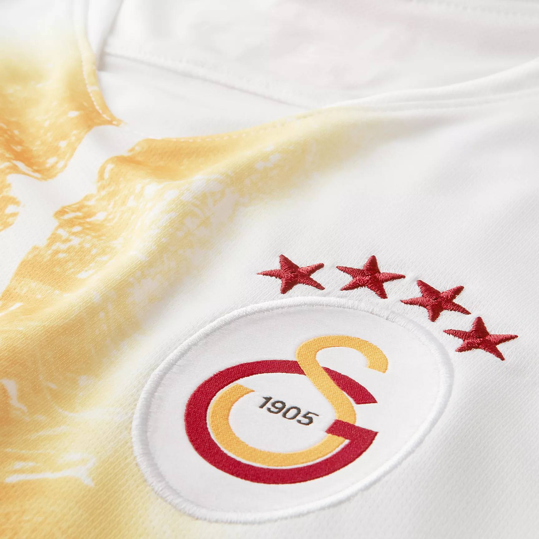
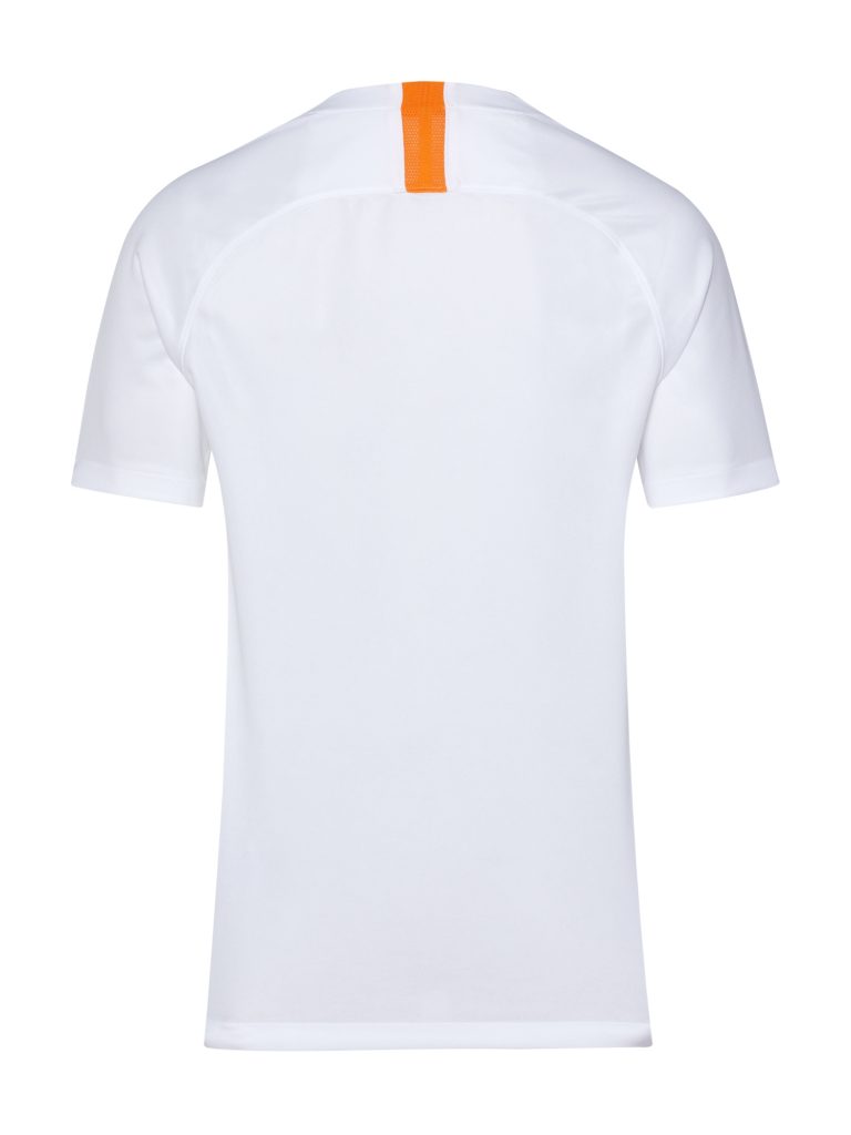
There is a reason for its striking nature. Running straight up the centre is a lightning bolt on an orange background. The pattern could also be interpreted as a crack in an orange landscape. Either interpretation is valid and the pattern acts as the perfect blank canvas for the club’s main sponsor, Nike’s iconic Swoosh, and the Galatasaray’s crest to sit on top of. The badge features four red stars running across the top and on the nape is an orange rectangle.
The neckline is a simple one and, furthermore, the sleeves remain without a secondary colour running around the bottom of them. This decision was perhaps taken to ensure that no design element detracts from the main pattern running up the centre of Galatasaray’s jersey.
Whether the club can secure another title win is yet to be seen, but they’re in a very good position to do so.

