Right now, as of writing this piece, it’s 10AM in the UK which means that in Melbourne it’s 8PM. That alone is pretty tricky to get my head around, but here are three other facts which shocked me about those living down under:
- There are three times as many sheep as there are people living in Australia.
- 17 of the world’s most poisonous snakes are to be found in the country.
- A ban on saying the word ‘mate’ in parliament was introduced in 2004. It was overturned after 24 hours.
We hope you’ll agree, they’re some smashing facts about a pretty neat country. Something else that’s neat is the latest home kit for Melbourne City. It’s bright, sleek, and simple. Three winning concepts that make a good kit great.
Let’s take a look.
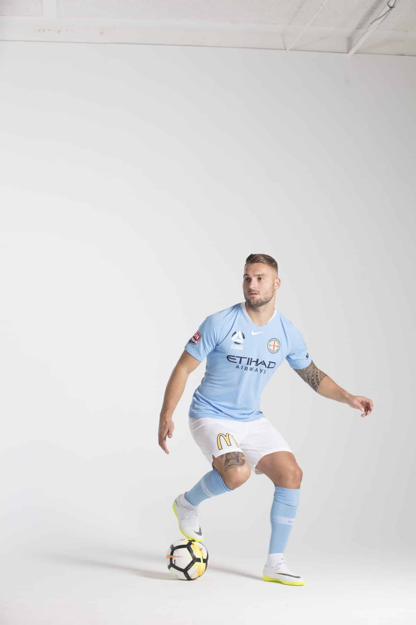
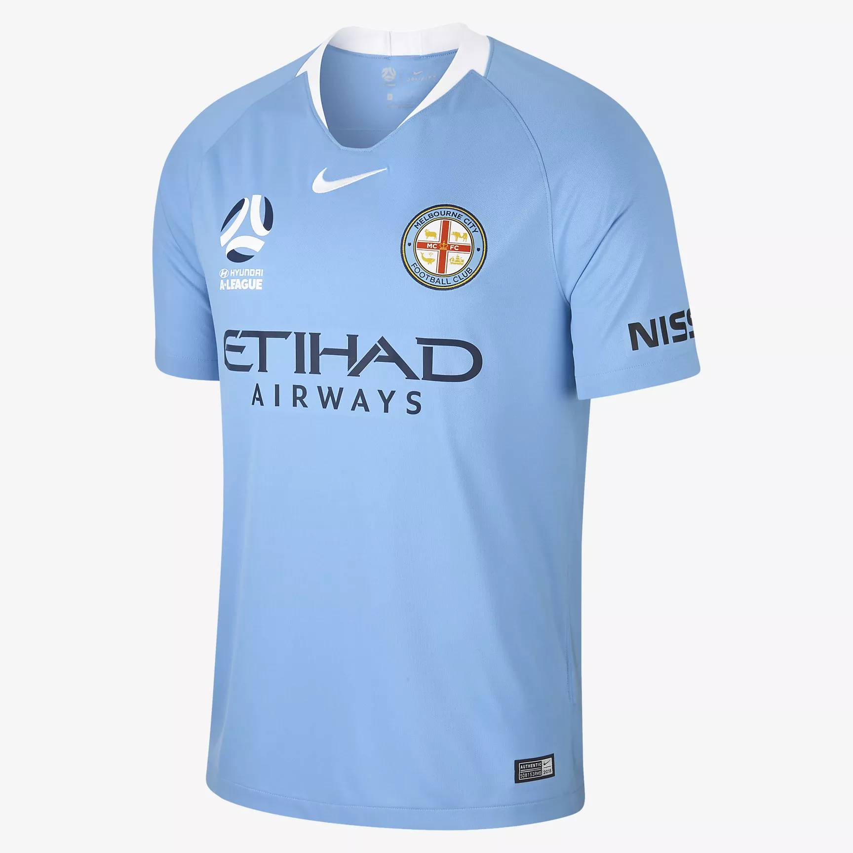
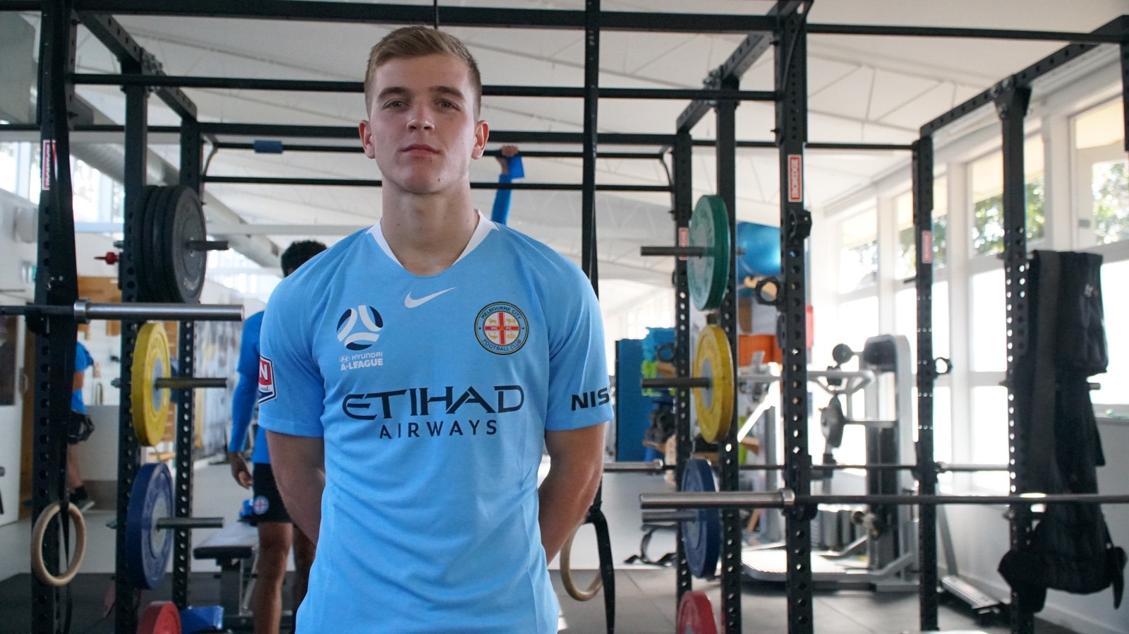
The kit is sky blue, tapered around the neckline with white. On the chest sits the club’s crest. Also featuring is the A-League’s symbol, Nike’s Swoosh, and the club’s main sponsor.
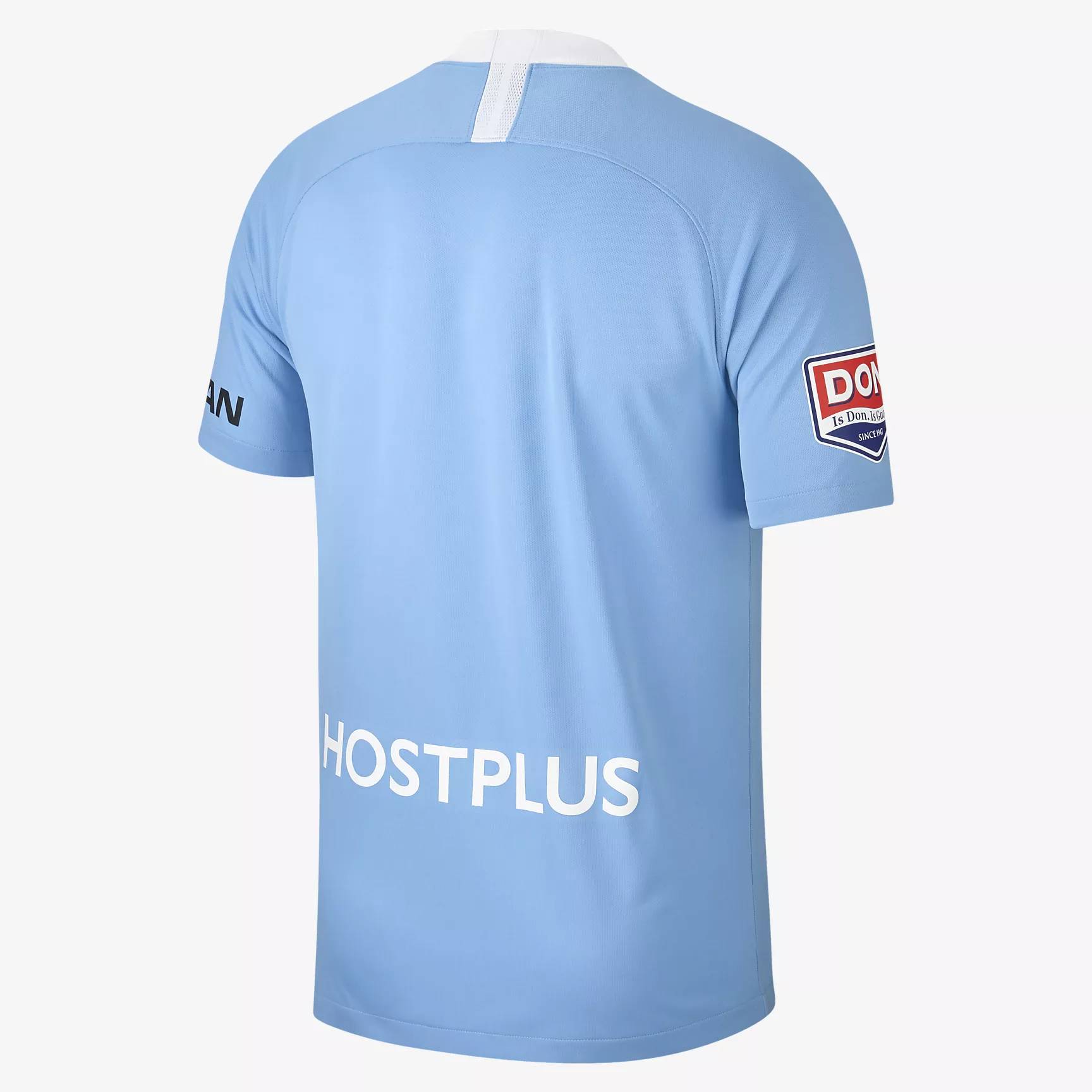
A white stripe features on the nape of the kit and at the bottom of the back is another club sponsor. Furthermore, to gain extra funding, each of the sleeves act as a canvas for another sponsor.
The club finished their 2017/18 campaign in third place. Behind Sydney FC and the Newcastle Jets, manager Warren Joyce will hope that his team can at least take on second place, if not take home the league title.
The promotional photos for this kit have been taken in what appears to be a gym. This perhaps suggests that the team are working hard to beat off the competition next season.
So far the kit has received fairly average feedback. It isn’t anything particularly special but fans do quite like the overall design. Furthermore, at UK think that it’s a positive, uncluttered kit, but what do you think?
