Let’s be honest. When you switch your Playstation on with a mate, put Fifa into the disk reader and choose teams to battle it out on the pitch, there’s normally a bit of an argument. If you find yourselves in La Liga, scrolling through teams, your friend might say, “you can’t be Barcelona, or Real Madrid, or Athletico Madrid.” As you stare at them in disbelief (because those are the only three teams you know), you suddenly remember your secret weapon – Sevilla. The might have finished in 7th place last season, well behind Villareal and Valencia, but at least they competed positively. They even beat Real Madrid 3-2 in May. With names like Vazquez and Sandro, you’re sure to feel a little more comfortable in the team screen.
Fans of Sevilla are also wanting to feel a little comfort. Their national team was knocked out of the 2018 World Cup against Russia, on penalties. So it’s natural that the fans will now be looking towards their club.
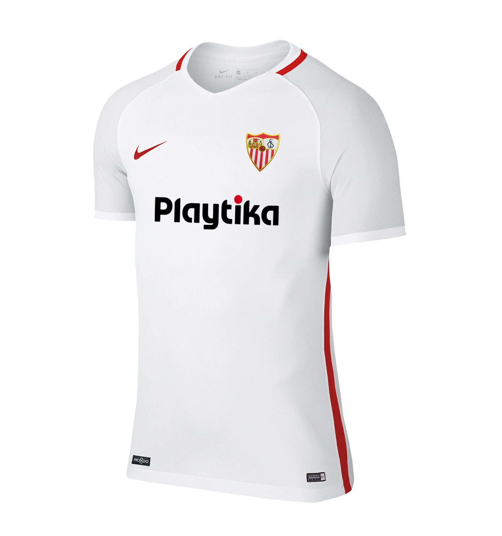
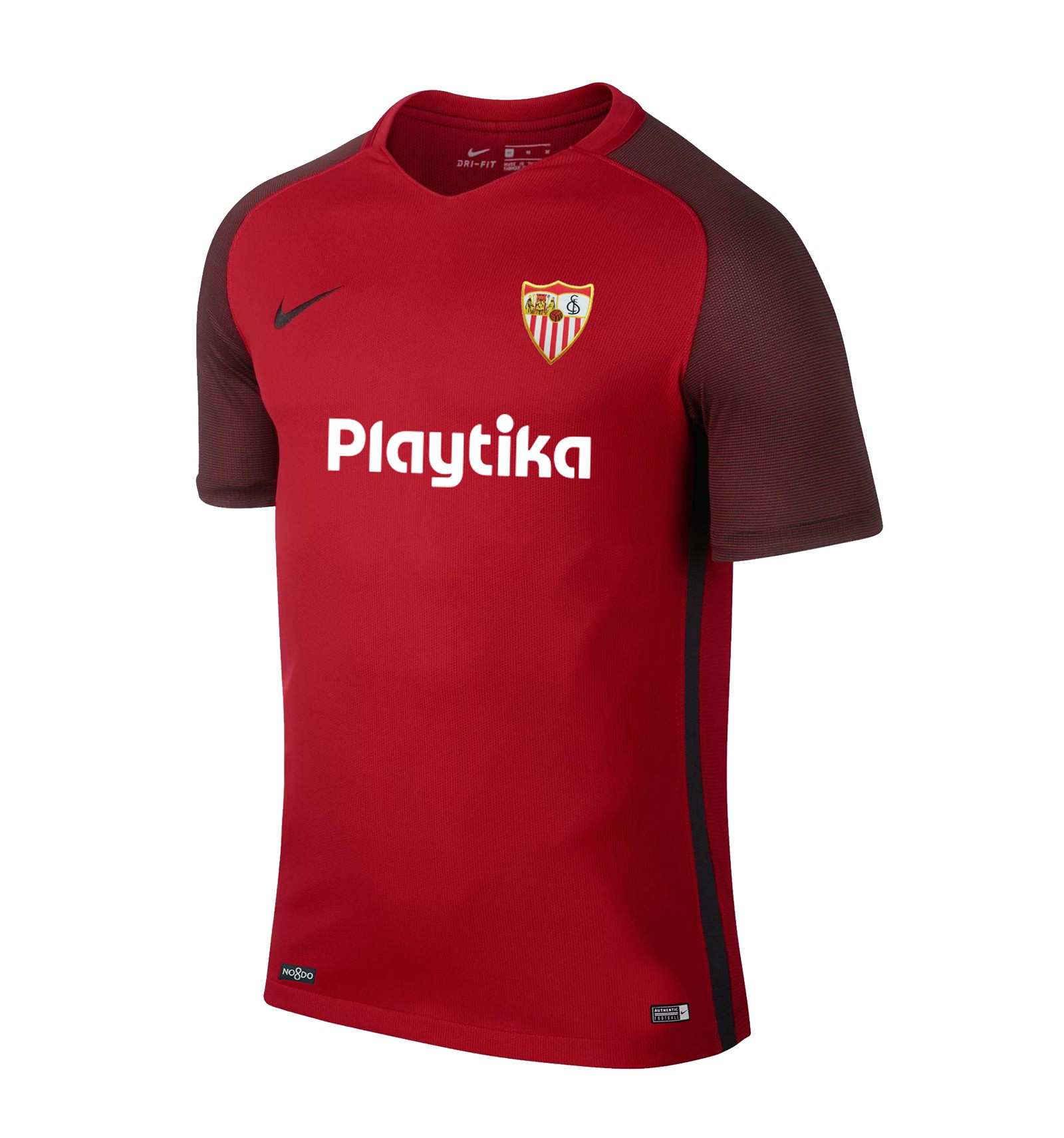
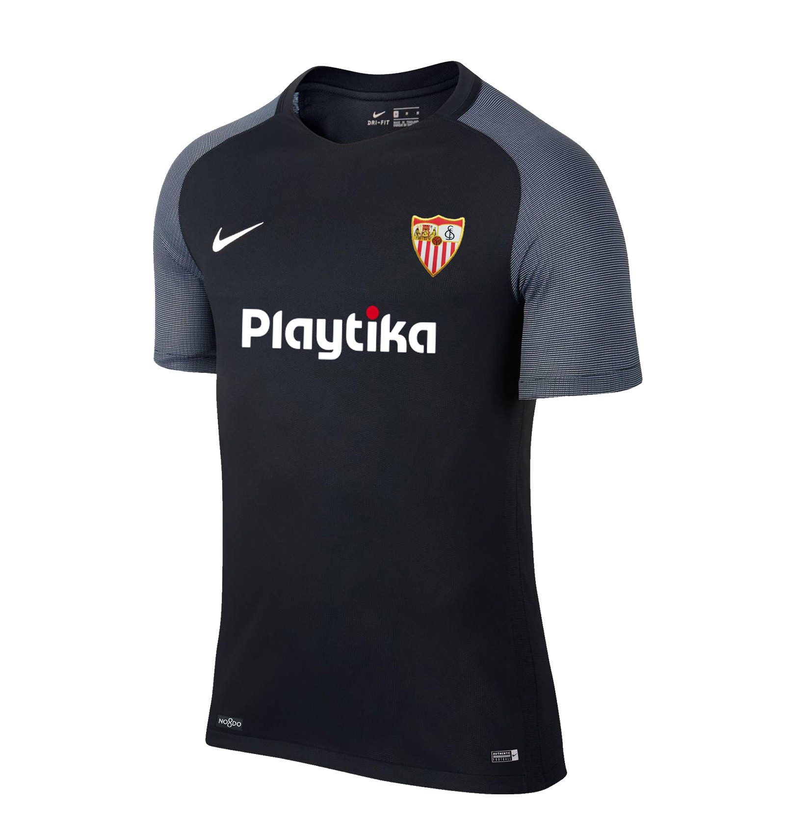
To help the 2018/19 campaign get off to a positive start, the club have teamed up with Nike to create a home, away, and third kit. Each design has its own unique style. All are incredibly simple.
While we at UK Soccer Shop love the three kits, what do you think?
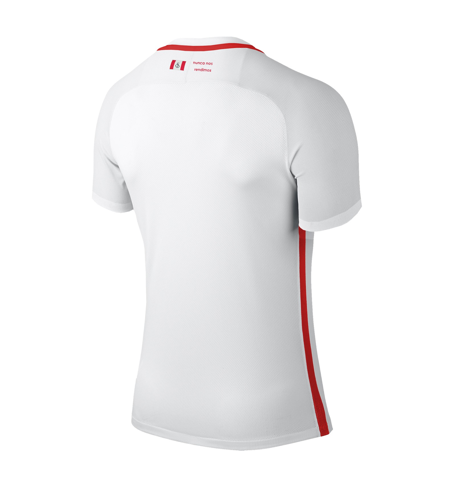
The home kit is white. The only colouring is red and features around the neckline, on the sponsor and Nike’s Swoosh, as well as down the sides and around the simple neckline. A deeper dynamic comes from the greying on the sleeves, giving the kit definition and completing the look nicely.
On the nape of the kit top are the words “nunca nos rendimos,” meaning, in loose translation, “we will never surrender.”
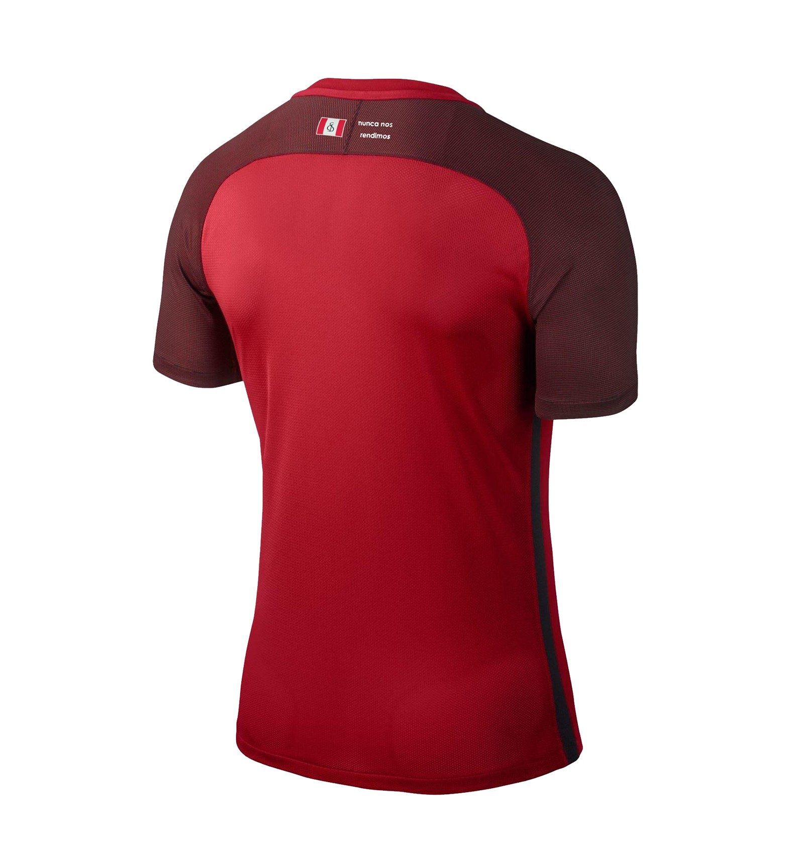
The away kit has a red body and darker sleeves. The Nike Swoosh is black and the club’s sponsor is white. The kit top ditches any tapering around the neckline. This in our opinion is the correct design decision
Finally, Sevilla’s third kit. The body is charcoal in colour with metallic-grey sleeves. It too ditches any tapering but still features the powerful words on the nape of the jersey.
