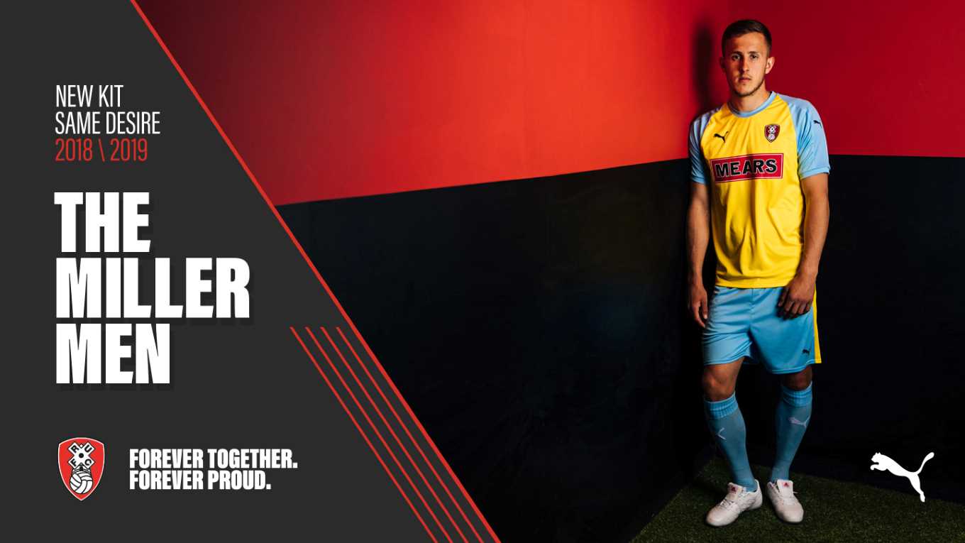
We showed you Rotherham’s 2018/19 away kit. Its wonderful blue and black stripes made it a clean, stylish second kit to a simple, subtle home jersey. We thought it best that you see their third kit.
By being bold and colourful, the jersey does exactly what it should: be so outlandish that no other team will have a matching kit, therefore, always easy to see when playing as them on Fifa.
And of course you’ll be playing as them on Fifa. In their mighty battle against Shrewsbury in the League One final, they fought hard to win 2-1. Surely you must agree that they are deserving of this. Surely you must also be wondering how long their seasons will be promotion and relegation back to back for. Hopefully this season they can weather the storm and sit tight in the Championship. Maybe not quite so tight as Ipswich Town, who might never leave the second tier of English Football.
Back to the kit.
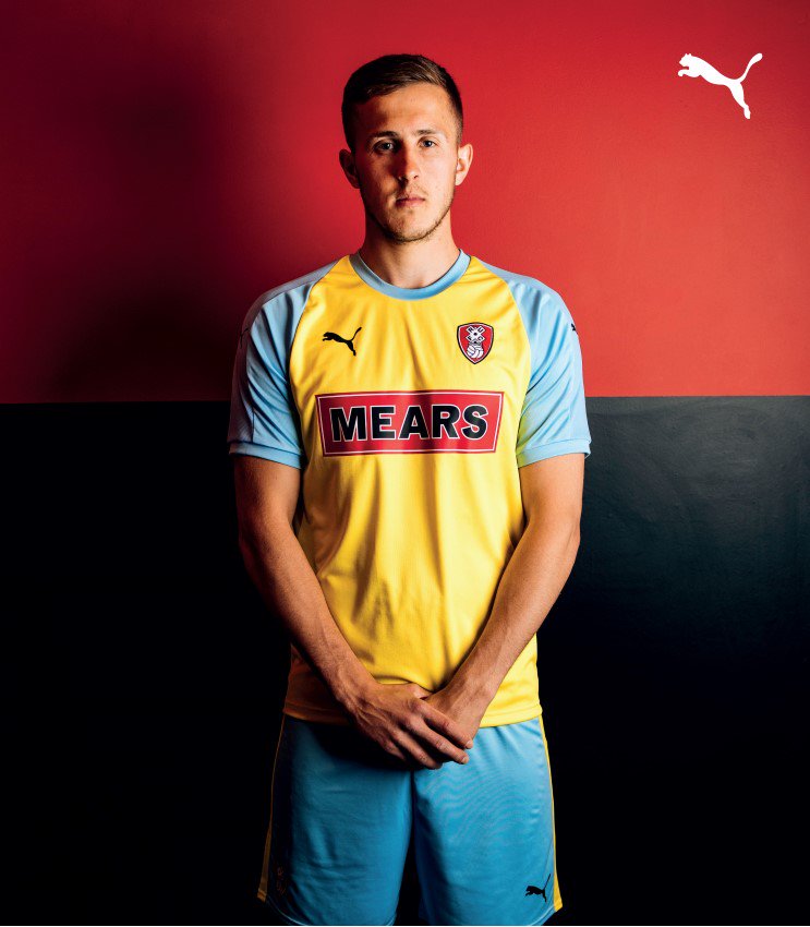
Puma have done a great job with the colour combination. The yellow body against sleeves of turquoise is rather pleasing on the eyes. In the press release photograph, Will Vaulks looks like a naughty schoolboy stood outside of the headmaster’s office. Perhaps the only reason this kit could get into trouble is the sponsor’s name in large writing across the chest.
Around the neckline is a blue tapering across the yellow. This tapering makes the jersey look like it has a bib over the top.
It would really be lovely if Rotherham could defy the odds and gain double promotion. Whether they achieve this, sit comfortably in the Championship for the next five years, or instantly get sent back down the leagues of English football, we can’t wait to find out. This third kit, much like the home and away is stylishly designed, practical, and worthy of promotion.


