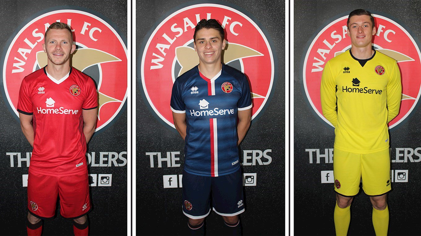
Accidentally describe someone from Walsall as from Birmingham and you’ll be in trouble. They are proud of their heritage. While the football club might just have finished out of the relegation positions by the skin of their teeth, they’re releasing their home and away kits. The hope is that these jerseys will inspire next season. Perhaps they might even push for promotion. Designed by Errea, the kits combine the perfect nature of simplicity and boldness.
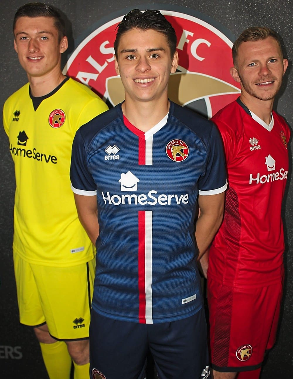
Walsall’s home kit is very similar to PSG’s overall theme. Navy blue with a bright red/orange stripe running vertically down the middle. Perhaps it’s thought that by copying this style, the football played will be similar to the French club’s. It’s unlikely, but it does show how great this model kit is. Running vertically are a number of thin, light and dark lines which give the kit some character. These lines stop at the sleeves, making it a nicely contrasted jersey. The sleeves are also tapered with white at the bottom, adding to the look
The away kit is red. It does not feature any of the stripes, however still acts as an effective second kit. The sides are black, patterned, giving the kit a positive aesthetic appearance.
Out of these two kits it is really the home which has seemingly had the most thought put into its design. The subtle pattern, together with the bold stripes really make it a kit worthy of promotion.
We all have a long summer ahead of us before we see league football again. The other side of this summer we’ll know if England can go out of a huge tournament to a team slightly bigger than Iceland this time.We hope that the style of the home kit and the simplicity of the away can spur the West Midlands team onto success.


