Last Year We Showed You the Ipswich Town Concept Kits. Here we Are Once Again.
Here at UK Soccer Shop, we’re inundated with excellent concept kits. They’re pushed across our digital desk every day and it’s tricky to decide which ones to look into further. Last week we showed you Arsenal’s, Leicester City’s and Fulham. You might have guessed by the title who today’s concept kit is going to be. It’s no secret to anyone that this author is an Ipswich Town fan. Despite being born in Norwich, he’s supported them from an early age and continues to do so in his 20s. As we say in the title, we brought you their 2018/19 concept kit and now we want to bring you the 2019/20 one.
Here goes.
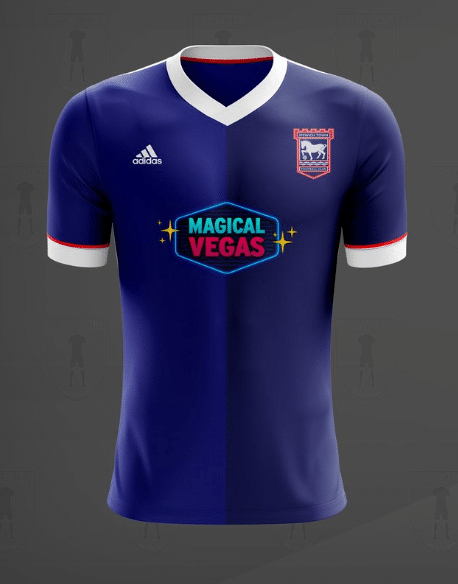
The home jersey is a half-and-half design. On one side is a dark shade of blue, on the other, a lighter one. On the centre of the chest is the unpopular Magical Vegas logo, and above, the club’s crest and Adidas’ logo. Furthermore, the simple neckline and bottom of each sleeve features a thick white tapering. It pushes the envelope just enough for a home kit, while retaining the club’s overall style.
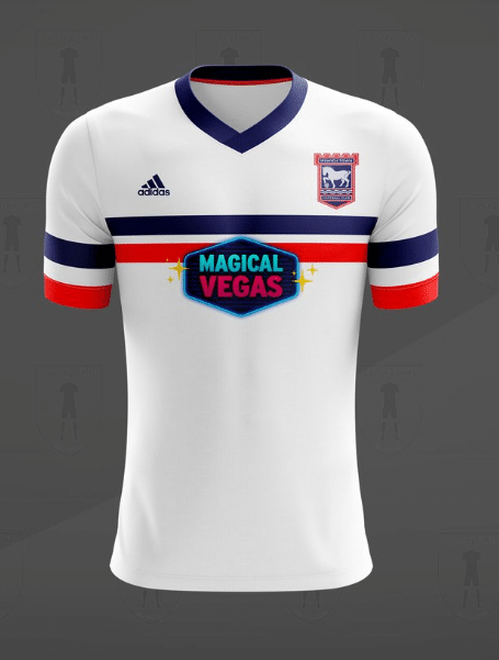
The away kit is white. On top of the blank canvas are two lines running horizontally – a blue one and a red. These stripes run onto the sleeves and blue features around the simple neckline. Ipswich Town’s away kit concept is a simple design, however the overall effect is slightly overshadowed by the dominating sponsorship logo.
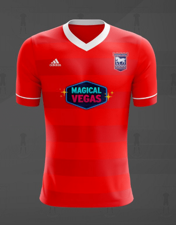
Finally, the third kit is bright red. Running horizontally across the jersey are a number of slightly darker lines. The simple neckline is once again white, and running across each sleeve is a single, thin white line. Ipswich Town’s third concept kit is very similar to a Nottingham Forrest home kit.


