The Saints Are Off to A Steady Start. Here’s Southampton’s Latest Home Kit.
Way back in June, as we were building up to the gorgeous heatwave and the World Cup had just started, we brought you Southampton’s away kit. This author accidentally called it their home kit and three months later, he’s still kicking himself. We never brought you the club’s simple home kit. But we’re about to right now. Southampton are currently sat in 13th place of the Premier League. They’re ahead of a number of teams including West Ham, Burnley, Huddersfield, and Newcastle. There’s a long way to go in this year’s Premier League but one thing’s for certain, it’s going to be a competitive campaign.
To help Southampton not only survive, but compete, they’ve teamed up with Under Armour to create a home kit that seems to work on some levels, and others, not so much. It’s received mixed reviews from fans but see what you think.
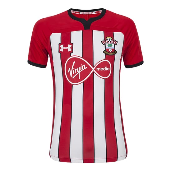
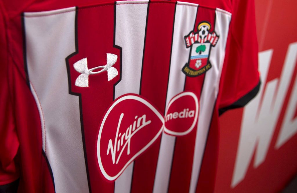
The kit consists of white and red, vertical stripes. Of course it does. That surely comes as no surprise. Each stripes is bordered with a thin black line which bends around the Under Armour logo. The positive effect of this design decision is that each element is more prominent and stands out. The flip side of this is that bending the stripes can interrupt the overall flow of the kit. Furthermore, the home kit is dominated by the black bordering of the simple neckline, as well as the bottom of each sleeve.
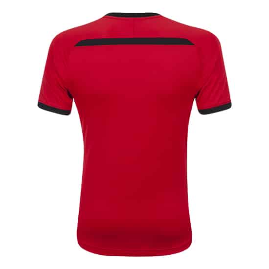
On a positive note, the black colouring that is also seen on the back of the jersey creates a positive contrast. It does make the kit more interesting and stand out from previous home kit designs, however football fans tend not to like change. Unless it’s promotional change.


