Wellington Phoenix’ Latest Release is Simple. What do you think?
Wellington Phoenix are a New Zealand team that competes in the Australian A-League. While that’s a strange concept, the A-League only has ten teams in it. At the end of last season, this New Zealand outfit finished in ninth place. This position was just ahead of the Central Coast Mariners who finished in tenth place. We’ve given a huge amount of airtime to Usain Bolt’s new team, but now it’s time for the Nix’.
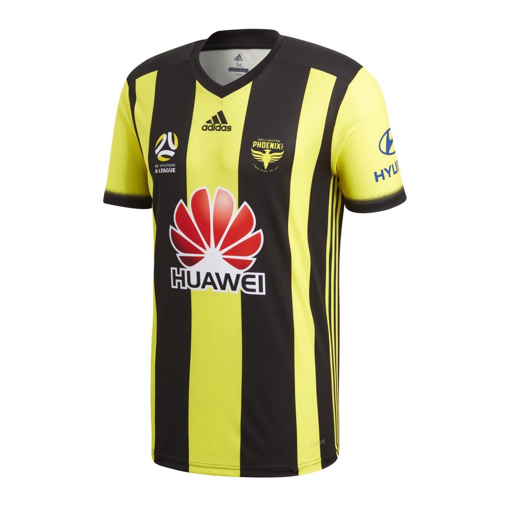
Their home kit is designed by Adidas. It consists of yellow and black stripes running vertically across the front of the jersey. Thinner stripes feature under the arms and contrast nicely with the rest of the design. Furthermore, the front stripes act as the perfect blank canvas for Wellington Phoenix’ club crest and the A-League’s logo.
While the kit has been positively received by the fans, there are some who believe the design to be dominated by the club’s main sponsor. Huawei’s red and white logo appears on the front. It is large and could possibly detract from the rest of the kit’s design.
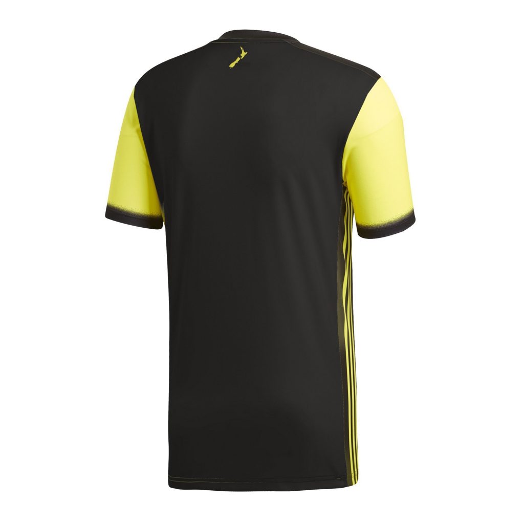
The overall design is a positive, simple one, however there are a number of smaller features that could be overlooked during a cursory glance. For example, on the nape of the jersey sits an illustration of New Zealand. Both the north and south islands appear on the reverse of the home kit.
As well as the image of New Zealand, Wellington Phoenix’ jersey utilises Adidas’ Climalite technology. This allows the players to feel at their coolest, even under the most intense pressure, or after a tough workout on the pitch.
Finally, it is worth mentioning the sleeves. They’re yellow, with a black, fade-in material at the bottom. These sleeves give the kit its necessary character and allow it to stand out on the field of play.


