Yesterday we brought you a selection of the best third kits that the footballing world had to offer. We showed you Parma Calcio’s third kit that was a combination of their home and away jerseys. We also looked at Millwall’s bright, bold kit which represented the club’s tough attitude nicely. Finally we showed off Bolton Wanderers third kit. It was bright blue and held plenty of character. Now is the time to show off Bolton Wanderers’ away kit. You see, we showed you their home kit, then their third kit. It’s probably best you see the final piece of that footballing puzzle.
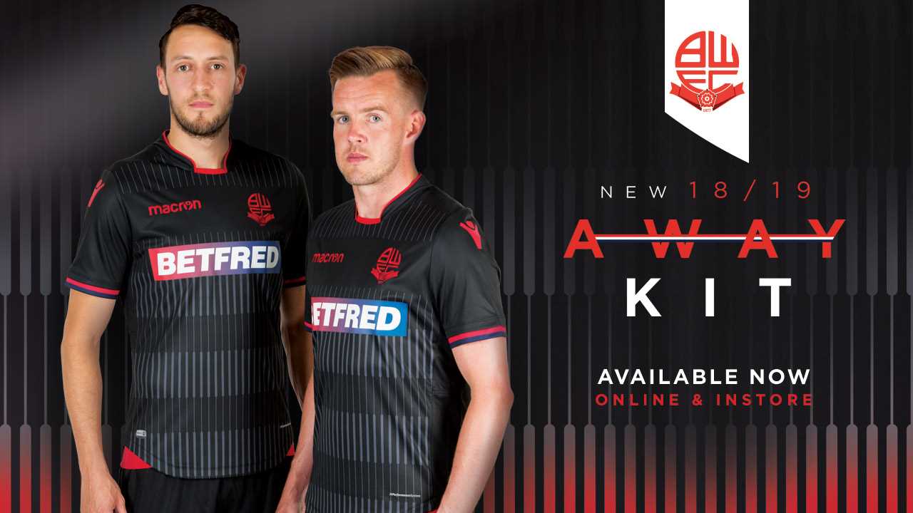
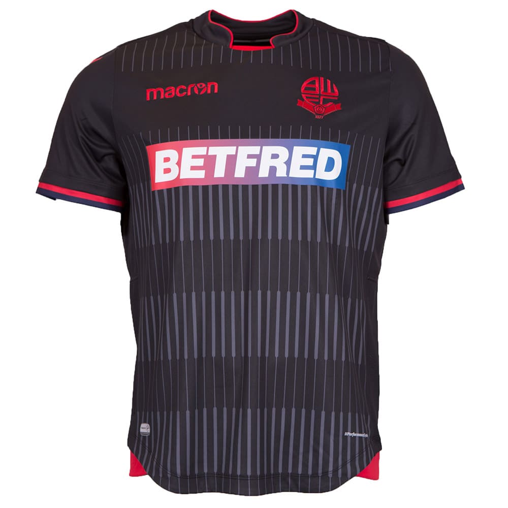
The home kit was simple, bright, and almost exactly what fans would have hoped for. The third kit had simple, subtle characteristics and a semi-classic collar. The away kit is quite extroverted in its appearance and features a striking pattern, unseen on any other football kits.
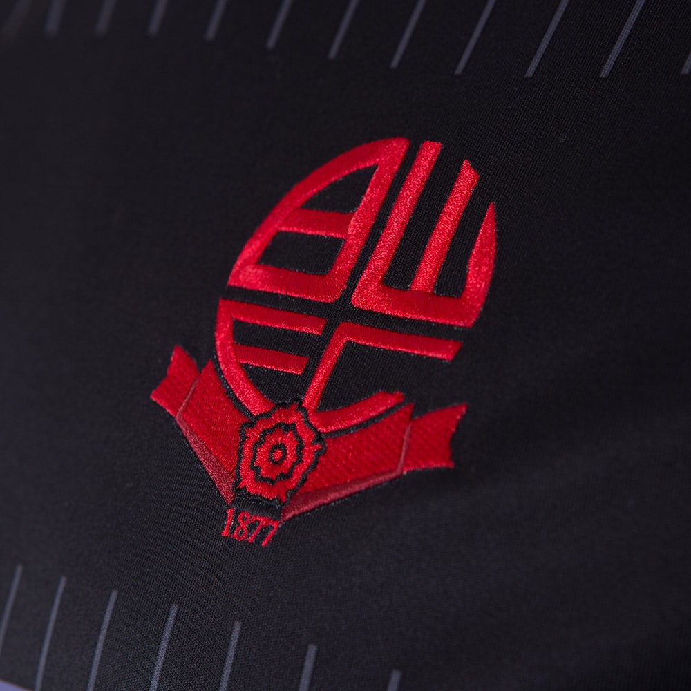
The kit top is black with a grey barcode-looking pattern running across the front. The club’s crest and Macron’s logo are both printed in red. This colouring allows them to stand out on the much darker background and remain uncluttered, even after competing with Bolton Wanderer’s main sponsor.
The kit top ditches the classic collar in favour of a more simple one – bordered with red.
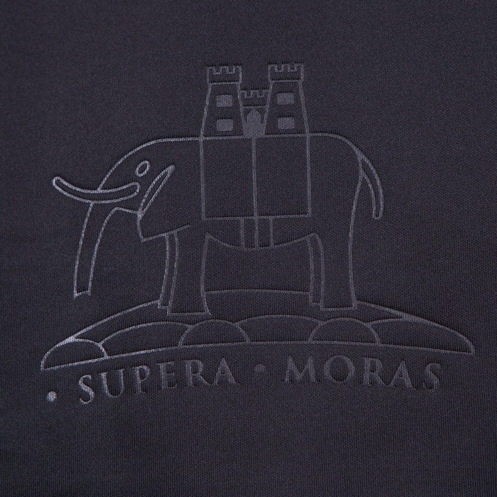
The sleeves are both tapered with red and navy blue, this completes the kit nicely. Just like on the third kit, a physical representation of the coat of arms appears. It has the words “Supera Moras” printed upon it, meaning “Bolton on the Moors.”
Bolton Wanderers’ third kit has received mixed reviews. Its striking pattern is also the element that fans are most unsure about. Some fans have commented upon the kit release by saying that they’d prefer the third kit to be the club’s away one.


