It’s a day of third kits. Yes, often they’re thought of as the least important, the one that is often neglected but today we dedicate to them. Starting off this wonderful remembrance event we take a look at Hull City. The club have so far played two league games this season, only taking one point. Furthermore, last night they went to penalties with Sheffield United in the Football League Cup. Hull City won the penalty shootout 5-4 and so progress through to the next round. It’s a rocky start but there’s plenty of time to iron out these competitive creases.
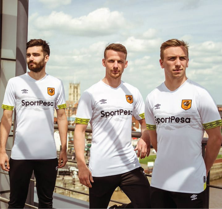
The club has teamed up with Umbro to craft a simple, eye-catching, slightly clashing kit top that has so far been positively received by fans.
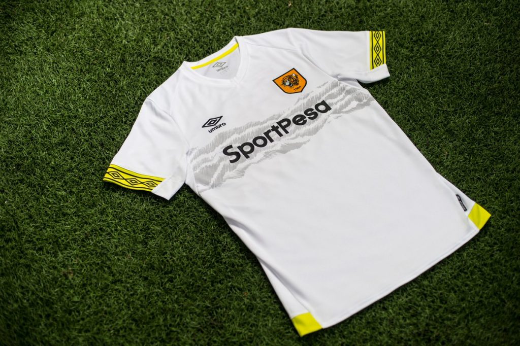
The kit top is white. A good start, and certainly not the worst white kit we’ve seen. Across the centre of the chest, running horizontally, is a semi-animalistic pattern that the club’s main sponsor: SportPresa sits ontop of. Further up on the chest is the club’s crest and Umbro’s logo. The interesting point to note here is that the club’s crest is orange, whereas the secondary colour of this kit is yellow. Obviously they couldn’t turn the crest yellow. That would be madness. But are yellow and orange the best two colours to feature on the kit top?
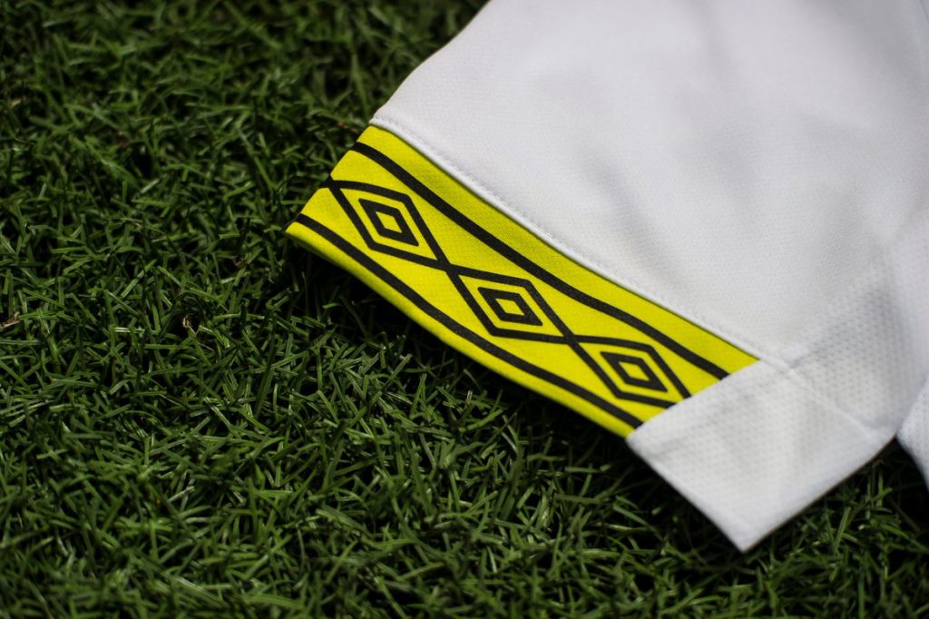
The bottom of each of the sleeves features Umbro’s trademark tapering. We have seen it with almost all of their released kits this season and if we’re honest: we love it.
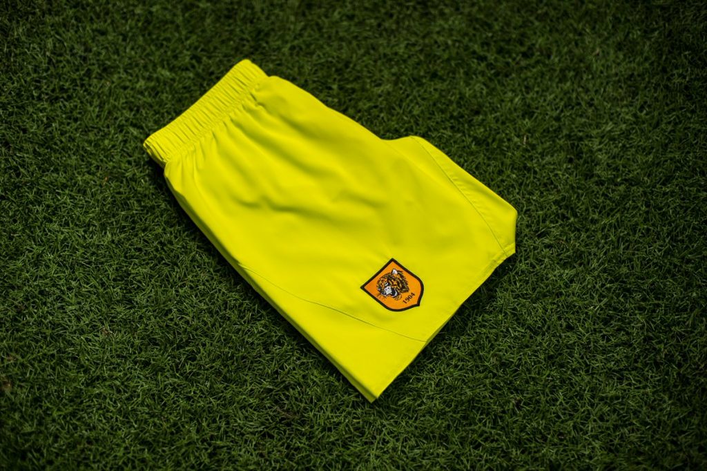
Yellow is seen once again at the bottom corners of the kit top. The shorts are also filled yellow and this colour features on the white socks.
Hull City finished their 2017/18 campaign in 18th place. Nigel Adkins will certainly be hoping that his side can improve this season. Furthermore, he might hope to push for promotion.
