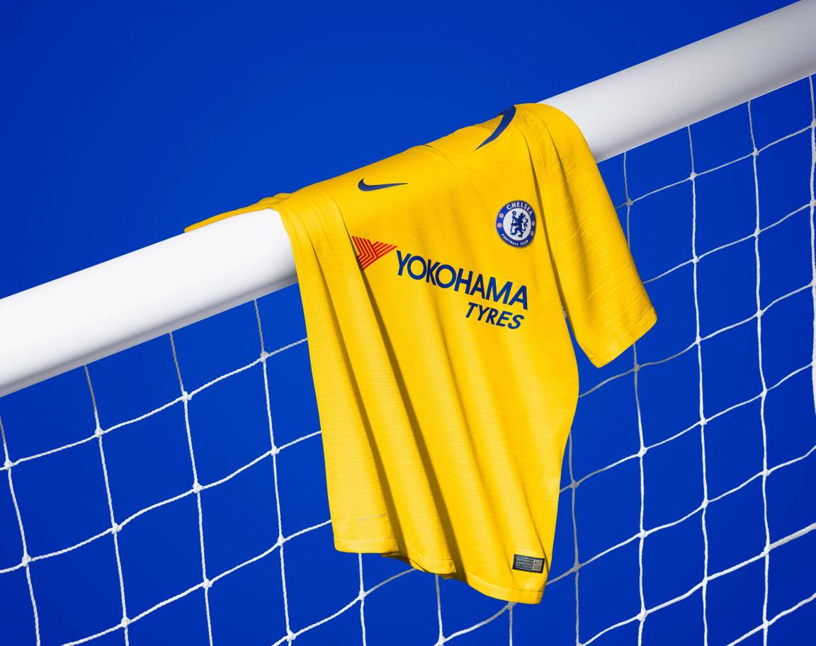
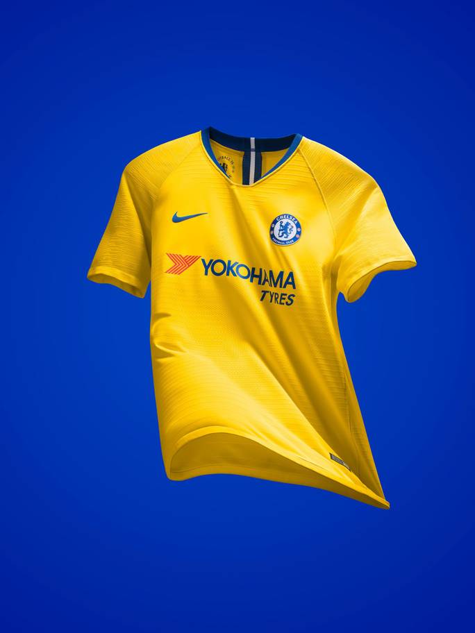
These past couple of months have been busy. We’ve been watching England crash out of the World Cup. Furthermore, almost every team from every league has released new kits. Here’s Chelsea’s away kit, released last month.
Yesterday evening Chelsea played Lyon in their final pre-season friendly before the Premier League kicks off. In terms of scoreline, it was a little dull. Ending in a 0-0 draw, Chelsea managed to win 5-4 on penalties and this was all without their star keeper – Thibaut Courtois. He’s currently hiding out in Belgium after skipping training. This AWOL activity is in the hope of forcing through a move to Real Madrid. Further to this empty net issue, Chelsea got rid of Antonio Conte in July. Fans might be looking a the state of the club a little nervously, however Ross Barkley has insisted that new manager, Maurizio Sarri, just needs time to get the team back on top.
To help the club get there (if a kit can contribute anything to a team other than aesthetic and practicality), Chelsea have teamed up with Nike to create a bold, bright away kit.
Whenever we’re asked what our favourite colour combinations for kit are, we’ll often say red and white or black and white. We always forget how gorgeous yellow and blue look together and how effective these colours can be as an away kit.
The body of the jersey is bright yellow. The shade of yellow that might hurt your eyes if you stare at it for too long. Across the kit are a series of horizontal, slightly darker lines, giving character to the design.
On the chest sits Chelsea’s crest, Nike’s Swoosh and the club’s main sponsor – Yokohama Tyres. Due to the blue colouring of each of these emblems, none lose their effectiveness and all stand out perfectly.
On the nape of the kit top are three vertical lines. A white one sandwiched between two blue. This is effective and completes the kit nicely.
Chelsea fans will be sitting at home right now a little nervous. Their first game is against Huddersfield in this kit and fans will naturally want to see a positive result.

