The Toffees. Why are Everton called this? Apparently there used to be a toffee shop near to the old stadium that fans would frequent. That’s it.
While they might have briefly had boyhood hero Wayne Rooney back for a season in 2017, the club will have to make do without him. Everton have always competed for a place at the top six table and seem to be the seventh place club in most people’s minds. However at the end of last season, they were denied a seat at that table by Burnley. With the football season fast approaching on the horizon, Marco Silava will want to see his team gather the points and compete with the titans of Tottenham and Manchester.
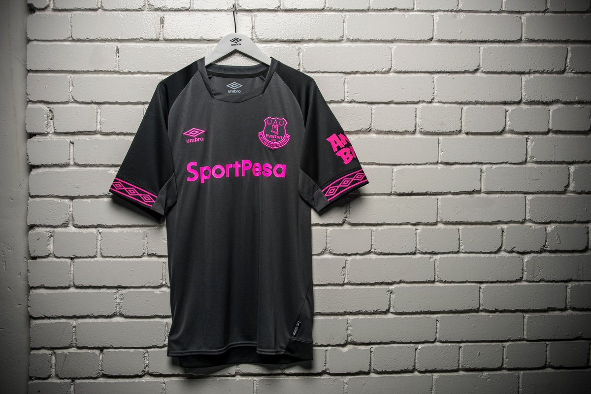
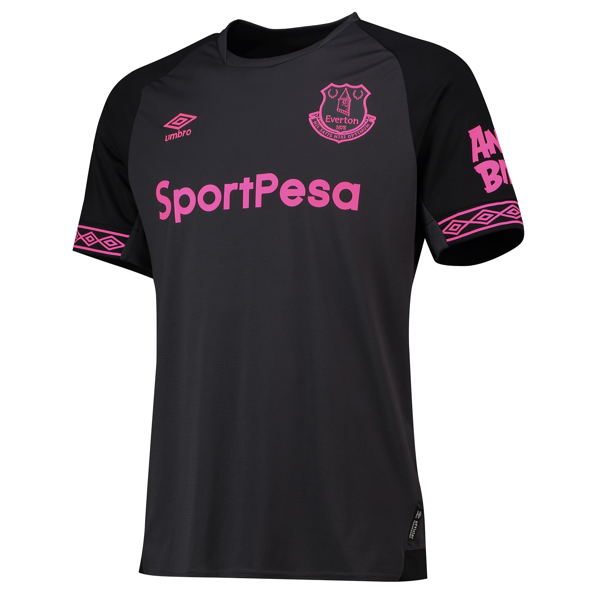
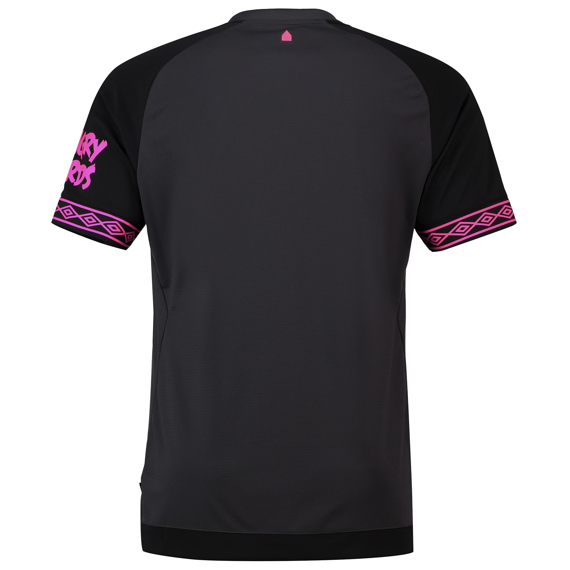
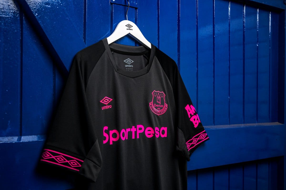
To help them achieve this, Umbro have designed an away kit that retains Umbro’s trademark style, as well as reflecting Evertons bold ambition.
We quite like its contrast, but what do you think?
The jersey is charcoal and the sleeves are a darker black. This instantly gives a nice dynamic to the kit and allows depth, without too much design-effort. The neckline is simple, without coloured tapering and features an overlap on either side.
The colour of the club’s crest, main sponsor and Umbro logo is bright pink. This is the contrast that we’re talking about.
The style comes about after a lengthy campaign, led by the women’s team and in the press release, the colour of writing is called “pink glo.”
Umbro’s Managing Director, Anthony Little made the statement:
“It’s a really striking kit which has been developed with the views of the fans in mind, so I’m confident it will be popular with Evertonians everywhere.”
The kit has received mixed reviews upon release and might get more negative press if the players fails to perform in it next season.


